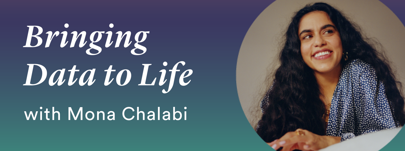
Mona Chalabi
Emerson Collective Fellow, 2023
This month, the New America Fellows Program announced the Class of 2023 National Fellows. An impressive group of 15 scholars, journalists, and filmmakers were selected from a pool of hundreds of applicants who over the course of their fellowships will explore issues ranging from climate change and energy to health and medicine to criminal justice. One of those talented fellows is Emmy-nominated data journalist Mona Chalabi. Chalabi uses words, color, and sound to “rehumanize” data to better help us understand the world we live in and the way we live in it.
In this extended Q&A from The Fifth Draft—the National Fellows Program’s newsletter featuring exclusive content about and from our Fellows—Class of 2023 Fellow Mona Chalabi gave us insight into her forthcoming project, what inspired it, and her style of illustration. Sign up for The Fifth Draft to hear how the world’s best storytellers find ideas that change the world.
Your Fellows project will be a book that explores income inequality by weaving together data visualizations with interviews with 10 people of varying income levels who live across the United States. What inspired this project?
Discomfort! That’s a starting point for a lot of my projects—I’m interested in writing about the things that we struggle to talk about. More specifically, I’m interested in the feeling of shame that money brings up and how that can often be debilitating. The goal of the book is to better understand not just the realities of income inequality but how we *feel* about our financial differences. I have managed to find most of the people now who will be in the book and despite the vast differences in the material reality of their lives, there are really interesting parallels in their desires to conceal the specifics of their wealth and income.
And I hope that I can maybe help to build a new vocabulary around those financial differences—one that promotes more transparency.
You have described your work in terms of “rehumanizing” data. What does this mean, and how can this process change our perception of data?
When most people think of data, I think the adjectives that come up are often things like: abstract, cold, detached. I don’t feel that way at all! Statistics are just the aggregation of human experiences and what humans experience should prompt feelings!
So I guess rehumanization has two components. First, it’s about remembering the humans that make up the data—whether it’s the percentage of people who have monkeypox or the number who are on a diet—there are all kinds of important factors that affect your chances of being in the “yes” or “no” category. So the inputs are humans.
Second, it’s about remembering that the outputs are human too. People, flawed people with experiences that shape their own biases are responsible for analyzing and representing data. (That’s not finger pointing, I really include myself in that!) That doesn’t mean that data is useless, I think it just makes it even more interesting.
How would you describe your illustration style? Does it differ between your data work and other mediums? What are the advantages to your style over more traditional data representation?
I think I might describe my illustration style as child-like? Maybe that’s because it hasn’t changed much since I was a child! I drew a lot when I was very young but stopped when I was around seven [years old] and only came back to it in my late 20s. I was surprised that the aesthetic hadn’t changed at all—I just picked up where I left off! At first, I was humbled and sad that the style isn’t artistically impressive but now I’m ok with it—I think it makes my style of work approachable. If people look at my illustrations and think “I could do that,” then great! My work has been accessible, it has made someone feel empowered!
I think that’s the advantage of this style of data visualization. I haven’t compromised one iota on accuracy (my drawings are traced and edited in photoshop so that they perfectly align with computer generated graphics) but the wobbly lines remind people about the fallibility of data. The imperfections of the drawings hopefully remind people about the imprecision of numbers.
What does your process of visual creation look like from initial planning to editing?
It really depends on the specific subject I’m tackling but it typically goes like this: find the data (again, depending on the subject, this can sometimes be the most arduous part), question it, try to find the most interesting or salient element, and create a standard data visualization on my computer—a pie chart, bar chart, line chart, etc. Then I think about the subject I’m representing and try to find ways to incorporate that visual language into it. So, if it’s a chart about sweat, should I make it a density map of little water droplets?
The next stage is pencil drawings, then ink. Then I scan, alter the image to make sure it lines up perfectly with the numbers and color it. Very often, I’m working with editors and other colleagues so there are a few rounds of revisions. Sometimes we’re just adjusting things like color, but sometimes I get a reply of “this makes no sense to my eyes!” In which case it’s back to the drawing board. That happens pretty often!
You share many of your illustrations on social media. Why is it important to you to share your work there, and how do you think data journalists can use social media effectively?
I share on social media for both pragmatic and ethical reasons. It’s pragmatic because I’ve seen that gaining a following has provided me with job opportunities that in turn have given me better financial security. (Since the job is all about money, it feels important to be transparent about that!) But it’s also really important for journalists to read the comments and understand what feedback readers are giving. Very often, there will be people on Instagram who have more direct experience of a subject than I do. If they’re saying “I don’t like the way you’ve represented this” or “Have you ever considered looking at the impact of this on this particular group of people?,” then I am all ears!
Mona Chalabi’s Instagram is a hub for lot of her beautiful work where she displays the power of bringing data to life:
The Gray-Green Divide
Ready to deepen your appreciation for trees? In this installation, Mona Chalabi explores the unequal impacts of environmental justice and climate change on Brooklyn communities. The Gray-Green Divide asks which neighborhoods lack vegetation—and at what cost.
9 Ways to Imagine Jeff Bezos’ Wealth
Being worth $172 billion is almost unfathomable, so Mona Chalabi provides us with some data visualizations that can help us wrap our heads around just how much money Amazon founder Jeff Bezos has.
Am I Normal?
We all want to know if we’re normal. Endlessly curious data journalist Mona Chalabi NEEDS to know, and she’s ready to dive into the numbers to get some answers and wonders does normal even exist?
100 New Yorkers
100 New Yorkers visualizes what the city’s population would look like if it were distilled down to a relatable 100 individuals. Using census data, Mona Chalabi has created 100 characters that, as accurately as possible, visualize the racial, economic, and social realities of the city’s population.
Emerson Collective Fellow, 2023