Examining the Data: State Per Pupil Expenditures and State Graduation Rates
Blog Post
Sept. 15, 2010
States across the country are always trying to figure out how they compare to other states on educational outcomes. Which state does the best on the National Assessment of Education Progress? Which states spends the most on education? Which state gets the most return on each education dollar it spends? The Federal Education Budget Project, Ed Money Watch’s parent initiative, collects and analyzes data on exactly these kinds of questions. Today, we will take a closer look at how state graduation rates (as defined and calculated by the U.S. Department of Education) vary with state per pupil spending for the 2007-08 school year. While some states get a great return on their education investment – high graduation rates despite relatively low per pupil expenditures, some states seem to be getting very little for every education dollar, displaying low graduation rates and high per pupil expenditures.
One of the best ways to gain a quick understanding of the trends in education data is to create a scatter plot of the data of interest. This provides a visual depiction of the relationship between the two sets of data for each state where one data point of interest is plotted on the x axis and the other data point of interest is plotted on the y axis. This makes it easy to compare how each state fares on both indicators and to see trends in the data for all states. Below, we have created a scatter plot where per pupil expenditure is plotted on the x axis and graduation rate is plotted on the y axis.
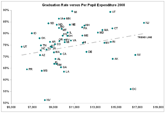
Additionally, we have included a “trend line” in the scatter plot which shows the general pattern that the data points follow. The slight slope of the trend line suggests that states that spend more money per pupil tend to have higher graduation rates. For example, New Jersey has the highest per pupil expenditure in the country at $17,620 and the fifth highest graduation rate – 84.6 percent, following the trend. Other states follow the trend line almost exactly – North Carolina, Texas, Hawaii, Wyoming, and Rhode Island all fall very close to the trend line on the scatter plot, indicating that they are getting similar returns on their educational investments.
However, the small slope of the trend line indicates that the relationship between per pupil expenditure and graduation rate is not very strong. Several states do not follow the general trend, falling far below or far above the trend line.
In fact, there are many outliers (states that do not follow the overall pattern) on the scatter plot. These states typically have low graduation rates and high per pupil expenditures or high graduation rates and low per pupil expenditures. For example, Wisconsin appears to get some of the best returns on its education spending compared to other states – it has a relatively low per pupil expenditure ($10,791 – just over the national average) but the highest graduation rate in the country (89.6 percent). Iowa and Minnesota, with slightly lower graduation rates (84.6 percent for both), also buck the trend with lower than average per pupil expenditures ($9,520 in Iowa and $10,048 in Minnesota).
In contrast, New York has the second highest per pupil expenditure in the nation ($16,794) but one of the lowest graduation rates (70.8 percent). The disparity in the District of Columbia is even greater – it has the third highest per pupil expenditure ($16,353) but the second lowest graduation rate (56.0 percent).
Nevada, on the other hand, is an outlier of a different variety – it has both relatively low per pupil expenditures and an extremely low graduation rate. It falls significantly below the vast majority of states, suggesting that Nevada is getting worse returns on its education spending than any other state that spends a similar amount per pupil.
While using scatter plots to infer trends in education data is imperfect, it does reveal some important patterns and clearly identifies the states that do not follow them. In this particular case, the scatter plot makes it abundantly clear that states are not guaranteed a certain graduation rate depending on how much they spend per student. Instead, how a state (and school district, and school) spends its money matters significantly more than how much money it actually spends.