
California’s New Data Dashboard and What It Means for English Learners
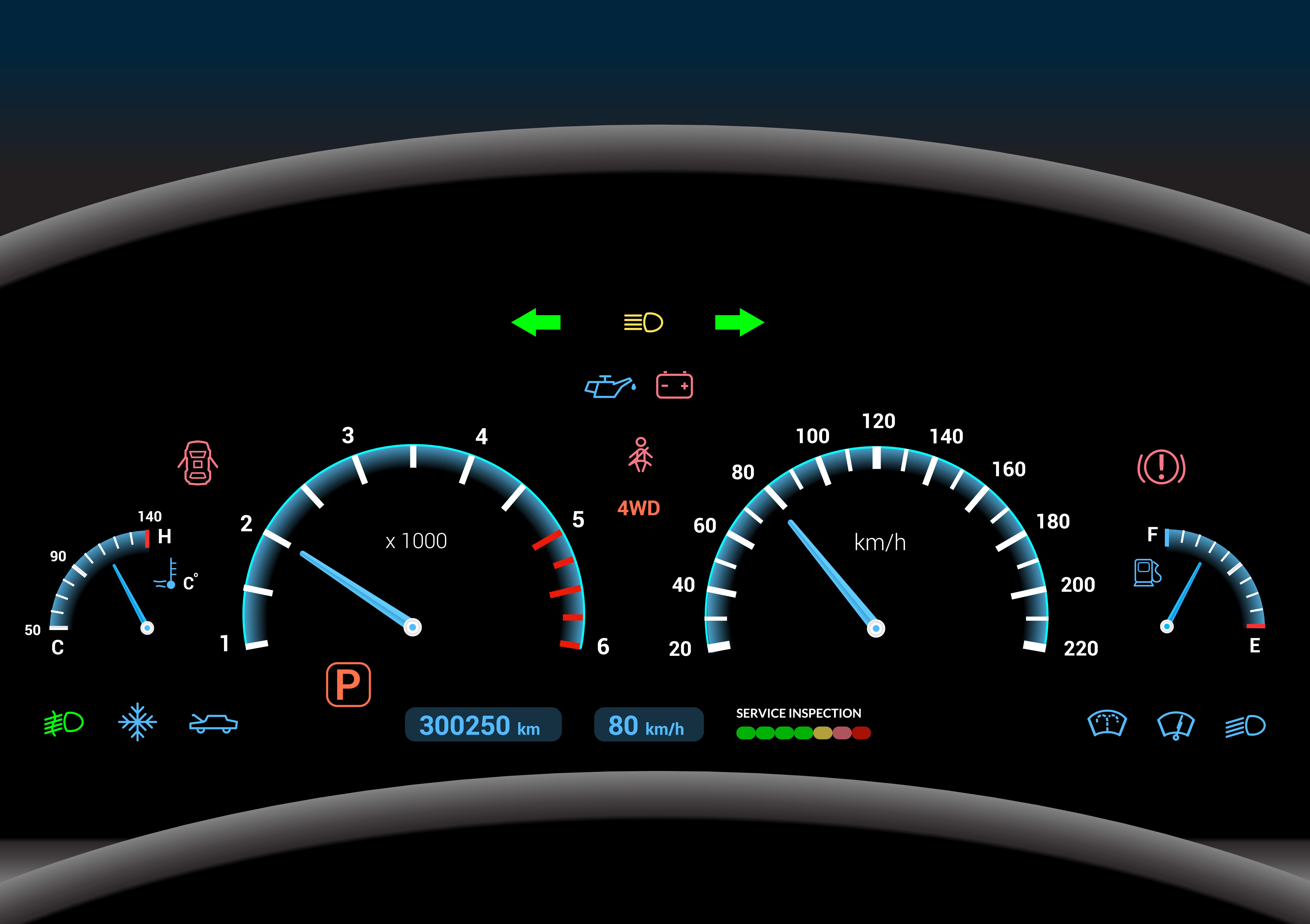
It’s hard to fix a problem you don’t know about.
It’s why cars have a number of well-lit signals in plain sight of the driver — the speedometer, the fuel gauge, and a variety of other indicator lights. Without these features, even a mundane road trip would be unthinkably dangerous.
Transfer this idea to education. As leaders proceed along their routes, aiming to equip students with a high-quality education for college and career success, they need timely metrics on what’s working and what’s not. Which areas are in great shape? Which need a tune-up? Straightforward data is vital for educators, families and school communities.
Along these lines, the California Department of Education unveiled a “field test” of its new School Dashboard website last week. The Dashboard is a color-coded system for tracking K–12 student performance. It allows users to search by school or district. Blue is the highest possible rating, green is high, yellow is medium, orange is low, and red is the worst. In case documents are presented in black-and-white, the colors are displayed visually in circles, sliced like a pie. Blue, the best, is a full five slices.

The Dashboard stems from California’s new accountability system, the Local Control Funding Formula (LCFF), signed into law by Governor Brown in 2013. The new law significantly changes how resources are allocated across the state. The changes intended to provide funds more equitably for students with learning and socioeconomic barriers.
Overall, the law’s funding mechanism has had a rocky start, including (frankly alarming) reports of financial mismanagement in some districts. And yet, on planning and evaluation, the new data Dashboard is an important development of the law’s implementation.
Previously, state leaders calculated a school’s Academic Performance Index (API) based on annual standardized tests. Each school’s effectiveness was represented as a three-digit number. Having a single figure was clear and succinct. But its simplicity was also its greatest weakness. One number can’t possibly capture the breadth of how a school is operating.
The new Dashboard shows a more holistic picture of how schools are doing, measuring progress over time on multiple indicators. Naturally, that comes with a trade-off: greater complexity makes the system harder to understand.
In this way, the Dashboard illuminates a key, inherent tension in education data: the competing priorities of simplicity and nuance. “The positive is that [the Dashboard] is based on multiple measures,” Cynthia Lim, who oversees data for the Los Angeles Unified School District, told The LA Times. Dashboard indicators feature academic test results, high school graduation rates, suspension rates, and English learner progress. So, “[t]here’s going to be a learning curve…But everyone is thinking this is a fairer way of looking at schools,” Lim said.
In particular, the breakdown of multiple measures is a vital change for the state’s one-and-a-half million English learners (ELs), who comprise a third of all ELs nationwide. With EL progress as one of the state’s high-profile indicators, the Dashboard makes these vulnerable students significantly more visible. For instance, the data enabled EdSource to highlight that EL progress was “red” and “orange” in 45 percent of schools and 38 percent of districts across California, which was “by far” the poorest-performing indicator. It was a quick analysis with revealing figures.
The key reason the dashboard is meaningful for ELs is the metric that the state chose to report. California’s progress indicator for ELs reports the percentage of students who moved up at least one level on the state’s English language test or who were reclassified as English proficient in the previous year. This data metric — progress in English proficiency — is one of the most valid of available ways to speak about current ELs’ success. As I’ve written before, using data to describe ELs’ progress fairly and accurately is complicated and often leads to misleading conclusions.
In particular, ELs are in somewhat of a catch-22 on academic English language arts and math tests in English, such as the new Smarter Balanced and PARCC assessments. By definition, most students still learning English will not perform well on these exams. Indeed, language interferes too significantly to make EL scores of academic achievement valid in many cases. A uniform expectation, experts argue, “may appear to be rigorous” but “actually ignores the developmental role that language proficiency plays in content area learning.”
The quandary here arises because EL populations are not stable. So, just as ELs reach English language proficiency and have greater odds of success on the academic tests, many test out of the extra language services. Their datapoint leaves the EL subgroup; they’re no longer considered “ELs.” Essentially, EL subgroup data moves through a revolving door. From an evaluation perspective, this set-up is problematic. It masks success with these students and creates an EL “achievement gap” that can never actually go away.
That’s why, as long as students are classified as ELs, monitoring the year-to-year progress on California’s English language development test is the crucial metric. It’s fairer and more accurate. (Note: the Dashboard still reports EL achievement on academic tests, so leaders can keep an eye on it — though they should do so cautiously.)
A similar EL growth figure was previously reported under Annual Measurable Achievement Objective (AMAO) 1 under requirements of the federal No Child Left Behind. But in general, that information was down in the weeds, masked by a dizzying array of acronyms, and buried on state websites, sometimes with broken links. If it felt like a treasure hunt for full-time policy professionals (like me!), the information was probably less accessible for more casual public stakeholders, including busy parents with eyes less-trained for data sets.
So, for English learners specifically and all students broadly, the California Dashboard seeks to strike a delicate, difficult balance between sophisticated yet readable data.
To this end, the state’s new data system features both simple information and detailed information for more curious users. The Dashboard reports a top-level, overall performance level on each indicator for districts and schools: one color.
An accompanying tool, a five-by-five grid, then allows users to “drill down” further and examine how these colors are generated. The grid plots most recent results (“status”) against the improvement of those results over time (“change”). The State Board of Education has assigned a color for each box on the grid that reflects the intersection of those two variables.
For the EL progress indicator, the final color reflects two questions: First, what percentage of ELs progressed at least one year on their English test (in this case, “status”)? Second, compared to last year, did this number of progress-making ELs grow or decline (“change”)? The idea is that poor performers for ELs can get partial credit for improving, and even the highest performers for ELs get dinged if they show evidence of backsliding.
As an example, take a look at the grid on EL performance in San Francisco Unified. Overall, the main Dashboard gives San Francisco Unified an orange rating on EL progress. So… not great.

Next, take a look under the hood via the five-by-five grid to see how “status” and “change” for ELs intersected. You can see which schools — called out by name —are the blue high-performers, red low-performers, and ones who fall somewhere in between. This opens the door for more follow-up research and case studies of what’s working so well at the blue schools.

California Department of Education
Taken together, California’s move to more centralized, transparent EL data is promising, even as it will take time for users to adjust to a new system. Any effective, equitable reform for ELs must start with an accurate diagnosis of problems and successes.
Going forward, it will be critical for the state to incorporate feedback from users to make tweaks where possible. Though just a low-stakes prototype — for now, the state plans to use the Dashboard to inform accountability actions in the 2017–18 school year. It will be important to watch how the tool evolves. For example, the state could pull all of the Dashboard’s academic indicators together for one, overall quality rating for each school, an idea some advocates have advanced. Moreover, to maximize impact, the state will need to publicize the Dashboard widely and provide trainings to truly empower families, educators, and advocates with the new data. The state’s overview video, translated into Spanish, is a helpful, jargon-free start.
In any event, California’s colorful ratings already model a useful step for EL equity, using data to paint a more vivid picture of where disparities lie.
—
This post is part of New America’s Dual Language Learners National Work Group. Click here for more information on this team’s work. To subscribe to the biweekly newsletter, click here, enter your contact information, and select “DLL National Work Group Newsletter.”
More About the Authors
Issues
Programs/Projects/Initiatives
Related

In 2026, States and Congress Will Need to Mitigate the Damage to PreK-12 Education

Celebrating the Education & Work Teams’ Impact at New America

Ushering Bilingual Education for English Learners Through Uncertain Times