Mapping the Opioid Epidemic
Table of Contents
- Introduction
- National Naloxone Access Map
- National Prescription Drop-off Map
- Celebrating Lost Loved Ones Map
- Case Study: Northern Kentucky
- Case Study: Tri-County, Colorado
- Case Study: DuPage County, Illinois
- Case Study: Cook County, Illinois
- Case Study: Alameda County, California
- Case Study: Tempe, Arizona
- Case study: Northeastern University
- Getting Started With Local Opioid Work
Abstract
For all the national media attention it has attracted, the opioid crisis remains a local problem, demanding that local governments try innovative strategies to fit their communities’ unique needs. Many do this through the Opioid Mapping Initiative (OMI), a coalition of 17 local governments, universities, and nonprofits who meet monthly to swap insights, share best practices, and test their theories of change. This report documents the efforts of the Opioid Mapping Initiative through its first year. On the following pages, case studies are included from a variety of the participating local governments, as well as maps showing a national perspective on various aspects of the opioid epidemic.
Acknowledgments
We would like to acknowledge the contributions of Afua Bruce, Vivian Graubard, and Cecilia Muñoz for their time and effort reviewing, providing feedback on the initiative over the last year, and editing this work. Special thanks to Denice Ross who provided inspiration from the work started with the Police Data Initiative and a wealth of useful building blocks to help build the network.
We would also like to thank all of the local governments, nonprofits and universities doing their work. We are specifically grateful for the following people for their tireless efforts and willingness to share with others: Tammi Shepherd, Trish Zizumbo, Phil Bertolini, Adam Anderson, Kendall Bobula, Ned Kalapasev, Sally Nussack, Dr. Cordula Robinson, Katherine van den Bogert, Captain Lars Paul, Richard Tuinstra, Dr. Stephanie Diedtrick, Matt Beyers, Jane Martin, Elaine Bautista, Dr. Kathleen Clanon, Curtis Condon, Sally Nussack, Pat Walker, Alison Webb, Mark Mullane, Molly Watson, Jamie Feld, Lily Sussman, Tom Ricker, Mike Semenek, David Arfa, Buddy Bates, Dr. Ponni Arunkumar, Heather Norman, Kiley Floren, Nina Wickens-Bhomik, Suman Mathur, Ewa Knitter, Christianna Kretschmann, Audrey Stasko, Michael Meit, Dr. Katy Brown, Kaila Webb, and Dr. Adam Gushgari.
Across the country, there are local consortiums doing great work to end the opioid epidemic, including Truth Pharm, Brady’s Hope, the Denver Harm Reduction Action Center, and many more. We are grateful for their leadership. We would also like to thank the National Safety Council for their work around awareness and for hosting the Celebrating Lost Loved Ones map. Thanks to Kat Prescott for her voice and energy in creating the short film Dear You in order to drive awareness. Thanks to Esri and the many colleagues who have supported and shared this work.
Lastly, we would like to recognize the thousands of family members who have added their lost loved ones to the map to share their memories and help others. It is in honor of those whom we have lost that we try to make this world a better, safer place.
Downloads
Introduction
The opioid epidemic is a problem that started in the 1990s, but in recent years has dominated headlines. Yet for all the national media attention it has attracted, the crisis remains a local problem, demanding that local governments try innovative strategies to fit their communities’ unique needs. Many do this through the Opioid Mapping Initiative (OMI), a coalition of 17 local governments, universities, and nonprofits who meet monthly to swap insights, share best practices, and test their theories of change.
The Opioid Mapping Initiative began in October 2017, largely motivated and inspired by the work of the Police Data Initiative, which also encourages local governments to publicly release data. Both initiatives built themselves off a common understanding: Data can drive actionable results at the local level. Early practitioners in the OMI came to the work excited to learn more from others, and additional agencies have since joined to share their own approaches through the initiative’s monthly webcasts.
This report documents the efforts of the Opioid Mapping Initiative through its first year. On the following pages, case studies are included from a variety of the participating local governments: Northern Kentucky, which has amassed the most comprehensive database of opioid related data for a local area; the Tri-County area of Colorado, which developed heat maps to illustrate mortality, educating the public while considering individual privacy concerns; and Cook County, Ill., where staff were spending too much time answering public records requests for opioid data, so they created a real-time data dashboard to share information on opioid-related deaths.
The work from those in the Opioid Mapping Initiative is meant to provide a guide for others looking to engage with this topic. From those in local government looking for a place to start mapping opioid data, to those seeking to make a difference in their community, we hope this report will provide valuable insights and action items.
Included in this report are maps showing a national perspective on various aspects of the opioid epidemic. The Celebrating Lost Loved Ones map was the original inspiration for this work, and documents the stories of those who have lost their lives to opioids and addiction. Now managed by the National Safety Council, the map puts a human face to the problem and works to reduce stigma. The National Naloxone Access map represents a unique partnership with Walgreens, CVS, and local governments to share data on where people can buy or receive naloxone for free. Naloxone is a life-saving drug that reverses overdoses, and is critical to any effort to combat opioid-related deaths. A nationwide map is useful for public education and for identifying areas where further investment in first-response efforts is needed. Finally, the report includes the National Prescription Drop-off map, which plots the locations of various stores, government departments, and organizations that allow safe disposal of unused and addictive prescription drugs.
These national maps are critical tools for anyone looking to engage their local government in prevention, education, and response efforts. They show the scope of the problem, allow for crowdsourcing and community engagement, and provide clear opportunities for launching conversations that scale the national to the local.
All of these resources are free to use and share with your community. May they spark proactive conversations, provide inspiration for new local efforts, and bring renewed community engagement with problem-solving efforts.
Error: Data visualization bundle URL missing.
National Naloxone Access Map
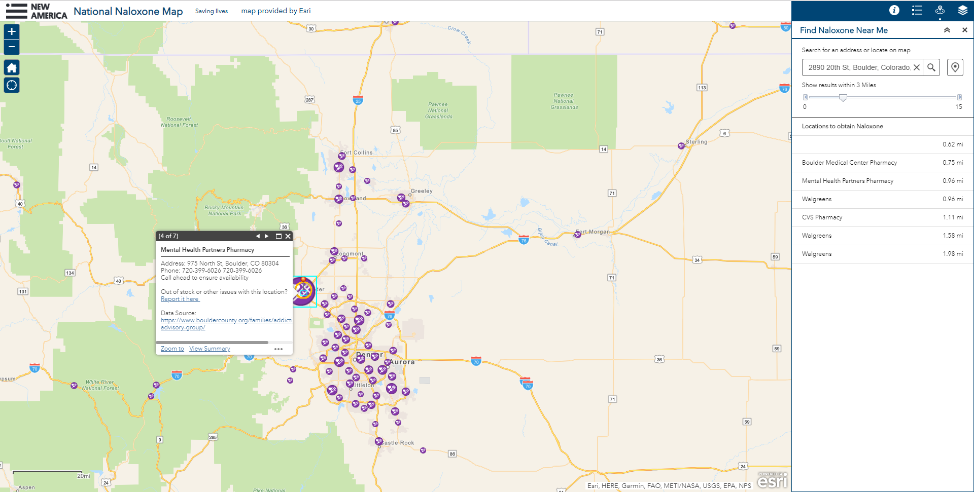
Naloxone is a lifesaving drug which can reverse the effects of an opioid overdose when it is administered in time. While this is crucial for first responders—and many participants in the Opioid Mapping Initiative have made it a priority for first responders to carry a supply of it—naloxone is also useful in the hands of the general public. Most states have made the drug more accessible, especially within pharmacies, or made it available without a prescription. The U.S. surgeon general even suggested that everyone carry naloxone, even if they believe that they don’t know anyone who is struggling with opioid addiction.
Many local governments have undertaken community mapping initiatives to notify the public about where they can find naloxone in their area. But piecemeal efforts couldn’t give a national representation of locations, so in an effort to stitch these maps together, a national map was created. Thanks to data obtained from Walgreens and CVS, the map now plots 25,000 locations. It represents the most comprehensive overview of naloxone access in the country, and serves as a tool for those who are trying to locate it in their communities.
The map has since been embedded into broader efforts to promote the acquisition and use of naloxone by community members. FEND, an organization which combines the tech, music, and streetwear scenes in an effort to empower youth to fight the opioid crisis, has integrated the Naloxone Access map into their app, winning a humanitarian award from Billboard Magazine. Local governments, including those in the Opioid Mapping Initiative, have used this map to help enlist the community to promote awareness and aide in saving lives, which largely falls at the hands of first responders. Some governments, such as the City of New Orleans, have even embedded the map directly into their local government sites to use for public education.
The national map was officially introduced in conjunction with the short film Dear You, a PSA-style production which chronicles a story of addiction to opioids. Director Kat Prescott said, “The film serves to highlight the often unseeable nature of opioid addiction and the alarming rates of fatal overdoses among America's teens and young adults, as well as showcasing the existence and importance of the overdose-reversal drug naloxone.”
National Prescription Drop-off Map
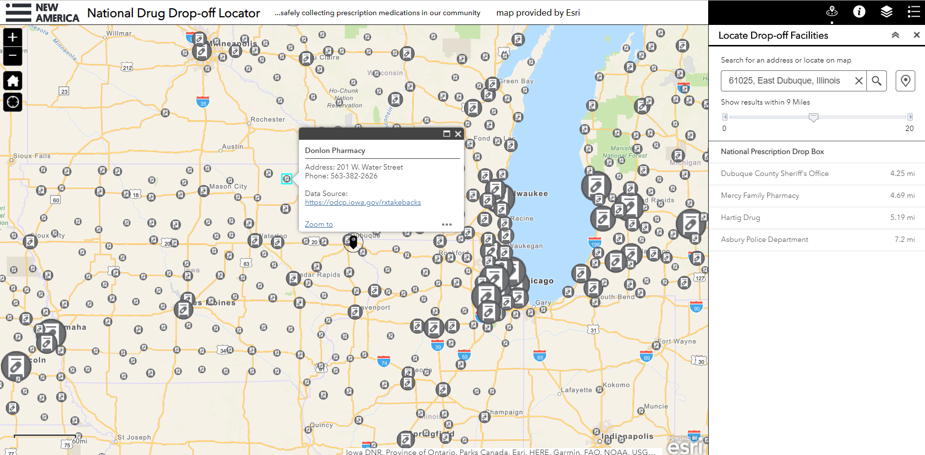
Many who become addicted to opioids do so because of legitimate temporary or chronic prescription pain medication usage. Opioids are increasingly over-prescribed, both in frequency and in the amount of pills given per prescription. Many people are left with an unsafe amount of pills they were prescribed following a surgery or procedure. In order to prevent these pills from furthering someone’s addiction, safe prescription drop-off locations are crucial.
Many states and localities provide resources that explain how to safely drop off unused prescription medications, like this document from Alabama. Other places, like Arizona, have sought to make it even easier for those looking to drop off medications by mapping all the locations that accept old prescriptions. Maps are particularly useful in this case, because people can determine where best to drop off medications—they may not feel comfortable at a police station, for example, so they can find the nearest pharmacy—and plot their course to get there.
The National Prescription Drop-off map represents another comprehensive data gathering initiative that compiles information for people across the country. While incomplete, it is an easy dataset that many governments have started to map. Allied Against Opioid Abuse, an organization that provides education and awareness resources about the abuse of prescription opioids, has embedded the map in their own site to increase visibility around disposal locations.
Local governments hoping to provide this resource to their community can start maps of their own with information they have on hand, such as locations of police departments and sheriff offices, or they can embed the national map into their own awareness campaigns in order to take advantage of the mapped private businesses like pharmacies that accept prescription drugs.
Celebrating Lost Loved Ones Map
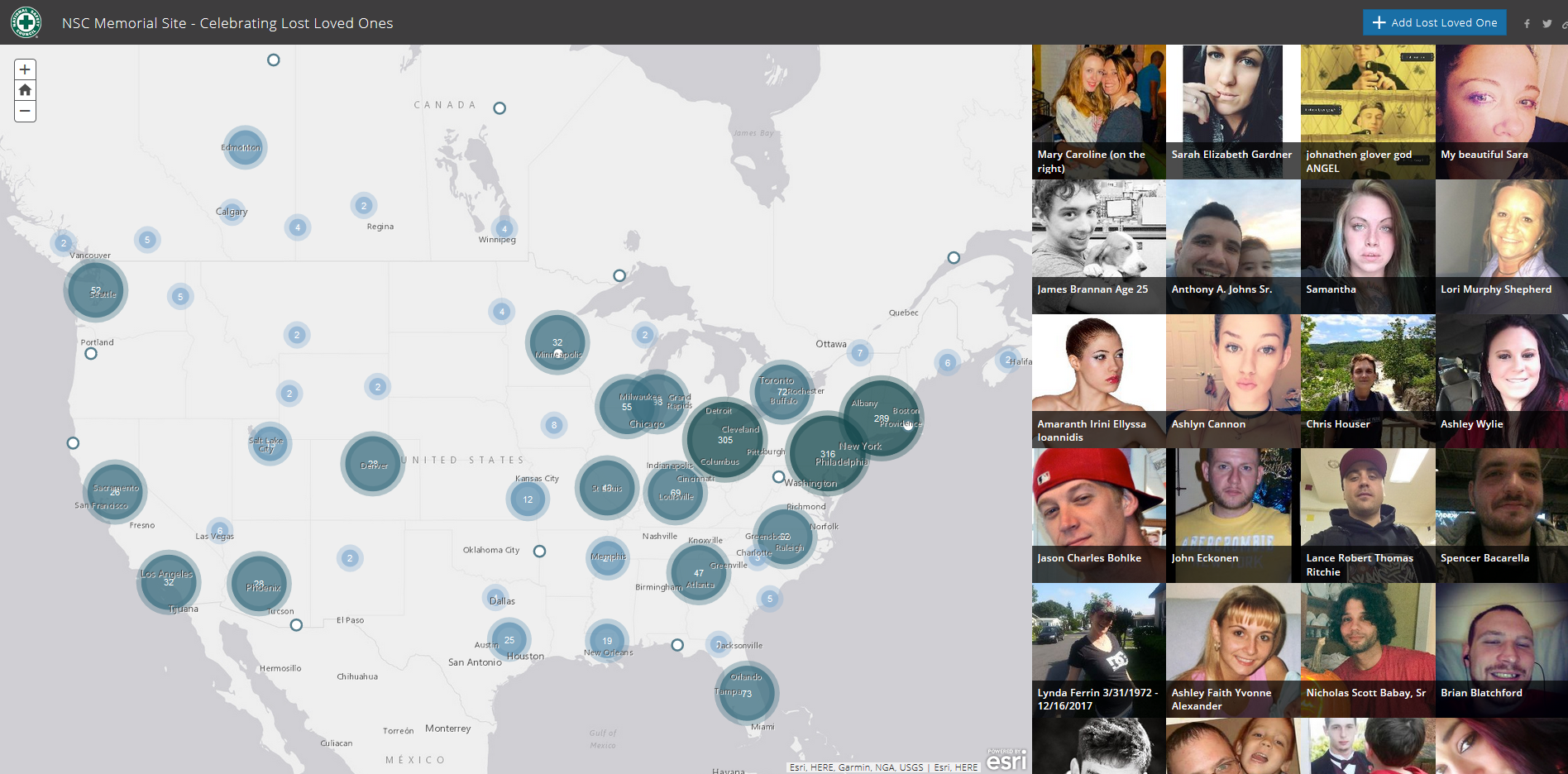
The following case studies contain a wealth of useful data about overdoses and mortality related to the opioid epidemic. This is extremely useful in driving change, but it is important to remember that behind these numbers are real people—great people with meaningful lives, lost to addiction. The Celebrating Lost Loved Ones map was one of the first national maps created to show the scope of the opioid epidemic. Appropriately, it is a crowdsourced initiative that allows family members to add a photo of their loved one to the map, along with a story about their life and their struggle with opioid addiction.
This map, unlike those that show anonymous data points, is meant to break the stigma associated with talking about drug overdoses and addiction by connecting data to human stories. When faced with the human toll of addiction, people are more inclined to pay attention and connect with these stories, especially when they appear in their own backyards. There are innumerable factors that drive people to develop addictions, and approaching each one of these reasons with compassion is key to confronting stigma.
In February 2018, the National Safety Council (NSC) officially adopted the map. NSC was already conducting work around awareness, and created the Survivor Advocates Network, which empowers surviving family members of those who have died from addiction to speak out. Since its adoption by the NSC, the map has grown to encompass more than 1,900 unique stories, and has broadened its reach through social media. The map can be a hugely beneficial educational tool for public health departments and nonprofit organizations across the country who hope to tackle misconceptions about opioids and help their communities address stigmas related to addiction.
Error: Data visualization bundle URL missing.
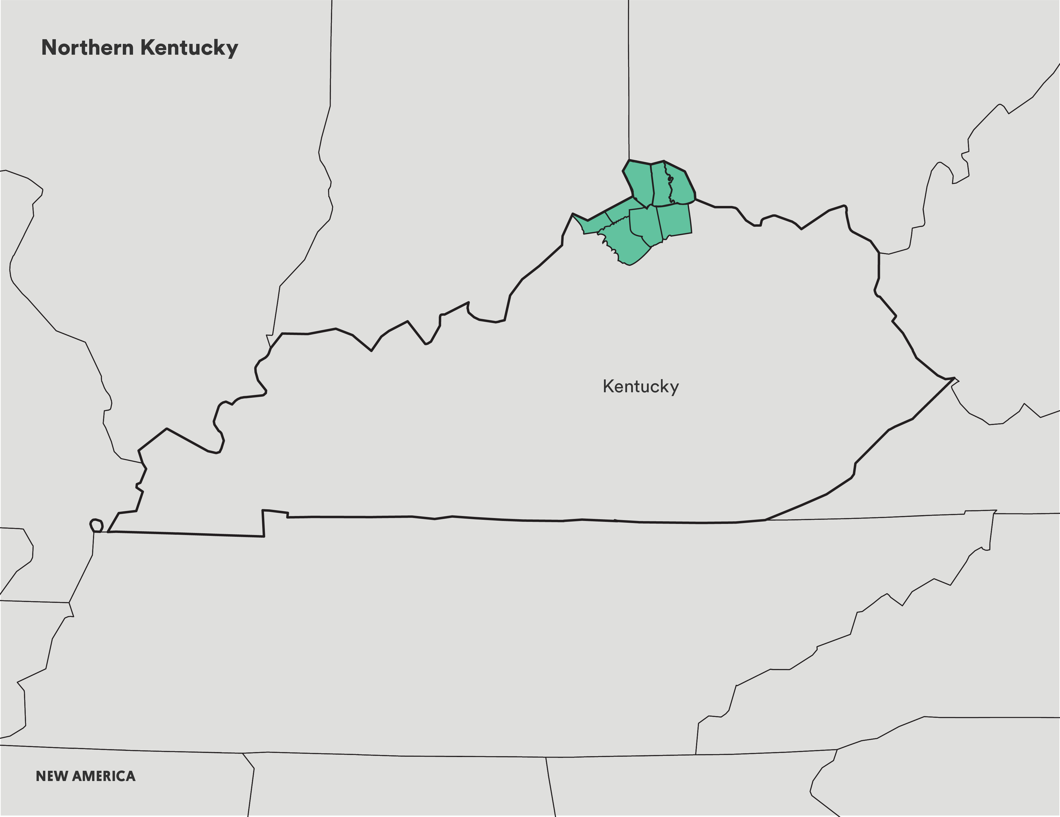
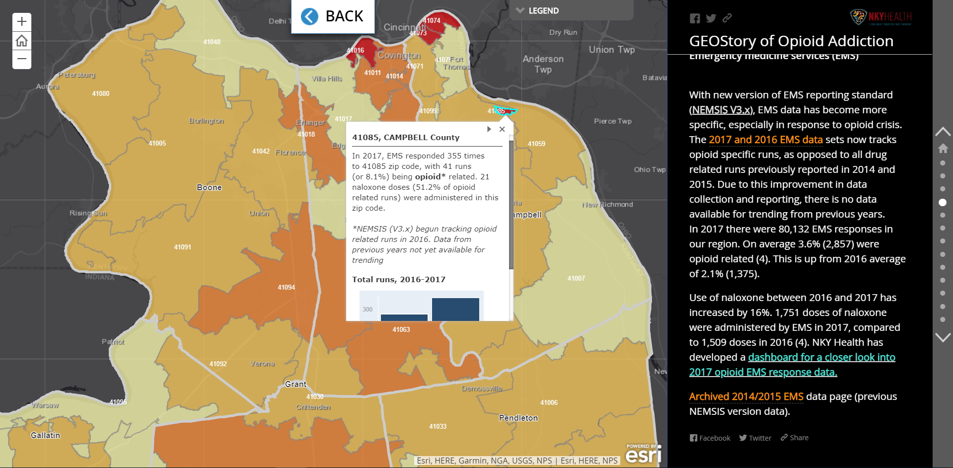
Case Study: Northern Kentucky
“The greatest impact of our work comes from showing the public that the problem is in their own backyard, and how they may be indirectly impacted without even knowing it through the allocation of tax dollars to fight the opioid epidemic.”
Ned Kalapasev, GIS Administrator, Northern Kentucky Health Department
In 2016, Kentucky was in the top 10 on the list of states with the highest rates of opioid overdose deaths. The Northern Kentucky Health Department and the county’s GIS team partnered to create a database for the Heroin Impact Response Team. In doing so, they created the most comprehensive local-level compilation of opioid-related data in the country. Recorded in the database are datasets on overdose deaths, hospitalizations, heroine arrests, naloxone access locations, treatment centers, and prescription drop-off boxes.
This effort isn’t just about one county, it represents the coordinated work of eight different counties and their corresponding governments. Residents in every one of these counties have up-to-date information on the state of the opioid epidemic and the community measures being taken to combat it.
Northern Kentucky has also learned from other local governments through the Opioid Mapping Initiative. Following a presentation by Tempe, Ariz., on their work mapping EMS services, Northern Kentucky created a replica dashboard for their locality. The dashboard tracks any opioid-related emergency dispatch, notes whether naloxone was used, and shows broader trends in patient age, gender, and the day of the week emergency services were utilized.
Northern Kentucky’s opioid taskforce remains focused on public education as a critical component of their work. This story map, which they created to impress the dire state of opioid overdoses in their counties, is open to the public and is regularly updated with new data.
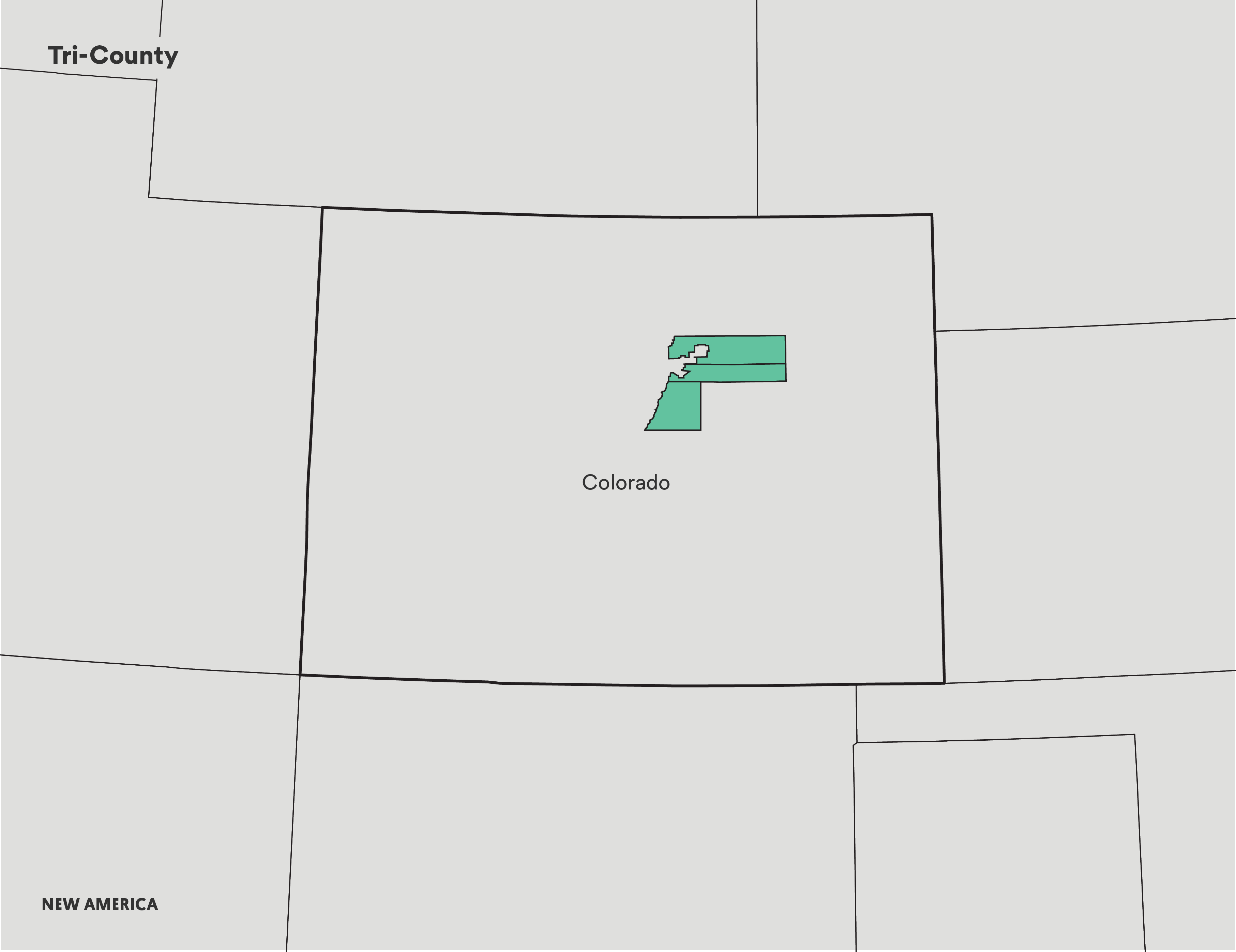
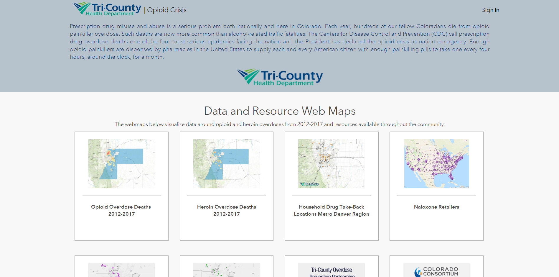
Case Study: Tri-County, Colorado
“Whether it is death certificates, hospital discharge data, electronic medical records, or prescription data—developing creative ways to collect, de-aggregate, and visualize these data points has been critical in addressing the needs of communities most impacted by the opioid crisis. As part of the Opioid Mapping Initiative, we have broadened our agency’s understanding of how we can bring opioid-related data to our community members.”
Adam Anderson, Senior Population Health Epidemiologist, Tri-County Health
The Tri-County Health Department represents three counties around the Denver, Colo. metro area. As a health-focused organization, they realized early the challenges associated with publishing protected health information. To make information public while avoiding the release of any personally identifiable information, the county turned to heat maps—which don’t use specific dots to represent data points—to illustrate trends. This strategy is particularly useful for rural areas, where small communities can easily make inferences from the data. By generalizing their data, Tri-County met the state requirements for medical confidentiality and were able to publicly release maps to educate the public, along with helpful community resources like treatment centers, naloxone distribution locations, and prescription drug drop boxes.
Tri-County focuses not just on keeping information up-to-date for the public, but also showing year-over-year trends. By plotting opioid-related overdoses as well as heroin usage, they have been able to see that where opioid death hotspots appeared years ago, heroin and illicit drug use are now more common.
Similar to Northern Kentucky, Tri-County has also begun to plot mental health issues, such as suicide mortality and mental health distress trends.
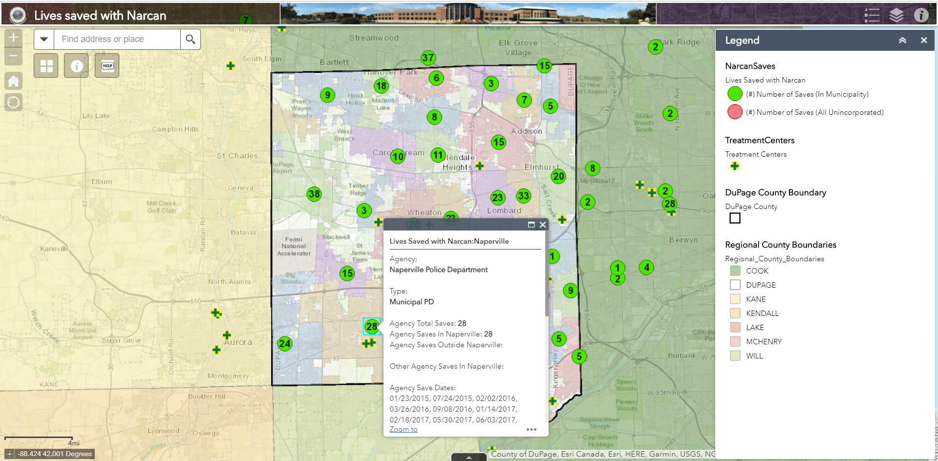
Case Study: DuPage County, Illinois

“The DuPage County NARCAN Program Digital Map Series, along with our RX Dropbox application, has provided the county an informative avenue for educating the public and county officials about these successful programs and the impact they make by saving lives in DuPage County.”
Tom Ricker, GIS Manager, DuPage County
Though naloxone is now nearly universally recognized as a powerful anti-overdose tool for use by individuals and local governments, this was not always the case. Naloxone wasn’t available in Illinois without a prescription until 2016. That same year, other states vetoed bills that would allow the same thing.
But DuPage County, Ill. recognized the utility of naloxone earlier than most of their neighbors. In 2014, the county introduced the DuPage Narcan Program, which trained more than 4,000 first responders and citizens on how to use the drug. In 2017, when the county joined the Opioid Mapping Initiative, they created a revolutionary map to show the importance of naloxone to their community. The NarcanSaves illustrates the hundreds of lives that have been saved thus far through the administration of naloxone.
DuPage County was also one of the first locations to start a local promotional campaign for prevention efforts that centered on prescription drop-off locations. Recently they released a comprehensive site that shows a variety of datasets, including deaths of the opioid epidemic. This new page also shows deaths over time and cause, showing a surge of fentanyl in last few years.
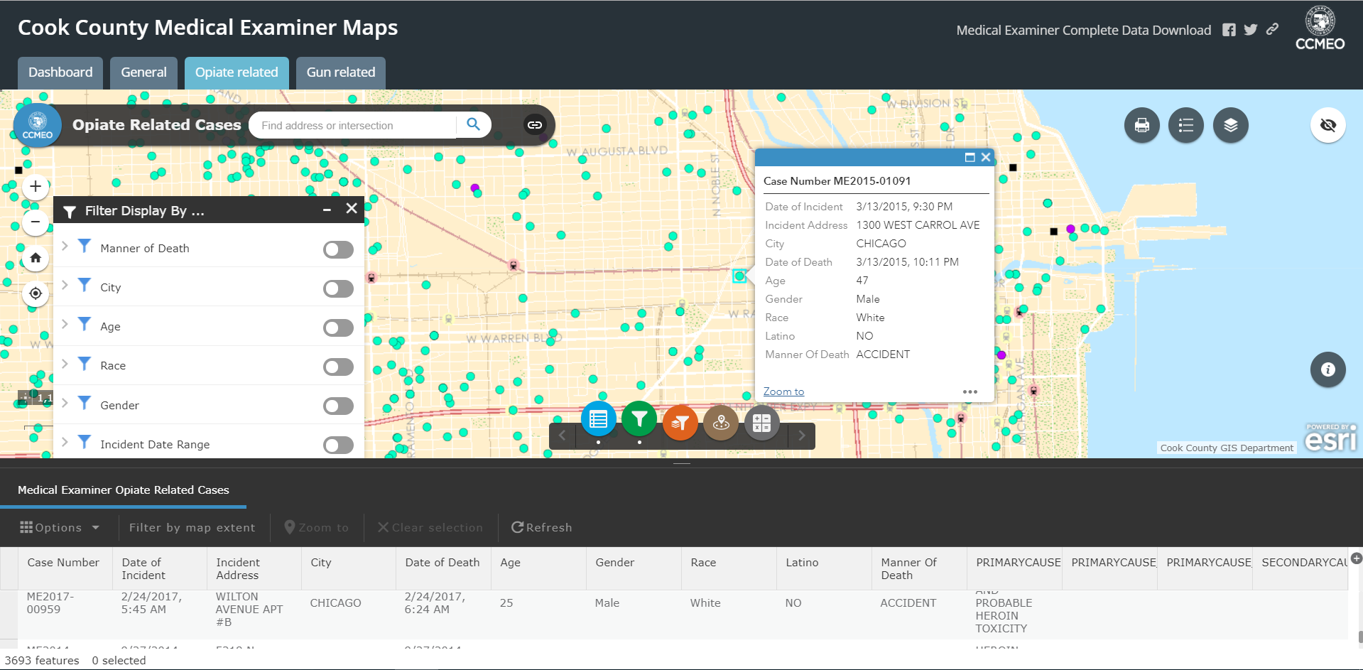
Case Study: Cook County, Illinois

Local government workers in Cook County, Ill. used to spend a significant amount of time answering public records requests they received about opioid deaths. Because Cook County includes Chicago, the population is over 5 million—meaning there was a lot of data to chart for requests. In order to provide information to law enforcement and the public, Cook County became the first county of its size to map data in real time. It used to take hours, if not days, to pull this type of information for the DEA, local law enforcement, and the health department. But by incorporating data as it is reported each night into the map the following morning, their dashboard saves valuable time for public servants.
Cook County has also published all their historical data in an open format, allowing anyone to embed it in applications or websites as they see fit.
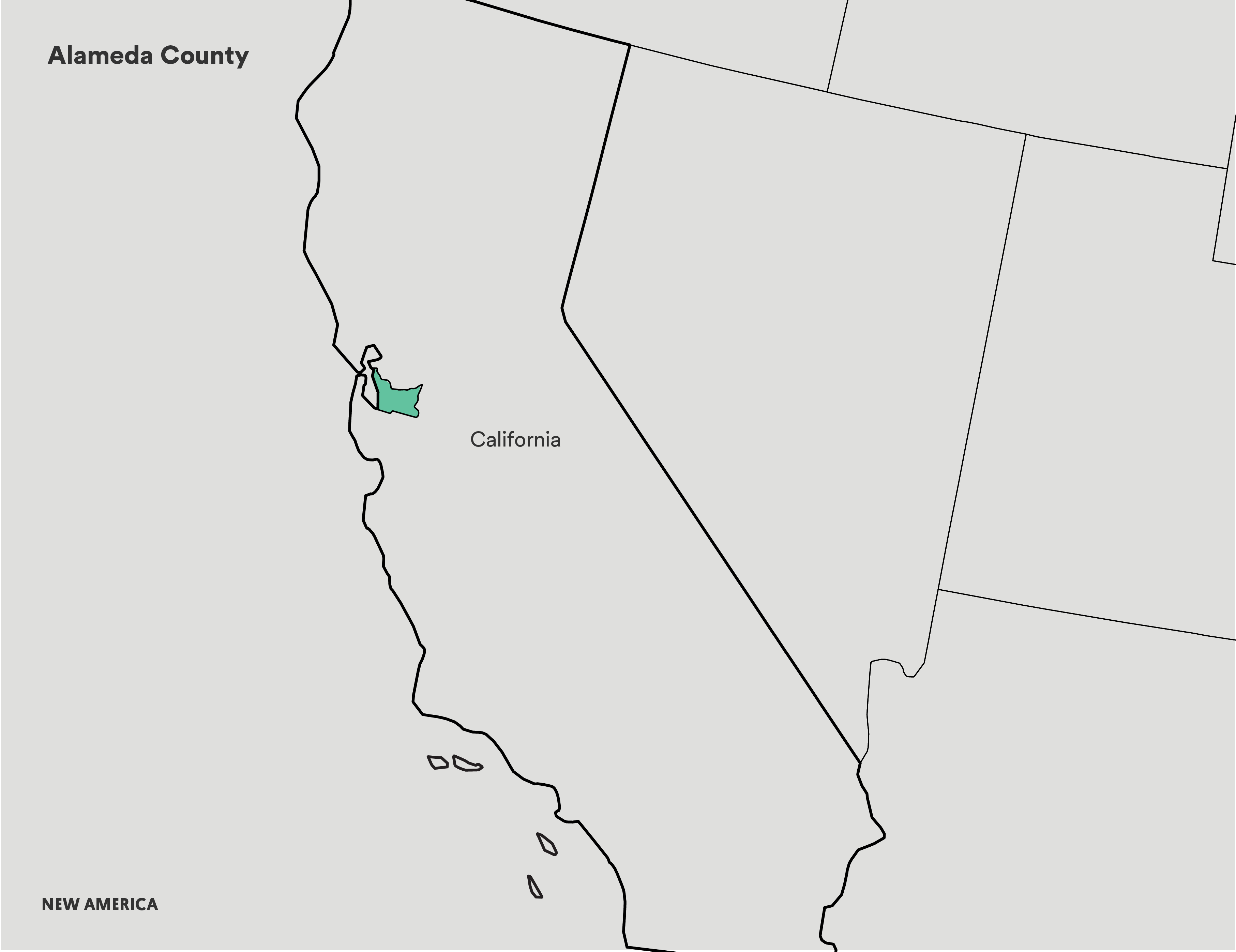
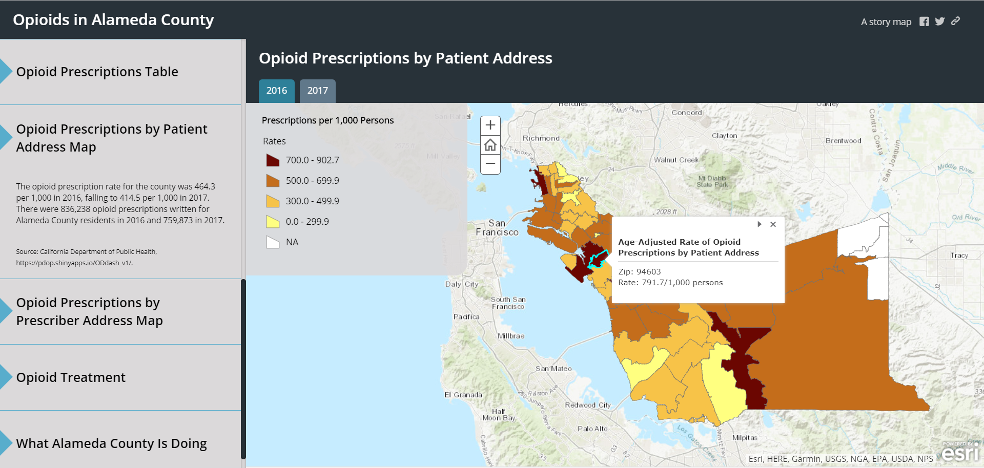
Case Study: Alameda County, California
“Our maps have been instrumental in providing context to the problem of opioid addiction for the East Bay Safe Prescribing Coalition—a group comprised of prescribers, health care providers, and policymakers. Through mapping our data, we have learned that there is so much more to do. We now plan to approach new departments for data, including poison control, emergency services, and the coroner, as well as try to get more timely data on ER visits.”
Matt Beyers, Acting Supervising Epidemiologist, Alameda Public Health Department
Though Alameda County has relatively few opioid-related deaths compared to the rest of California, the opioid epidemic is still a challenge for the community. In particular, the low number of deaths has made it more difficult to confront the epidemic, because it seems like a less pressing concern for residents and therefore can be pushed out of view.
Local coalitions are trying to change this perception by increasing awareness of opioid use, reducing the number of opioid prescriptions given in the county, and increasing access to naloxone. They see their work as “bending the demand curve” by showing the real risk to benefit ratio of taking opioids for any reason.
They also engage in the more common mapping techniques of other members of the Opioid Mapping Initiative. They too use a story map to illustrate inpatient visit occurrences for opioid and heroin-related reasons. By charting demographics alongside visits, the local data has contradicted many county-level reports that contended a lower risk of opioids to African American communities in comparison to other races. In fact, the African American community in certain parts of Alameda County is more impacted by opioids than other races. These statistics are vital to public information campaigns.
The county has also mapped opioid prescriptions in order to see where education about the risks of prescription drugs could be most beneficial. By breaking down data from the county to the community level, the maps have been able to show avenues for more targeted responses.
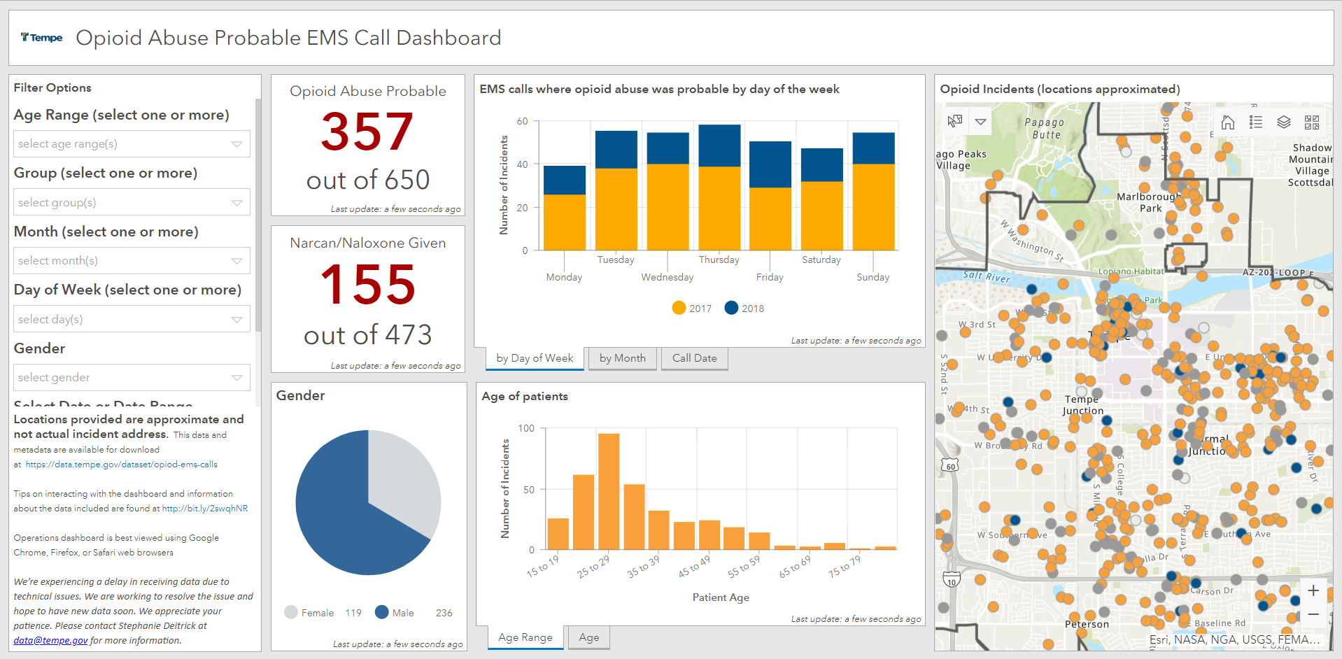
Case Study: Tempe, Arizona

“Getting support to share this data from city leaders and our Fire Medical Rescue Department felt easy because they were already bringing together stakeholders to find ways to fight this epidemic and raise awareness.”
Dr. Stephanie Dietrick, Enterprise GIS Manager, City of Tempe
Tempe, Ariz. is ahead of the curve with innovative approaches to combat the opioid epidemic. Before their live data dashboard that shows all opioid-related emergency response calls, their Fire Department was already convening local community stakeholders in order to source new ideas for the problems they saw regularly through emergency responses.
Because Tempe has become so comfortable using data, they have been able to customize their maps to the city’s unique demographic profile. Now, one can navigate through the data to see whether emergency responders were called to help an Arizona State University student or a homeless person—understanding when these two different patient profiles appear more often helps them target better responses.
Through the Opioid Mapping Initiative, Tempe has been able to provide advice to other local governments and replicate alternative strategies. For example, the Tempe City Council recently published a story map with the data in order educate the community about the crisis and provide links to helpful resources like treatment centers and naloxone distribution locations.
The city has also taken advantage of their proximity to ASU in order to track experimental datasets. One such example, which monitors wastewater for opioids, may provide new insights into opioid usage trends.
Case study: Northeastern University
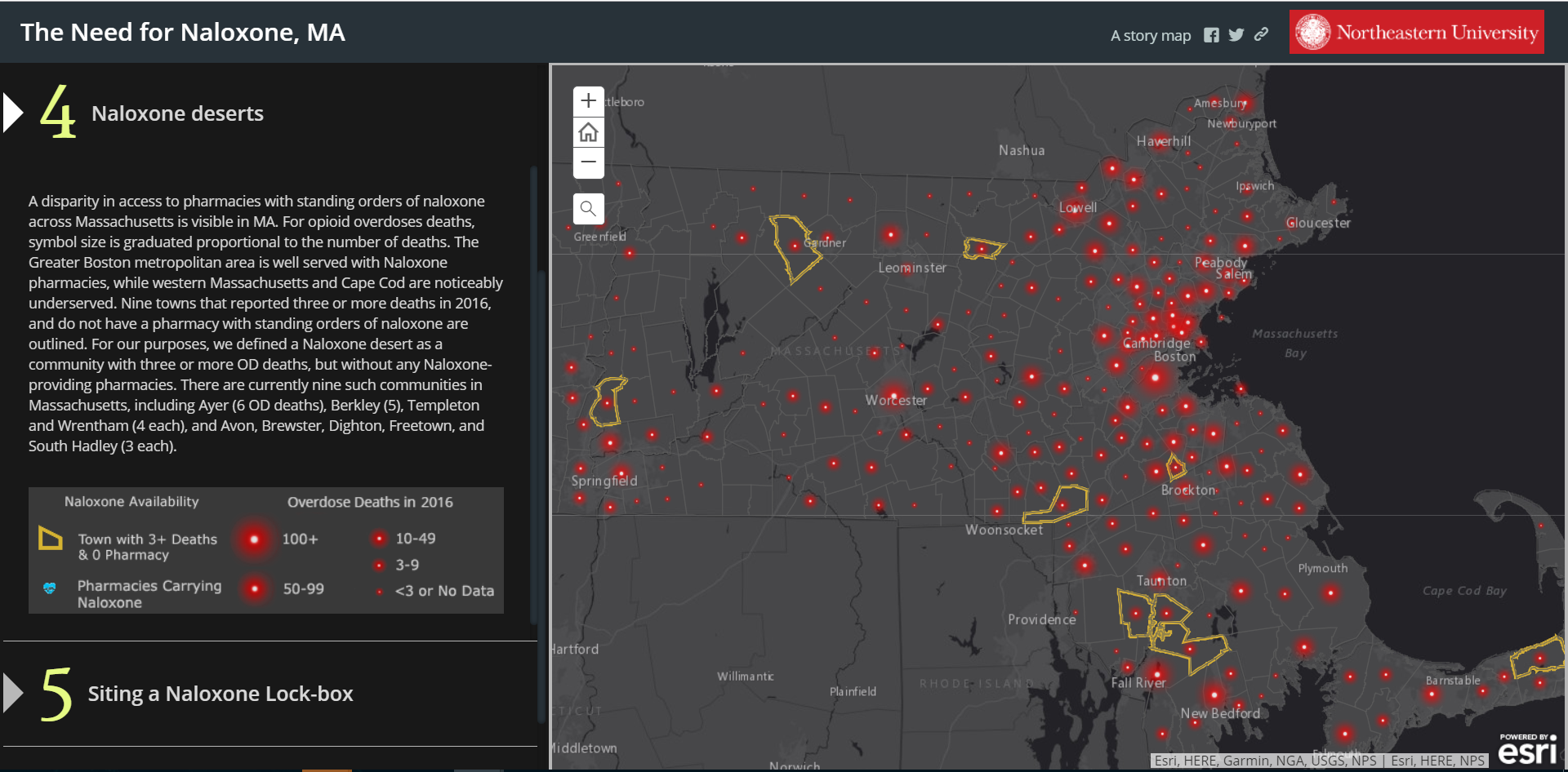
“Our first goal is to prioritize prevention, so we inventoried pharmacies with naloxone. In mapping these, we noticed a correlation between sites of overdose deaths and a lack of access to pharmacies—some towns were even classified as ‘naloxone deserts’.”
Dr. Cordula Robinson, Professor, Northeastern University
The Opioid Mapping Initiative comprises more than just local governments. A team of Northeastern University researchers and the school’s Global Resilience Institute are proactively addressing the opioid epidemic in Massachusetts.
The team started by compiling maps that examined death rates in Massachusetts. They were able to analyze year-over-year trends in opioid deaths and look more closely at opioid deaths per town. The team then created a story map to present this information publicly and highlight areas for better responses.
One of the clearest areas for change was found in nine “naloxone deserts,” or towns where three or more deaths have occurred, but there are no naloxone-providing pharmacies. Armed with clear information, Northeastern University and the Global Resilience Institute have started to hold larger community meetings, using data as a critical public education tool.
The team is now also bringing their focus closer to home, conducting in-depth analyses of fentanyl overdoses in Boston neighborhoods, working with community advisory boards, and partnering with local organizations like We Are Allies to distribute naloxone.
Since they began this work in 2017, several other universities have begun conducting similar studies. Higher education institutions often have the capacity to collect and analyze large amounts of data that local governments lack, making them a welcome addition to any area looking to implement data into their strategies to combat the opioid epidemic.
Getting Started With Local Opioid Work
Are you a member of a local government who is part of a local opioid task force, hoping to incorporate mapping or data collection into your opioid abuse prevention and response efforts, or utilize national maps to create awareness in your community? Here are some strategies that you may consider to begin:
- Learn from the Opioid Mapping Initiative. Much of the work from participants has been cataloged at the initiative website. Take time to review the various applications, datasets, and storytelling approaches used by other local governments to drive community impact.
- Start collecting and analyzing data for your community. It’s important to remember that you do not need to reinvent the wheel by creating applications, datasets, and maps from scratch. Many of the participating governments in the Opioid Mapping Initiative have open-source applications and templates that you can customize for your location’s available data. A listing of typical data sources and the stakeholders who may maintain them are found here.
- Embed the National Prescription Drop-off map and the National Naloxone Access map into your government’s website. This may be the easiest step for those who do not yet have the capacity to build out an opioid task force or awareness initiative. These maps provide community members with quick, localized data they can use to help those in their lives who may be struggling with addiction.
- Read in-depth profiles of locations that have used data in creative ways. Tempe, Ariz. maps EMS data to determine where and when opioid overdoses are most common, and then distributes resources accordingly. Three local governments weight the value of different mapping techniques, with raw data in Connecticut, aggregated data in Oakland County, Mich., and heat maps in Colorado’s Tri-County area. Oakland County, Mich. also uses data to track prescription drug dosages by zip code, and publishes results on their Opioid Open Data Initiative page. Colorado’s Northern Larimer County realized that addiction and mental health are intertwined, so now they map areas where people struggle the most with mental health through a community wellness survey. New participants in the Opioid Mapping Initiative have copied the dashboards of other participants, as happened with Tempe, Ariz. and Northern Kentucky.
- Reach out for ideas. Contact Jeremiah Lindemann at celebratelostlovedones@gmail.com if you have questions about how to get started, different approaches, or would like a connection to one of the local governments mentioned in the case studies.
Additional Resources
Still looking for more information? You can find out about local and national efforts to use data and mapping to combat the opioid epidemic in these articles:
- Opioid Data Analysis and Resources, The Center for Disease Control
- Why Data about the Opioid Epidemic is so Unreliable, Slate
- Tempe, ASU to work together on wastewater monitoring to improve public health, Arizona State University
- Medicare Part D Opioid Prescribing Mapping Tool, Center for Medicare and Medicaid Services
- Appalachian Overdose Mapping Tool, National Opinion Research Center at the University of Chicago
- Regional Hospital Utilization and Medication-Related Data, Quality Innovation Network
More About the Authors

Emma Coleman
Jeremiah Lindemann
Issues
Programs/Projects/Initiatives
Topics
Related