Crossing the Line Report
Full report on inequality between school districts
Resource
School district boundaries define more than just the area where a certain group of children attends a given set of schools. They also determine the taxing jurisdiction that supports those schools with local property taxes. Big differences in property value can lead to large funding gaps, even between neighboring districts.
These disparities in property values are the legacy of discriminatory housing policies explicitly intended to segregate neighborhoods by race and class. The school district lines drawn onto this divided landscape then replicate segregation and inequity in schools. But our current district borders need not be permanent. They can be redrawn to produce better outcomes for students and their schools.
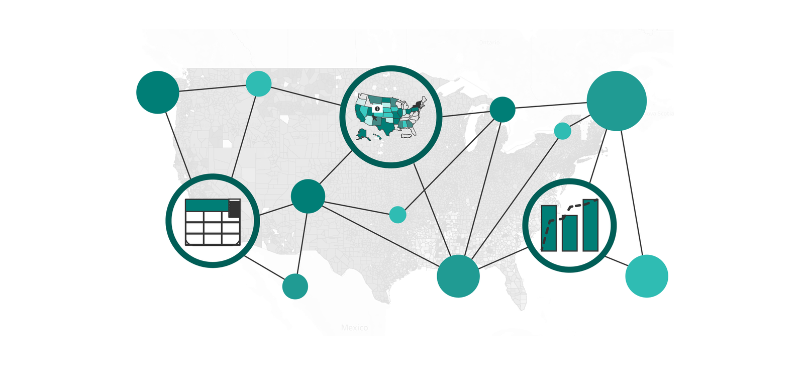
In a new research report, New America’s Education Funding Equity Initiative analyzes nearly 25,000 pairs of adjacent school districts to measure how district borders create deep economic and racial divisions, producing radically different educational resources and experiences for students in different districts—even districts that are right next door to each other. It also features stories about these disparities told by local educators and families. An accompanying multimedia story shows what these divides mean for American school districts and communities, and an interactive national map and data tool allows users to explore American school districts and the borders that surround them.
This report was produced as part of the Education Funding Equity Initiative at New America, which is supported by the Bill & Melinda Gates Foundation. New America thanks the foundation for its support. The findings and conclusions contained within are those of the authors and do not necessarily reflect positions or policies of the foundation. The authors would like to thank Sabiha Zainulbhai for her expertise and thought partnership; Sara Hodges for her technical advice and support; Sabrina Detlef for her copyediting support; and Katherine Portnoy, Natalya Brill, and Amanda Dean for their communications and data visualization support. Special thanks to local story contributors James Paul, Denita Dorsey, Julian Morris, Lakashia Wallace, Robbie Esteban, Amy Marlow, Gigi Calaway, LaDonna Fogle, Bethany Martinez, and Diana Cournoyer, all of whom shared generously their time, insight, and personal experience. Additional thanks to Justin Madron of the Center for Geospatial Solutions at the Lincoln Institute of Land Policy, Casie Wise of the National Indian Education Association, Patrick Gibson and Ashley Robles of the School + State Finance Project, Emily Hatch and Jen DeNeal of The Education Trust-Midwest, and all those who shared their expertise and local knowledge with the authors during the researching of this report.
Full report on inequality between school districts
Resource
Sharing findings and local stories of segregation and inequality
Resource
Data explorer showing districts, boundaries, and key statistics
Data Visualization
School funding debates in the United States tend to center on how much money school districts should receive, and through what policies and formulas. But they almost never focus on the district map, even though district borders do a great deal to determine the funding of each school system. School district boundaries don’t just define the area where a certain group of children attends a given set of schools. They also determine the taxing jurisdiction that supports those schools with local property taxes. Big differences in property value can lead to large funding gaps, even between neighboring districts.
These disparities in property values are not happenstance. They are often the result of housing policies that were explicitly intended to segregate neighborhoods by race and economic class. The school district lines drawn atop this divided landscape then replicate segregation and inequity in schools. But district borders are a product of state policy. They can be redrawn, and border policy can be changed, to produce better outcomes for students and their schools.
To illuminate these issues, New America’s Education Funding Equity Initiative (EFEI) produced a research report looking at borders between neighboring school districts, the degree of economic and racial segregation they create, and the funding implications of these divisions. The report features stories about these disparities told by local educators and families. To accompany this report, EFEI has created a multimedia story depicting what these divides mean for American school districts and communities, and an interactive national map and data tool that allows users to explore the demographic, economic, and financial data for all American school districts, and to view the borders that surround them.
American communities have been shaped by decades of segregative housing policies. In the twentieth century, the government housing agencies that engaged in redlining (the practice of rating American neighborhoods by the level of risk they carried for mortgage lenders) openly considered communities of color to be poor investments, making homebuying difficult or impossible for minoritized families. Racially restrictive covenants, which were contracts that prevented homeowners from selling to Black or other specified categories of buyers, were used and enforced. Segregated housing developments were constructed with public financing. Town governments pursued “urban renewal” agendas that cleared neighborhoods of residents of color. Even today, many localities deploy exclusionary zoning policies—local building rules that make housing more expensive and are often calculated to maintain segregation.
When school district boundaries are drawn narrowly around communities that are principally poor or affluent, or predominantly white or non-white, the divides in property wealth translate into unequal district property tax capacity. Along the school district borders that mark the steepest racial and economic divides, students are getting shortchanged. In too many cases, the districts serving more students in poverty or more students of color are more cash-strapped than their neighbors. In all of the districts defined by these borders, children are segregated from their peers, deprived of the opportunity to learn alongside students of different backgrounds.
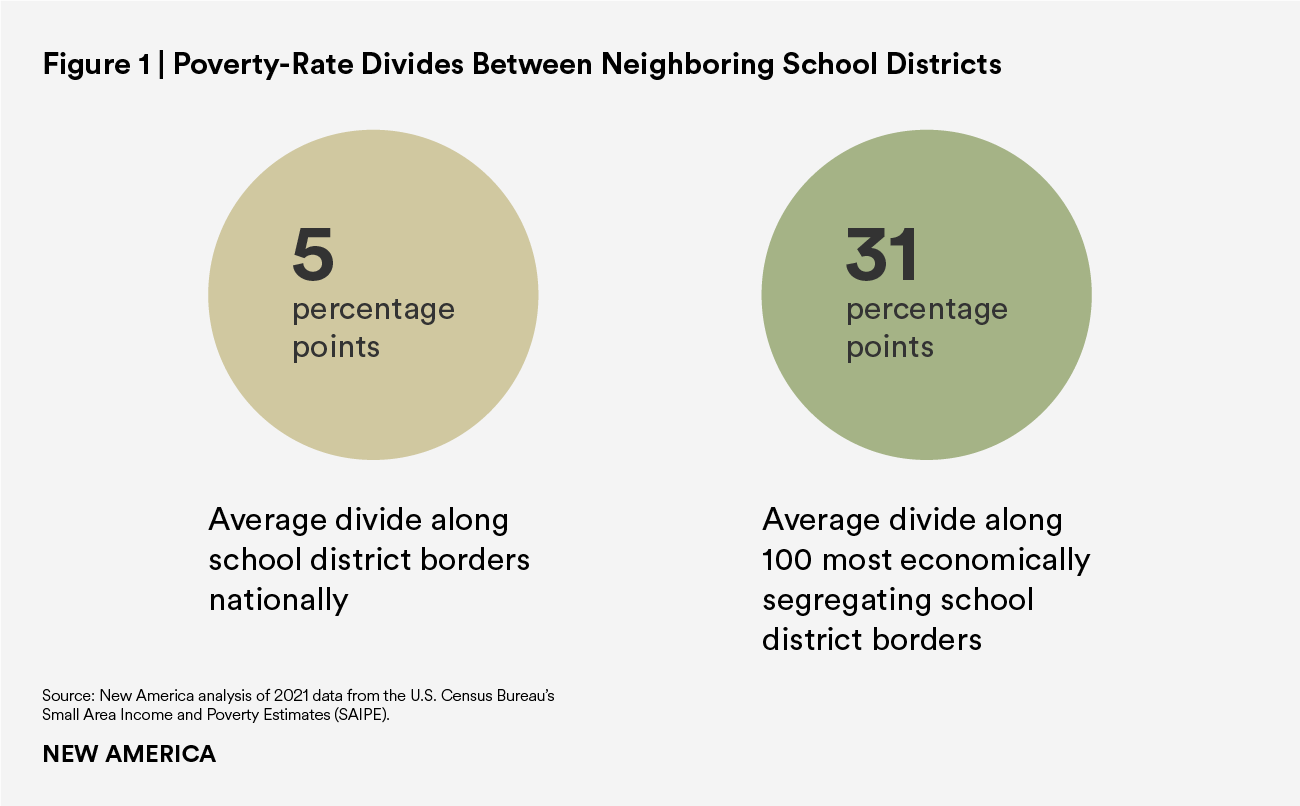
This report looks at neighboring school systems and the borders that separate them. We examined 24,658 pairs of adjacent districts and measured the divides between them in two ways. First, to measure economic segregation between neighboring districts, we compared their poverty rates among school-aged children, and identified the 100 borders that mark the greatest differences in poverty rates. Second, we looked at the differences in racial composition between adjacent districts by comparing their percentages of enrolled students of color, and identified the 100 borders that create the greatest differences by this measure.
The average border between two neighboring school districts in the United States marks a poverty-rate difference of 5.2 percentage points. However, along the 100 most economically segregating borders, the average divide is a staggering 31 percentage points.
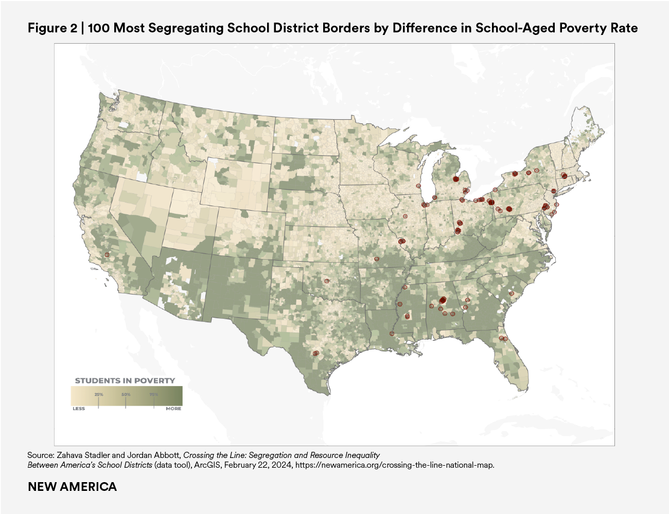
The map below shows the location of these 100 most segregating borders by poverty-rate difference.
School district borders that mark a wide poverty-rate divide often also separate districts with very different property values. Because so much school funding is drawn from local property taxes, these differences can mean big disparities in school budgets. Along the 100 most segregating school district boundaries by poverty rate, the average difference in local revenue between lower- and higher-poverty districts is $4,119.46 per pupil. This ground-level inequality places a huge burden on state budgets to close the gap.
On average, they are barely managing to do so. When state and local funding are added together, the higher-poverty districts have about 4 percent more per pupil. However, this figure represents the average effect of wildly different state funding policies; in Ohio, such districts receive 14 percent more, while in Pennsylvania, they get 11 percent less. The 100 most segregating borders in the country by poverty-rate difference are located across 20 states. In nine of those 20, the higher-poverty districts are on the losing end of a funding divide.
Nationwide, 53 percent of public-school district enrollees are students of color. However, these students are highly concentrated in a relatively small number of districts. Forty-six percent of students of color are enrolled in just 1 percent of all school districts. Meanwhile, 26 percent of school systems serve student populations that are more than 90 percent white.
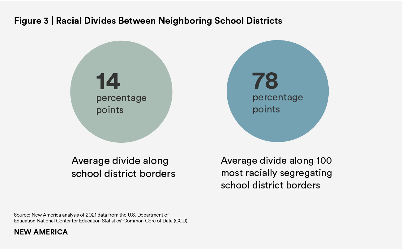
The average district border separates districts that are 14 percentage points apart in their proportions of students of color. But along the 100 most racially segregating school district borders in the country, the separation is, on average, between a district that is 92.4 percent white and a district that is 86 percent students of color.
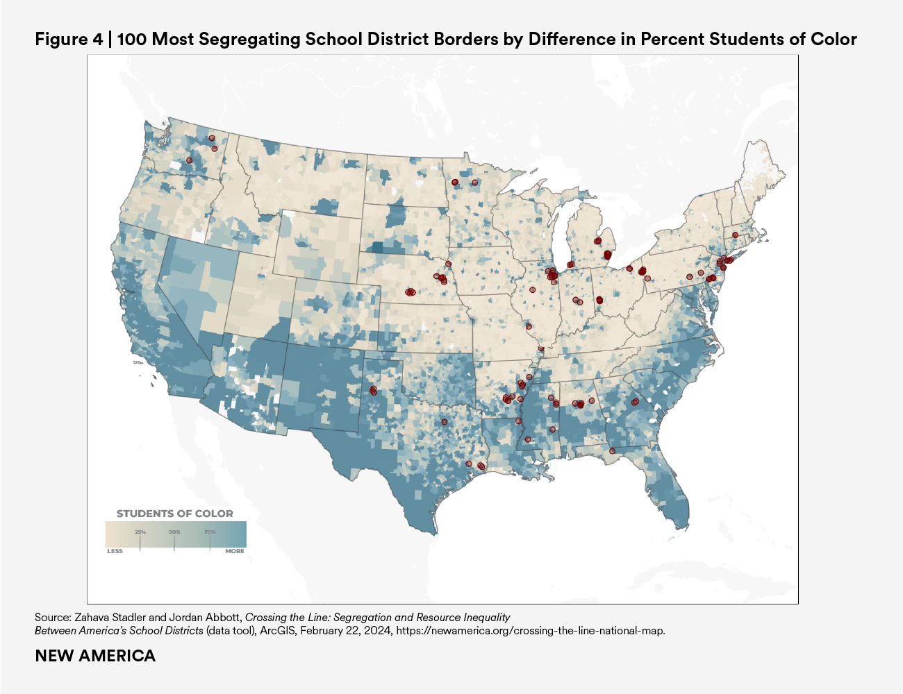
The map below shows the location of these 100 most racially segregating borders.
Like districts serving more students in poverty, those serving more students of color are likely to have lower property values. Along these most-segregating borders, the districts serving more students of color collect $2,222.70 less in local revenue per pupil than their predominantly white neighbor districts. It is expensive for states to compensate for these inequalities. On average across all 100 borders, state aid is indeed making up the difference, and more: After state aid is added to local funding, these districts receive $1,087.89 more per pupil.
Not all states have met this challenge, however. Nebraska is one troubling example: It is home to 11 of these most segregating borders. Along these borders, the districts serving more students of color raise almost $8,300 less per pupil on average from local sources than their neighbor-districts, and the state funding system provides less than a quarter of what is needed to make up the deficit. And even in states where the funding gap across these borders does not disadvantage students of color, it is nonsensical for states to allow districts to start out with huge local revenue deficits and then be forced to find huge amounts of state revenue to compensate. Instead, states should construct a funding system that is fair from the start.
To allow students to learn in diverse school systems whose funding levels match student need, not local property values, states must address interdistrict divides at the source. One option is to purposefully draw school district boundaries to include heterogeneous student communities and more economically mixed areas. Another is to eliminate or reduce the role of local property taxes in the school finance system, such as by levying all education taxes at the state level, or by pooling local property tax revenues across multiple districts. Any remaining local property taxes in the school finance system should be appropriately governed to limit funding inequality.
The nature and severity of interdistrict disparities vary from region to region and community to community. But they all exist as facets of a single problem: the building of school districts, and school district finances, atop a divided and unequal foundation. The redlined neighborhoods of the past have produced redlined schools—and school budgets—in the present. States need not continue to make policy choices that reinforce these deep interdistrict divides. It’s time to draw the line.
The interactive map and data explorer offer a national view of the school district landscape. With this tool, users—particularly state and local advocates, policymakers, and journalists—can better understand the nature of segregation and inequity in and around America’s school districts. How does the poverty rate or racial composition of your school district compare with those around it? Do school district boundaries create especially deep divisions in your area? Would widening or changing an existing border give students in your community access to more funding? Would it allow for more diverse schools?
The map displays America’s public-school districts in two views. In one, districts are shaded by the percentage of students of color enrolled, while in the other, they are shaded by their local school-aged poverty rates. Each view highlights the 100 most segregating school district borders in the country by the selected measure. Clicking on a particular school district or border reveals key data points about student demographics, interdistrict segregation, and school funding.
As users zoom or navigate through the map, the ranked list on the side of the screen automatically identifies the most segregating borders currently visible. The tool also offers options to filter districts by state or by student demographics, or to select a specific community or region and view key statistics about the school districts and district borders in that area.
To create the school district border dataset used in this analysis and mapping tool, we obtained data from the following sources:
See the Annual Survey of School System Finances: Public Elementary-Secondary Education Finance Data Technical Documentation (2021) for state-specific notes in relation to education finance data.
We conducted a spatial analysis of all unified, secondary, and elementary districts in the United States. This process identified all pairs of school district neighbors that share a border. Only districts that share land borders and borders along linear bodies of water were considered to be neighbors. Districts whose shared borders exist entirely along wider bodies of water, such as lakes, were not considered to be neighbors. Pairs were excluded from this neighbor list if their shared boundary was less than 500 feet long or if the two districts were located in different states.
Each neighbor pair was identified by their shared school district border and joined to the data from the SAIPE, CCD, and ACS described above. To determine the degree of economic segregation between the districts separated by each border, we calculated the difference in their school-age poverty rates. To determine the degree of racial segregation between the districts separated by each border, we aggregated the enrollment percentages for all racial groups other than non-Hispanic white into a new category representing each district’s percentage of students of color enrolled and took the difference in these enrollment percentages. After making the exclusions outlined below, we ranked each border in our dataset by the degree of both racial and economic segregation it enforces. Similarly, we computed the dollar amount difference in local, state, and the combined value of local and state revenues between districts; this information was not used for ranking but is provided for context.
We employed several exclusion criteria in compiling our borders dataset. Our analysis includes only districts that meet our standard requirements for a geography-based analysis. Therefore, any district that does not have a defined geographic area and is not included in the Composite School District Boundaries File was excluded. We also excluded districts from the U.S. territories. Further, because we only identify within-state school district neighbors, Hawaii and the District of Columbia were excluded from the neighbor-pair analysis, as they each have only one school district.
There are three types of school districts: unified, elementary, and secondary. Our analysis was confined to certain categories of district pairs in order to avoid comparing resources across districts of different types. These pairings include unified to unified, unified to secondary, secondary to secondary, and elementary to elementary.
We additionally excluded school districts where the student population is at least 75 percent Native, or where more than 75 percent of the area overlaps with American Indian reservation land. For the purposes of this report, American Indian reservations are not considered to include off-reservation trust lands or Tribal statistical areas, as neither are considered to be sovereign administrative units. Trust lands are administered by the federal government, and often have relatively small Native populations. State and federal designated Tribal statistical areas, including Oklahoma Tribal statistical areas and Alaska Native village statistical areas, encompass areas with significant Native populations, but whose Tribal majority do not have a reservation or trust lands. School districts where 75 percent of the area overlaps with any other kind of reservation land are excluded from this analysis. For more information on the reason for this exclusion, please see the section “Divided Districts and Native Students” above.
Since the school-age poverty rates are estimates, they are not always reliable for school districts with very small school-age populations. Therefore, we removed districts where the student population is less than 200 and did not analyze or rank the borders they share with neighboring districts.
Finally, we removed districts with a student density of less than or equal to 0.5 students per square mile, as these districts often face unique geographic considerations due to the extremely low student density. The borders of these districts with their neighbors were not analyzed or ranked.
After applying the above exclusions, we analyzed, ranked, and mapped the resulting database of 24,658 pairs of district neighbors.
Throughout this report, we supplement our borders dataset with additional state-level data in order to provide context to our findings.
Median household income is also used to measure economic disparity between districts in specific instances. We calculate these disparities between neighboring districts as the ratio of the median household income in the higher-income district to that in the lower-income district. While we do not report these disparities in the national data explorer, we note the differences for specific geographic areas in the full report.
The full report also includes brief discussion of analyses of assessed property valuations and per-pupil revenues in select states: Arkansas, Connecticut, Mississippi, and Ohio.
Connecticut aggregates assessed property values at the town level in its Equalized Net Grand List dataset. Though the default public school district in Connecticut also serves town units, there are 17 regional districts that serve multiple municipalities. Using a dataset provided by the School + State Finance Project, we were able to link the towns served by each district with both the state and national LEA codes. This connection allowed us to link our borders dataset with assessed property values.
To compute assessed property values per pupil in Connecticut, we first calculate the share of each regional district’s enrollment from each of its constituent towns. As previously mentioned, only regional districts draw from more than one town. We then multiply the total assessed value for each town by its enrollment share in a regional district. We obtain the total assessed value per pupil by summing across each of a district’s constituent towns and dividing by its enrollment.
We also calculate assessed valuations per pupil in Arkansas, Mississippi, and Ohio, each of which aggregate the total value of assessed property at the school district level. We divide this value by a district’s enrollment.
To determine if a statistical relationship is present between differences in assessed property value per pupil and the degree of segregation between districts, we separately regress our measures of racial and economic segregation on assessed property value per pupil. We report a relationship as statistically significant if it is valid at the ∝=0.01 level.

Project Director, Education Funding Equity Initiative

Senior Data Scientist, Education Funding Equity initiative