
J.A. Hersh
Civic Tech Content Strategist and Editor
A review of state paid leave websites reveals how programs can best make information clear and findable.

One of the most important jobs of a paid leave website is to make critical information easy to find. This means highlighting this information in navigation menus.
Paid leave sites should be easy to scan so readers can readily find information they are looking for. Tables of contents and informative headings can help.
Paid leave is full of complex, unintuitive terms. Experts should pay careful attention to language, explain terms clearly, and test language with real users.
State programs can replicate these leading practices when designing and updating paid leave web content.
Fourteen states plus the District of Columbia (DC) have passed paid family and medical leave laws that provide working people with paid time away from their jobs to bond with a new child, recover from a serious health condition, or care for a sick family member.
In each state, a public agency is charged with implementing the law or overseeing its implementation and providing public information to stakeholders, including employers, employees, and medical providers. That means these programs’ public websites need to provide information in a way that is accessible and easy to navigate.
Paid leave websites are the front door for users to learn about and experience state paid leave programs. If paid leave agencies can ensure that public websites are easier for users to navigate and understand, they could reduce potential sources of friction at multiple stages of the application and claims process. Additionally, paid leave agencies could expend fewer resources on answering standard claimant questions and more on helping those with complex situations. But state paid leave agencies may be under-resourced and may not have the time or expertise to carefully design a website with plain language and user testing.
This publication focuses on the design and layout of paid leave websites to help programs build more intuitive and straightforward systems. Our team of paid leave experts and content strategists studied the 14 websites of the active paid leave programs across 11 states and DC to assemble a list of characteristics that help make these websites easier to navigate, read, and understand. (New York and Rhode Island each have two websites, one for paid leave and one for temporary disability.) We then compiled examples of good user-centered practices, plain language, and clear navigation to help state agencies improve their paid leave websites.
Top-level navigation should allow a person coming to the program’s website to quickly move to the portion of the site most relevant to them. Almost all operating paid leave websites have top-level navigation based on roles in the paid leave program—such as claimants (also called workers or employees), employers, and health care providers—giving users an easy place to start.
Eligibility and benefits information are likely among the most important details to many website visitors. The Oregon and New York paid leave sites have those items prominently in their “Employees” menu. DC’s site has them in its “Resources” menu. On all three of these sites, users can reach eligibility and benefits information directly from the homepage and without searching through text on a page.
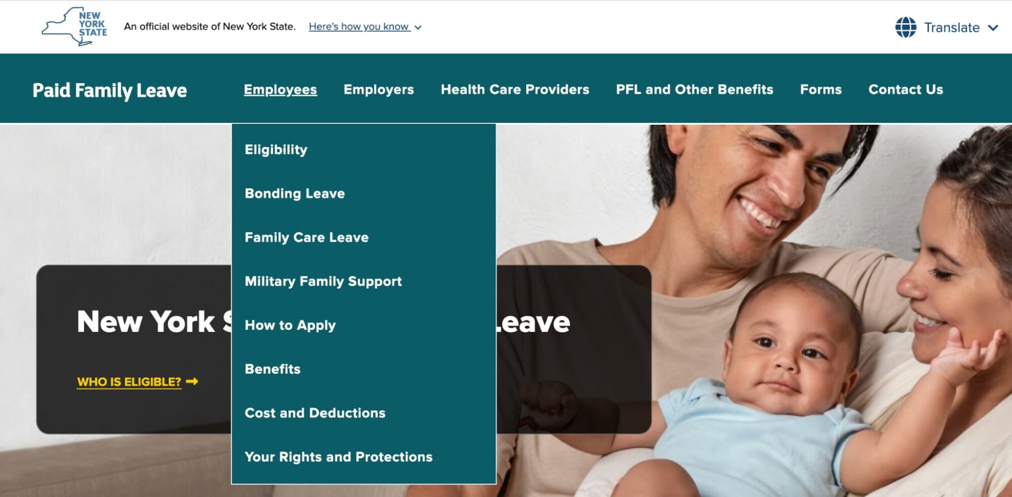
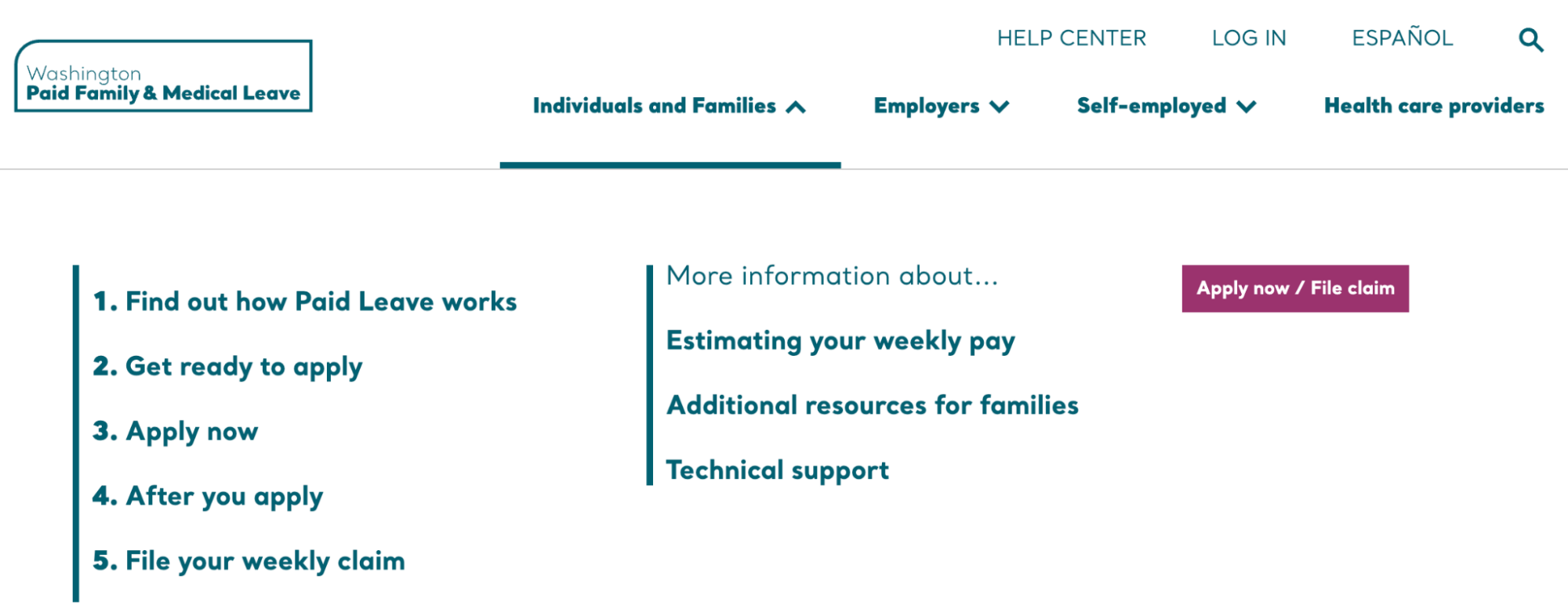
California and Washington also have this information in their navigation menus, where they’re included among numbered, step-by-step menu items on how to apply and what happens after you apply. Washington’s menu shows how its designers haven’t confined themselves to a numbered structure, instead making it flexible to fit user needs.
Most users of websites scan rather than read information. For a paid leave program, it’s inevitable to end up with some long pages, but that doesn’t mean readers should need to read several screens of information to find what they need. Using tables of contents allows readers to scan pages quickly and find information easily.
Minnesota and New York place tables of contents on each page so readers can see at a glance what information is on that page. These tables of contents are sticky, so they remain onscreen as readers scroll—so wherever they are, they can navigate easily.
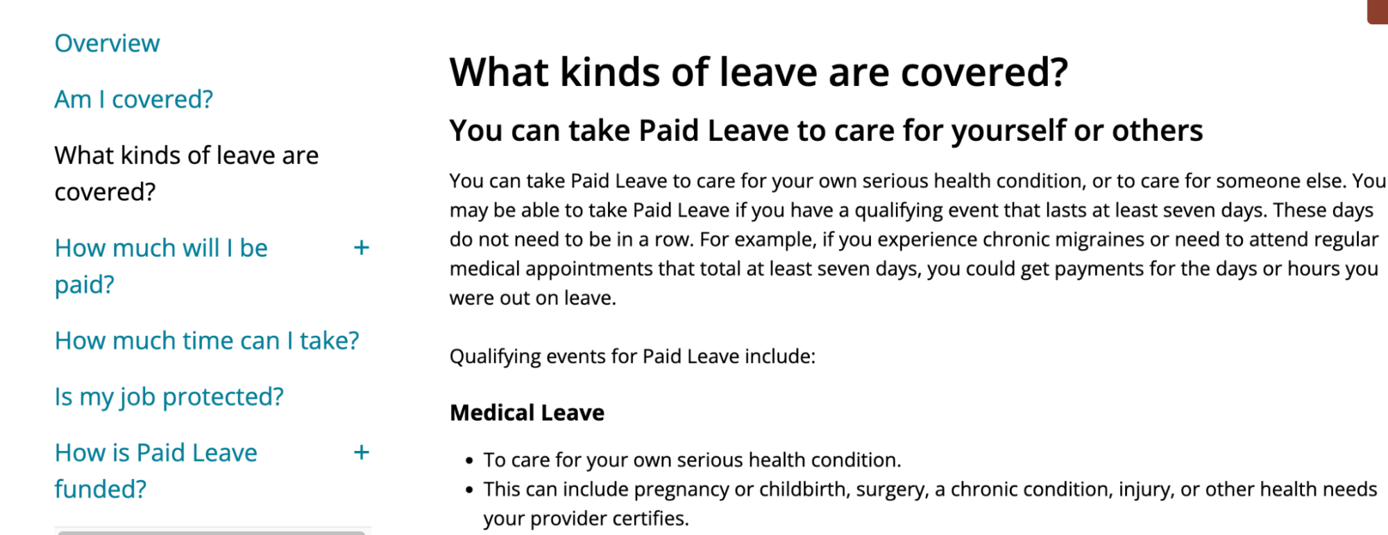
Washington state uses large, prominent headers that are easy to see while scrolling and that clearly label the sections. The site also provides concrete information in its headers, such as “You must have worked 820 hours in your qualifying period.”
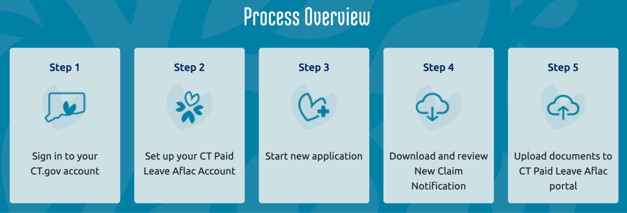
On its “How to Apply” page, Connecticut has buttons with numbered steps that outline the application process. This functions not only as a table of contents but also as helpful information in itself: Users can both see the entire process at a glance, in order, and easily skip to the section of the page with full information on whichever step they’re interested in.
As noted in the previous section, California and Washington also use numbered steps in their navigation menus. Additionally, Washington’s “Apply Now” page provides numbered headers with the application steps.
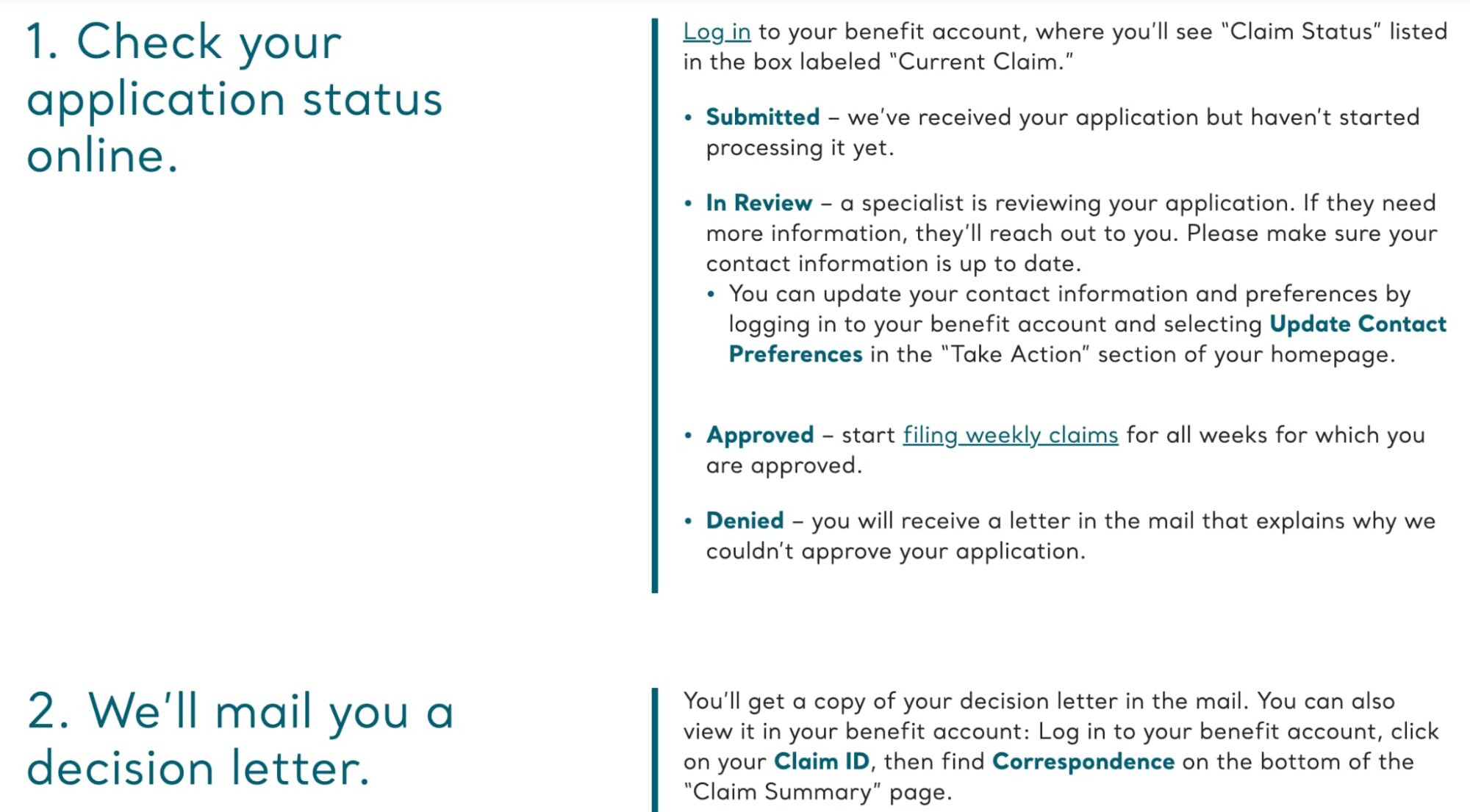
Washington also combines numbered and bulleted lists. On its “After You Apply” page, there are numbered headers with steps on the left and bulleted lists on the right so that readers can, for example, easily find their current claim status and read what it means.
Paid leave is full of terms that are second nature to those immersed in it but not immediately obvious to users. Paid leave programs should strive to explain complex concepts on their websites in ways that are easy for users to understand. “Base year” is a good example of a complicated term, since it affects eligibility and benefits pay. The base year is the time period states use to determine whether a person met the eligibility requirements for hours worked or amount earned. In this section, we’ll show some examples of definitions of base year as well as alternative ways of explaining this term.
California’s paid leave website provides a concise two-step process to help users understand how their base year (or “base period”) is determined. Users only need to know the date their claim starts, and then the site lists the exact base period for each month of the year:
January, February, or March:
The base period is the 12 months ending last September 30.
Example: A claim beginning February 14, 2026, uses a base period of October 1, 2024, through September 30, 2025.
Delaware uses alternative language, providing a simple PDF resource for employers to think about whether their employees may be eligible:
To be eligible for paid leave benefits, an employee also needs to have worked at least 1,250 hours for your company—based on your last 4 quarterly reports submitted to the state. That’s about the same as averaging 25 hours a week for a full year (not counting vacation or sick time).
It can also be complicated to explain how benefits are calculated. Many states have an interactive benefits calculator, and some also include brief text explanations. For example, Minnesota’s explanation of paid leave benefits informs the user that
paid leave pays part of your normal pay. Most people will receive between 55% and 90% of their regular wages while on leave, with a maximum amount set at the state’s average wage. Right now, this is $1,423 per week.
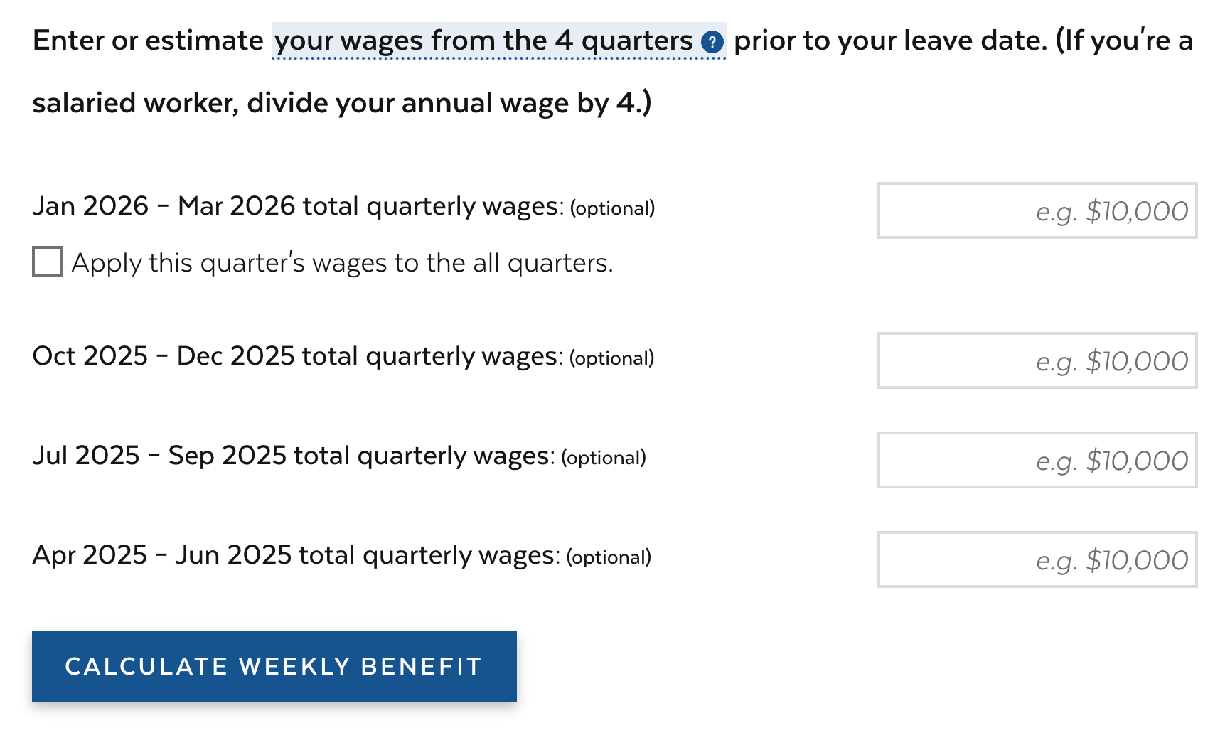
Massachusetts’s benefit calculator, shown below, has a simple interface and clear instructions:
Enter or estimate your wages from the 4 quarters prior to your leave date. (If you’re a salaried worker, divide your annual wage by 4.)
The paid leave process has many phases for users: learning, applying, managing the claim, receiving a decision, receiving payment, and extending or ending leave. It also involves a lot of people—primarily claimants, employers, and health care providers, but also more specific user types, such as self-employed workers and small business owners. Paid leave programs should provide all potential users with clear information for each step in their paid leave journey.
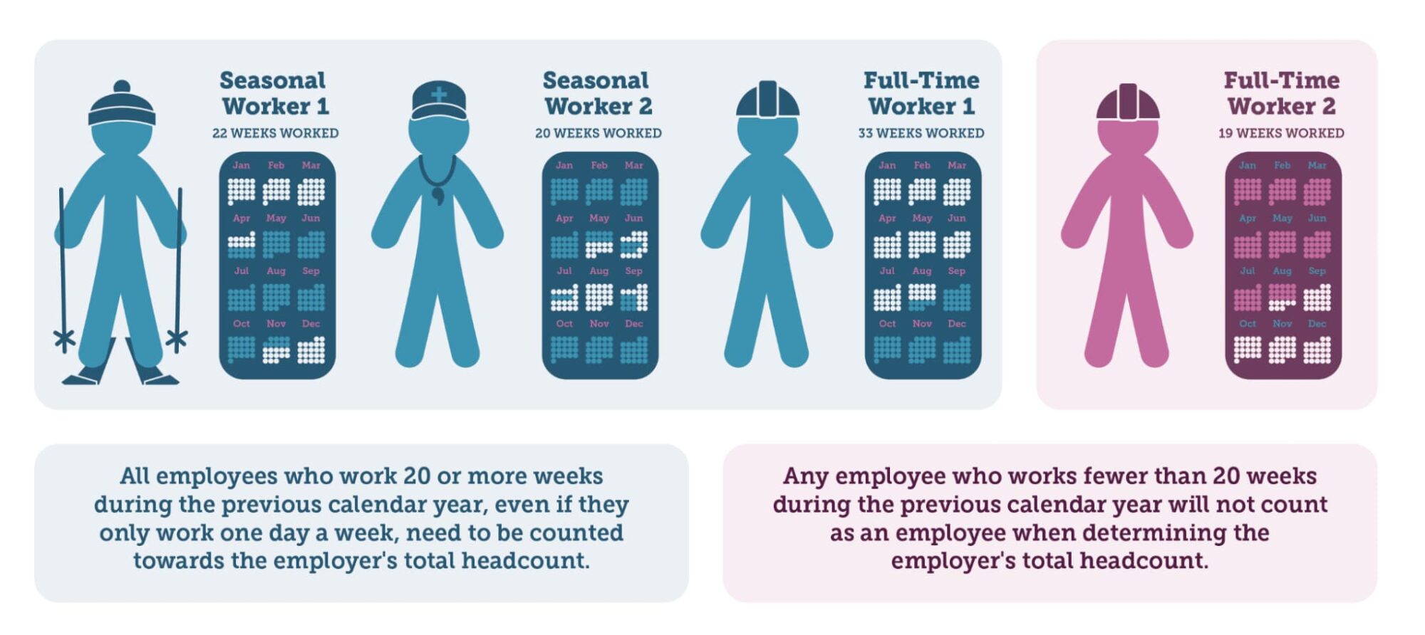
For example, Massachusetts provides extensive information for health care providers, which is rare among paid leave sites. It includes a toolkit, FAQs, and step-by-step instructions to help health care providers fill out a paid leave certification form. Colorado has a Small Business Corner that explains specific requirements for businesses with fewer than 10 employees and instructs businesses on how to count employees.
It is essential for paid leave sites to be accessible to all users, including those with disabilities and limited English proficiency. Inclusive design and accessibility help all users:
Programs should also user-test their websites to make sure real users understand the content and can navigate the site easily.
See these resources on accessibility:
See these resources on user testing:
A worker’s experience with an agency website may affect their decision to pursue benefits they’re entitled to receive, just as an employer’s or medical provider’s experience with the site may affect their ability to support a worker’s claim—all of which makes a tangible difference in the lives of workers and their families. Agencies should review their paid leave websites for navigation, content design, language, and accessibility. The New Practice Lab will continue to apply these user-centered best practices in our work—helping agency staff administer their programs successfully and, ultimately, helping them deliver paid leave that meets the needs of workers, families, and businesses.
If you’re interested in collaborating with the New Practice Lab to better center people in your policy design and delivery, please contact us at [email protected].
Thanks to Diana Boesch, Suzanne Chapman, Nikki Lee, Vicki Shabo, Lindsey Wagner, and Jessica Weeden for their thoughtful and detailed reviews of this publication.
Civic Tech Content Strategist and Editor