Table of Contents
- Executive Summary
- Introduction: Past, Present, and COVID
- Methodology and Definitions
- Housing Loss and Poor Data
- Housing Loss in the United States: Our National Rankings and Maps
- Housing Loss in Forsyth County, North Carolina
- Housing Loss in Maricopa County, Arizona
- Housing Loss in Marion County, Indiana
- Policy Recommendations
- Conclusion
Housing Loss in the United States: Our National Rankings and Maps
We estimate that nearly 5 million Americans are forcibly displaced from their homes every year due to eviction, mortgage and tax foreclosure, and other mechanisms of loss. This year, as a result of the COVID-19 crisis, we anticipate that number will be magnitudes greater. As we write, more than a quarter of Americans have reported that they cannot pay their rent or mortgage. On September 1 the Centers for Disease Control (CDC) announced a nationwide ban on evictions until the end of the year. However, rent will still be due on January 1, and thus far the government has not offered rent forgiveness and only limited relief.
We also know that affordability was the major driver of housing instability, even before the COVID-19 crisis. Housing is the largest expenditure for most American households, and is becoming increasingly unaffordable. The growth of housing costs has outpaced income growth over the last sixty years, contributing, in part, to an ongoing affordable housing crisis. Between 1960 and 2016, the median monthly rent across the United States increased by 61 percent while median income among renters increased by only 5 percent. Among homeowners, the median home value increased 112 percent while the median homeowner income increased by 50 percent.1 These disparities result in greater housing cost burdens for both renters and homeowners, and put both groups more at-risk for missing rent or mortgage payments, which very often lead to home loss through eviction or mortgage foreclosure. In some instances, these two processes are interrelated, such as when a renter is evicted because their landlord is experiencing a foreclosure.2
But beyond that, we know very little about where housing loss is most acute, and who is most at risk. As mentioned in the previous section, U.S. housing loss data is poor and incomplete, leading decision-makers to underestimate housing loss across the country and leaving them in the dark as to how to remedy the issue. Likewise, this report certainly under-represents the actual scale of home loss across the country. We were not able, for example, to capture partition sales that force Black families off their land, or the abandonment of Puerto Rican homes destroyed by Hurricane Maria, nor were we able to analyze tax foreclosures, informal evictions, takings via eminent domain or other forms of housing loss.
Instead, we chose to focus on two common forms of housing loss for which data does exist, albeit imperfectly—eviction and mortgage foreclosure. Although these two modes of loss are distinct in the timescales in which they occur and the category of tenure they impact, both forms of displacement bring about deleterious effects on the communities and neighborhoods in which they take place. In some cases, mortgage foreclosures on renter-occupied properties lead directly to the eviction of tenants; in other cases, foreclosures occur independently of eviction but high rates of both forms of displacement are found to be geographically concentrated. Our focus on these two mechanisms aims to characterize housing loss holistically and to identify regions at risk of experiencing the negative downstream impacts of housing instability, which are shared regardless of the particular mode of displacement.3
How Are People Losing Their Homes?
Housing Loss Index4
In order to measure housing loss that includes both evictions and mortgage foreclosures, we first calculated each county’s housing loss rate. The housing loss rate combines the total number of evictions and the total number of mortgage foreclosures for a given geography, and then normalizes that sum by the total number of renters and the total number of homeowners with a mortgage within the given geography.
We then converted the housing loss rate into a housing loss index by comparing a given county’s housing loss rate to the national average, across all counties for which we have data. A county with a housing loss index of 1 experiences a housing loss rate equal to the national average, while an index of 3 indicates that the county experiences a housing loss rate that is three times the national average.

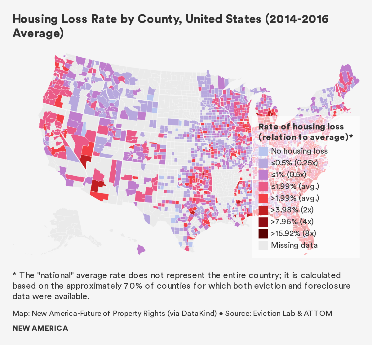
Based on these calculations, we found that the national average housing loss rate was 2 percent between 2014 and 2016.
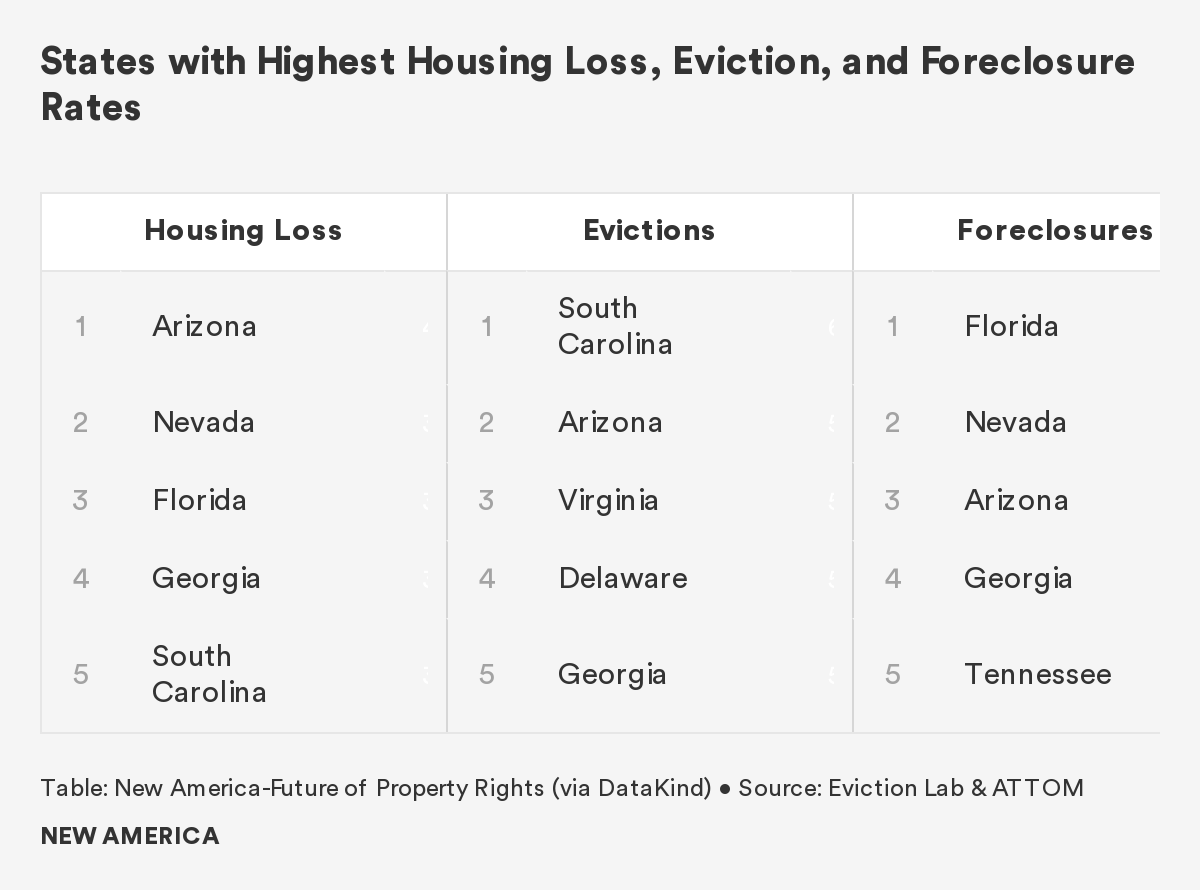
On a state-wide level, housing loss between 2014 and 2016 was most severe in Arizona, Nevada, and Florida. All three of these states saw rates of housing loss of more than 3.8 percent, almost twice the national average. As of June 2020, each of these states had unemployment rates at or above 10 percent. Given that non-payment of bills is by far the most common cause of housing loss, and given their pre-existing housing vulnerability, we expect these states to be disproportionately impacted by the pandemic-era housing crisis.
Conversely, the states reporting the highest unemployment rates as of June 2020—Massachusetts, New Jersey, and New York—have historically had below-average levels of housing loss.5
On a county and county-equivalent level, Petersburg City, just south of Richmond, Virginia, had the highest overall housing loss rate in the country. The housing loss rate in this independent city is roughly 12 percent, six times the national average. Eviction accounts for 96 percent of all housing loss in Petersburg City, affecting approximately one in eight renters, and drives the high overall housing loss rate. Foreclosure rates in Petersburg City are also slightly above the national average.
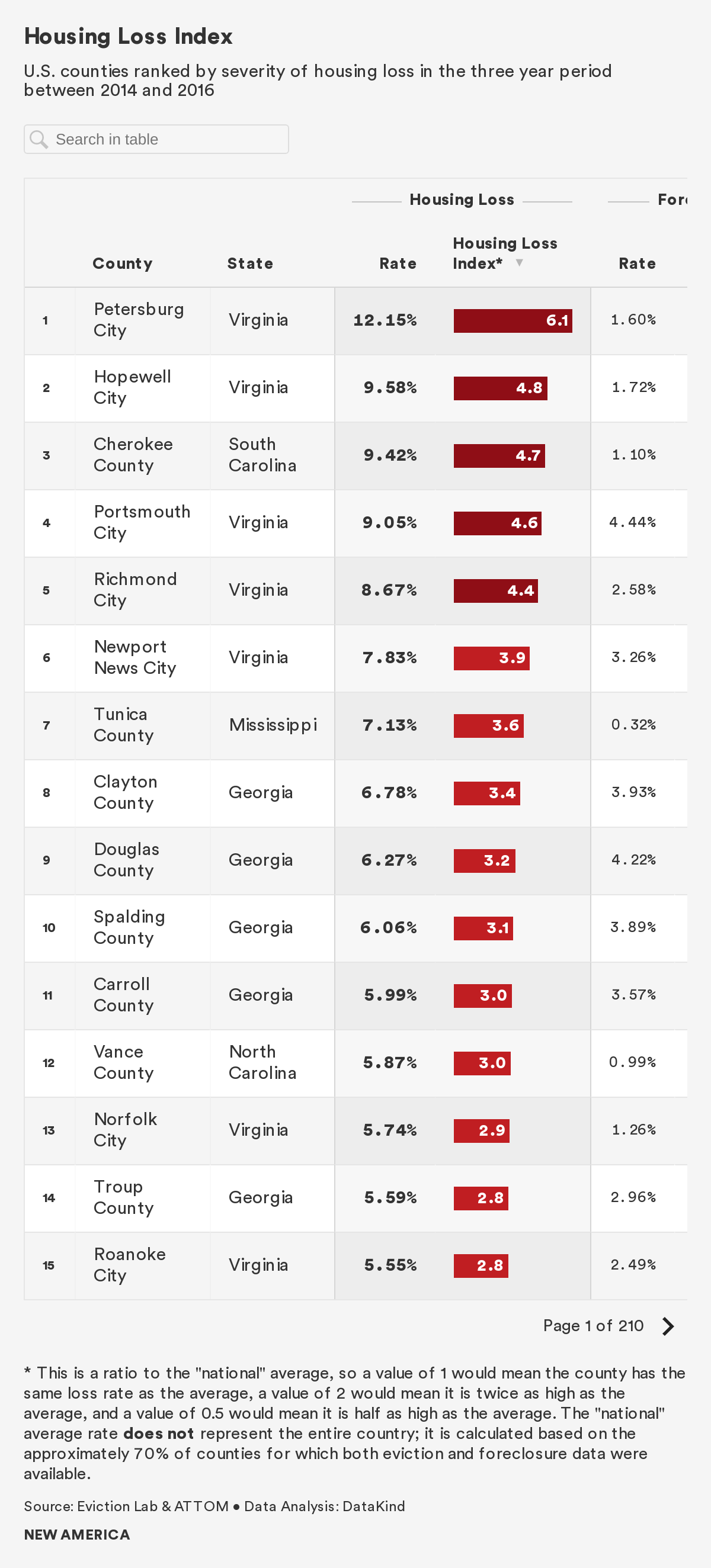
Of the counties or county-equivalents with the twenty highest housing loss rates, eight are located in Virginia, eight are located in Georgia, and the remaining four are located in Mississippi, North Carolina, Florida, and South Carolina, respectively. These 20 counties have rates of housing loss ranging from 4.4 to 12.2 percent—between two and six times the national average.
Eviction Findings: The national average eviction rate was 2.6 percent between 2014 and 2016. Based on available data, we know that approximately 900,000 renter households were evicted from their homes each year. However, data is unavailable for some counties and states, with North and South Dakota, Arkansas, and Alaska notably absent, as indicated on the map below.6
States with the highest rates of eviction are generally located in the Southeastern region of the United States, while those with the lowest rates of eviction are located in the Midwestern and Northwestern parts of the country. Though our findings suggest a geographic pattern, due to incomplete data we cannot determine whether these patterns are coincidental or due to common underlying mechanisms that relate to policy or demographics.
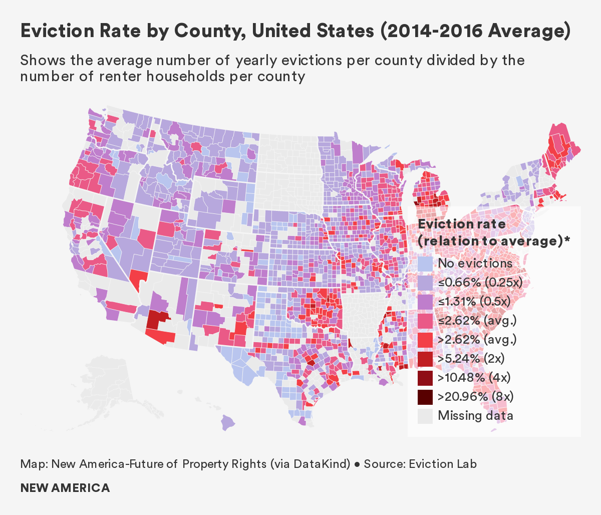
South Carolina experienced the highest eviction rate of any state between 2014 and 2016, at a rate of 6.2 percent and with an average of 26,430 evictions per year.7 Twenty of South Carolina’s 46 counties see rates of evictions greater than 5 percent, about twice the national average. Other states with high eviction rates include Arizona, Virginia, and Delaware.
By contrast, Minnesota had the lowest rate of eviction during the same period, at 0.8 percent and with an average of 4,802 evictions per year. Other states with low eviction rates include Montana, Utah, and Oregon. Given the prevalence of missing eviction data, it should be noted that our findings are limited to those states and counties for which data are available; as a result, states with large amounts of missing data such as North and South Dakota, are not represented in our analysis.
Cherokee County, a small county in northern South Carolina, had the highest eviction rate in the country: 17.9 percent, or nearly seven times the national average. Gaffney, the county seat, is known as the Peach Capital of South Carolina and also has the dubious honor of being the hometown of Frank Underwood, the fictional main character of the drama House of Cards. Evictions in Cherokee County account for 94.1 percent of all housing loss in the county, though renters comprise only a third of the population. Cherokee County had an 11 percent unemployment rate as of June 2020, portenting an even greater eviction rate in the coming months.
Perhaps most striking, six independent cities in Southern Virginia express eviction rates that rank in the top 10 nationally. Experts at the local RVA Eviction Lab point to several factors—including low court fees for filing evictions, and a lack of policies that protect renters—as driving the region’s high eviction rates.
Several counties in Georgia, Michigan, and Mississippi, respectively, also had acute eviction rates.
U.S. Counties With Highest Average Eviction Rates (2014-2016)
| Rank | County | State | Percent Renters | Eviction Rate |
|---|---|---|---|---|
| 1 | Cherokee County | South Carolina | 30% | 17.88% |
| 2 | Petersburg City | Virginia | 59% | 16.82% |
| 3 | Hopewell City | Virginia | 50% | 14.64% |
| 4 | Portsmouth City | Virginia | 46% | 13.01% |
| 5 | Richmond City | Virginia | 59% | 11.69% |
| 6 | Muskegon County | Michigan | 26% | 11.27% |
| 7 | Newport News City | Virginia | 51% | 10.99% |
| 8 | Hampton City | Virginia | 44% | 9.84% |
| 9 | Vance County | North Carolina | 40% | 9.80% |
| 10 | Houston County | Georgia | 35% | 9.71% |
| 11 | Anderson County | South Carolina | 29% | 9.49% |
| 12 | Berkeley County | West Virginia | 27% | 9.45% |
| 13 | Tunica County | Mississippi | 61% | 9.20% |
| 14 | Calhoun County | Michigan | 30% | 9.15% |
| 15 | Douglas County | Georgia | 34% | 9.09% |
| 16 | Clayton County | Georgia | 49% | 8.98% |
| 17 | Carroll County | Georgia | 36% | 8.87% |
| 18 | Clinton County | Michigan | 20% | 8.74% |
| 19 | Hinds County | Mississippi | 41% | 8.71% |
| 20 | Rockdale County | Georgia | 32% | 8.64% |
Evictions in each of these counties or county-equivalents is undoubtedly influenced by unique demographic, economic, political, geographic, and historical factors. Further research is required to determine the underlying causes that are driving high eviction rates in these locations.
A Spotlight on Summer Eviction
An analysis of more than 300,000 evictions over a three-year period across 17 counties conducted by New America and Eviction Lab shows that evictions spike in summer. The increase is not subtle: Eviction rates across the country are on average 40 percent higher in July and August than at their low point in March. In some cities, like Dallas and Richmond, eviction rates double from spring to summer.
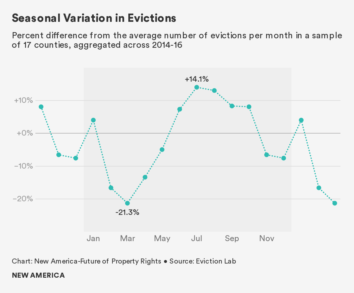
Little is known about why evictions spike in summer, though researchers have some guesses.
The most obvious culprit is the high cost of summer utility bills: Nationwide, electric bills average $143 in July, compared to $90 in April. But that does not explain why even cold weather states, which do not see significant differences in summer utility costs, still experience summer eviction spikes.
This finding points to another factor that does not discriminate between Arizona and Alaska: Children are out of school during the summer. Care experts and frontline workers say the cost of summer care leaves some parents unable to make rent, and ultimately results in evictions. Indeed, a 2018 study found that nearly half of American parents say it is somewhat or very hard to afford summer care or camp for their children.
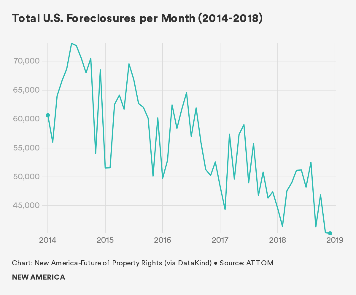
Mortgage Foreclosure: While national eviction data is available only for the three-year period from 2014 to 2016 (and therefore our housing loss index is limited to this time frame), our foreclosure data covers the five year period from 2014 to 2018. Based on our dataset, the average national mortgage foreclosure rate between 2014 and 2018 was 1.5 percent, resulting in approximately 670,000 households losing their homes to foreclosure each year.8 In multiple counties, foreclosure rates were above 5 percent. Overall, rates of mortgage foreclosure declined during these five years, but still remain high compared to rates before the housing crisis of the mid-2000s (the national foreclosure rate was 0.6 percent in 2006 and 1.8 percent at the height of the housing crisis in 2008).
The state of Florida experienced the highest foreclosure rate nationally, at 3.7 percent. Nearly 105,000 Floridian households per year lost their home through foreclosure during the study period. Nevada, Arizona, Georgia, and Tennessee also displayed high rates of mortgage foreclosure, all over 2.2 percent.
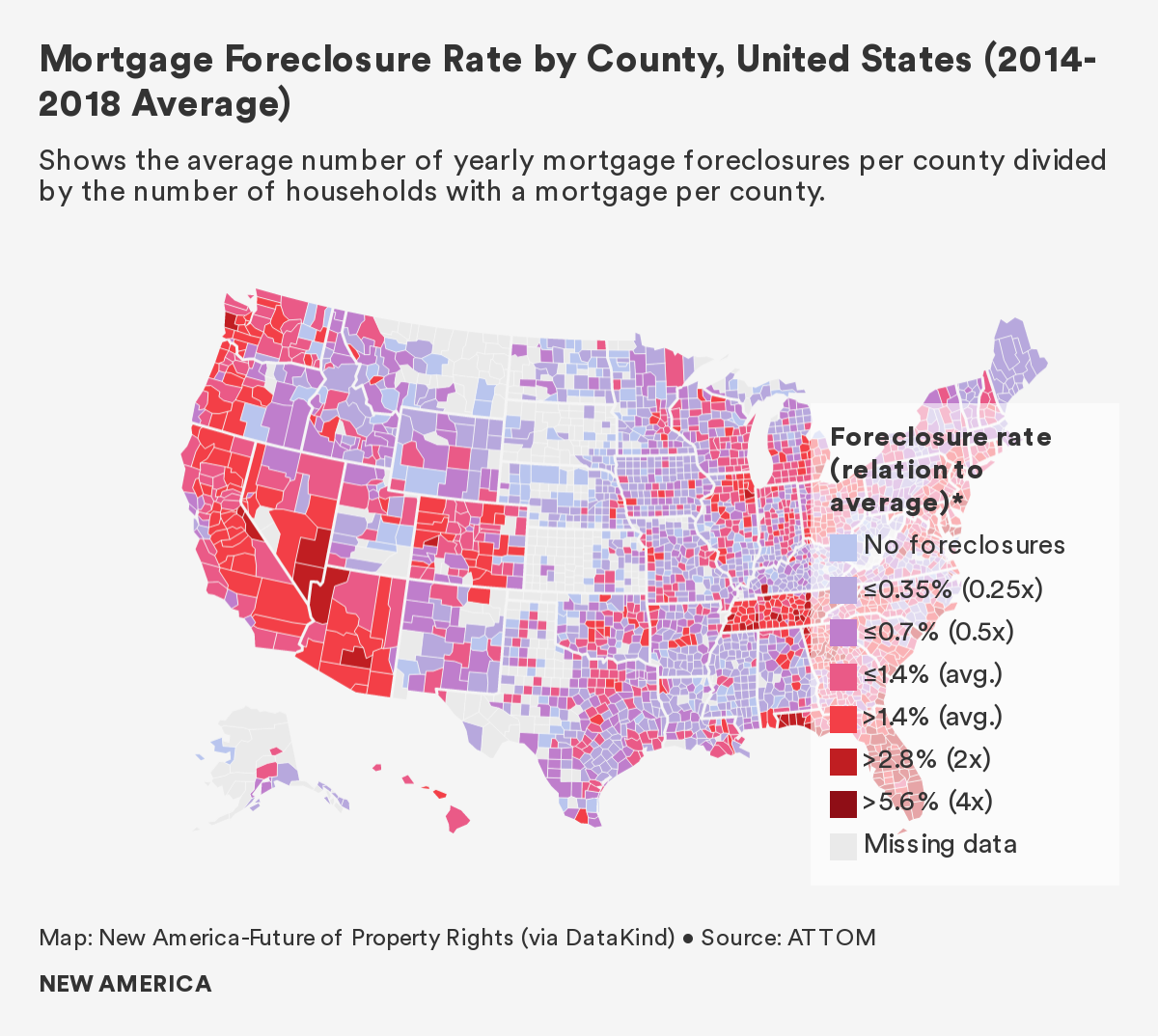
By contrast, Maine had the lowest average mortgage foreclosure rate nationally, at 0.1 percent or an average of 248 foreclosures per year between 2014 and 2018. Other states with low rates of mortgage foreclosure include West Virginia, Vermont, and Massachusetts, with rates less than 0.4 percent.9
The county with the highest foreclosure rate in the country is Avery County, North Carolina. This tiny county nestled in the Appalachian Mountains displayed an average foreclosure rate of 5.6 percent between 2014 and 2018. This finding is surprising because between 2014 and 2016, Avery County’s foreclosure rates were not in the top 20, but the county catapulted to the top spot after posting a foreclosure rate of over 8 percent in 2018.
Aside from Avery County, foreclosures are heavily clustered in Florida; eight Sunshine State counties rank in the top 20, all with rates over 4.2 percent. Several counties in Maryland, Virginia, and Georgia, respectively, are also included near the top of the rankings for average mortgage foreclosure rates.
Interestingly, a snapshot of top foreclosure rates between 2014 and 2016 is much more homogenous. In the three-year period from 2014 to 2016, the 13 counties with the nation’s highest foreclosure rates were all in Florida. In 2017 and 2018 foreclosure rates dropped significantly in several Florida counties, making room for other counties to rise to the top of the rankings.
Counties with the Highest Rates of Mortgage Foreclosure: 3-Year Average vs. 5-Year Average
| County | State | Average 3-Year Foreclosure Rate (2014-2016) | County | State | Average 5-Year Foreclosure Rate (2014-2018) | |
|---|---|---|---|---|---|---|
| Osceola County | Florida | 6.38% | Avery County | North Carolina | 5.60% | |
| Walton County | Florida | 6.38% | Walton County | Florida | 5.59% | |
| Gulf County | Florida | 6.35% | Osceola County | Florida | 5.24% | |
| St. Lucie County | Florida | 6.10% | Baltimore City | Maryland | 5.23% | |
| Pasco County | Florida | 6.07% | Gulf County | Florida | 4.87% | |
| Flagler County | Florida | 6.01% | Worcester County | Maryland | 4.86% | |
| Charlotte County | Florida | 5.87% | Sevier County | Tennessee | 4.86% | |
| Indian River County | Florida | 5.60% | Pasco County | Florida | 4.86% | |
| Volusia County | Florida | 5.46% | St. Lucie County | Florida | 4.78% | |
| Franklin County | Florida | 5.35% | Henry County | Georgia | 4.56% |
Mortgage foreclosure in each of these counties or county-equivalents is undoubtedly influenced by unique demographic, economic, political, geographic, and historical factors. Further research is required to determine the underlying causes that are driving high mortgage foreclosure rates in these locations.
Who is At Risk of Losing Their Homes?
Generally, correlation analysis at the county level is less useful than at the census tract level because counties are so large and heterogenous. Therefore, the findings below are quite broad and limited. Our census tract-level findings on who is at risk of displacement in each of our case study locations are more convincing and provide an avenue for further research and scaling.
Broadly, however, we found that geographies with predominantly non-white households see higher rates of evictions and overall housing loss than those with predominantly white households. Areas with more Black households, in particular, show higher rates of eviction than areas with predominantly Latinx households and white households.
We also observed a positive relationship between the percentage of non-white households and foreclosures, but the relationship was less pronounced than for evictions. In order to better understand the relationship between housing loss, income, and race, future analyses might control for co-variates—such as income—in order to inform inferences about disparate impacts of eviction and foreclosure across minority groups.
We found that as the percentage of rent-burdened households in a county increased, so did rates of housing loss. Across the United States, more than 20 million households spend more than 30 percent of their income on rent, of which 10 million spend 50 percent or more of their income on rent. These findings align with prior studies that found higher rates of housing loss among low- and moderate-income minority racial and ethnic groups.10 Interestingly, we also found a positive relationship between higher median rents and higher housing loss rates (and in particular foreclosures); this tells us that counties with expensive housing stock experience higher loss rates, regardless of residents’ incomes.
Of all the demographic, socioeconomic, and housing variables analyzed, we found mortgage foreclosure to be the most strongly associated with the proportion of households living in mobile homes in a county. We do not know whether this is because mobile homeowners are uniquely vulnerable to foreclosure, or because foreclosed upon homeowners are likely to move into mobile homes; the relationship between housing loss and mobile homes is an emerging area of study deserving of further research.11 Finally, we found mortgage foreclosure to be positively associated with the number of vacant properties in a county, and single-parent households.
Conclusion
Our national-level analysis prioritized breadth over depth. As a result, it was not within the scope of our project to delve into the causes and effects of evictions and mortgage foreclosures at the national scale. Also out of scope of our analysis was a focus on the presence of and variation in housing-related policies across localities (e.g., eviction filing fees or “just cause” eviction laws). Future research might focus on how rates of housing loss vary in localities with stronger versus weaker protective policies.
Our findings align with prior and more locally-focused studies investigating correlates of eviction and foreclosure, and aim to move forward research on housing loss at the national scale. Our findings also reveal what we believe to be housing loss "hot spots," providing some guidance for prioritizing resources and attention. These findings are particularly pertinent in the context of the COVID-19 crisis, and "hot spots" may also be logical areas to conduct additional in-depth research to identify causes and consequences of high rates of housing loss.
Given the general patterns of rates of eviction, mortgage foreclosure, and housing loss generally, future research might seek to understand what underlying causes contribute to differences in housing loss across U.S. states and counties.
Citations
- Harvard Joint Center for Housing Studies. State of the Nation’s Housing, 2018. Report. P. 5. source ; ACS 5-year estimates, 2012-2016
- Urban Institute. 2009. source
- Fullilove, M. T., & Wallace, R. (2011). Serial Forced Displacement in American Cities, 1916–2010. Journal ofUrban Health , 88 (3), 381-389; Rogers (2019). The Connections Between Evictions and Foreclosures in Richmond. RVA Eviction Lab. source
- For an in-depth description of how we created the Housing Loss Index and how to interpret it, please see Section 2: Definitions & Methodology. Note: the National Housing Loss Index was generated for the three year period between 2014-2016 due to the overlap in data coverage for both evictions and foreclosure. When discussing housing loss through mortgage foreclosure, specifically, we report figures from the five-year period between 2014-2018 because mortgage foreclosure data were available for this time span from ATTOM Data Solutions.
- We have not found research that assesses the comparative impact of historical housing vulnerability and current economic shocks on real-time housing loss. In other words, we don’t know whether historical housing loss rates or current income loss rates are a better predictor of current housing loss rates; this research may lay the groundwork for such a comparison.
- We were also only able to measure formal evictions conducted through the courts. In some places it is estimated that half of all evictions are informal, leaving no administrative record; again, this means our data are necessarily incomplete and an understatement of the problem.
- In its methodology report, Eviction Lab identifies a number of states for which the available data was insufficient to yield trustworthy eviction rates. In the report and on its website, Eviction Lab indicates where the calculated eviction rates likely under-represent the prevalence of evictions, and where these rates likely over-represent this prevalence. For the purpose of our report, we exclude those states identified as having data quality issues that impact the accuracy of the reported eviction rates. For example, though Eviction Lab data shows a high average eviction rate for New Hampshire from 2014-2016, we excluded New Hampshire from the results because of the data quality issues identified and highlighted by Eviction Lab (see Eviction Lab’s methodology report for more details).
- This rate was calculated based on the counties for which we had foreclosure data, between 2014 and 2018.
- States with a substantial number of counties for which mortgage foreclosure data were not available, for example South Dakota, were excluded from our discussion of states with highest- and lowest-rates of foreclosure.
- Allen, R. (2011). Who experiences foreclosures? The characteristics of households experiencing a foreclosure in Minneapolis, Minnesota. Housing Studies, 26(6), 845-866; Desmond, M. (2012). Eviction and the reproduction of urban poverty. American journal of sociology, 118(1), 88-133; Raymond, E. L., Duckworth, R., Miller, B., Lucas, M., & Pokharel, S. (2016). Corporate landlords, institutional investors, and displacement: Eviction rates in single family rentals. FRB Atlanta Community and Economic Development Discussion Paper, (2016-4). source ; Gold, A. E. (2016). No home for justice: How eviction perpetuates health inequity among low-income and minority tenants. Geo. J. on Poverty L. & Pol'y, 24, 59.
- Phillips, L. A., P. Solís, C. Wang, K. Varfalameyeva, and J. L. Burnett. Forthcoming. Hot for Convergence Research: A Community Engaged Approach to Heat Resilience in Mobile Homes. Under Review at Geographical Review.