
Usability Testing
People tend to be very opinionated about the design of financial aid offers. Certain design choices, like font size, type, and color, can completely distract from the contents of the package and derail conversations about what works when formatting and designing offers. To avoid these issues during the usability testing, we created prototypes that all used the same font and only two colors, black and white.
This is also the reason why we created a set of criteria—known as “success criteria”—to determine whether students and parents could navigate and understand the offers during our usability testing.
The Success Criteria
Our success criteria are rooted in our findings from Decoding the Cost of College and our focus groups. In order to successfully navigate financial aid offers, students and parents must be able to:
- Understand the differences in financial aid packages, including:
a. Grants and scholarships they will receive
b. The amount of federal student loans they can borrow
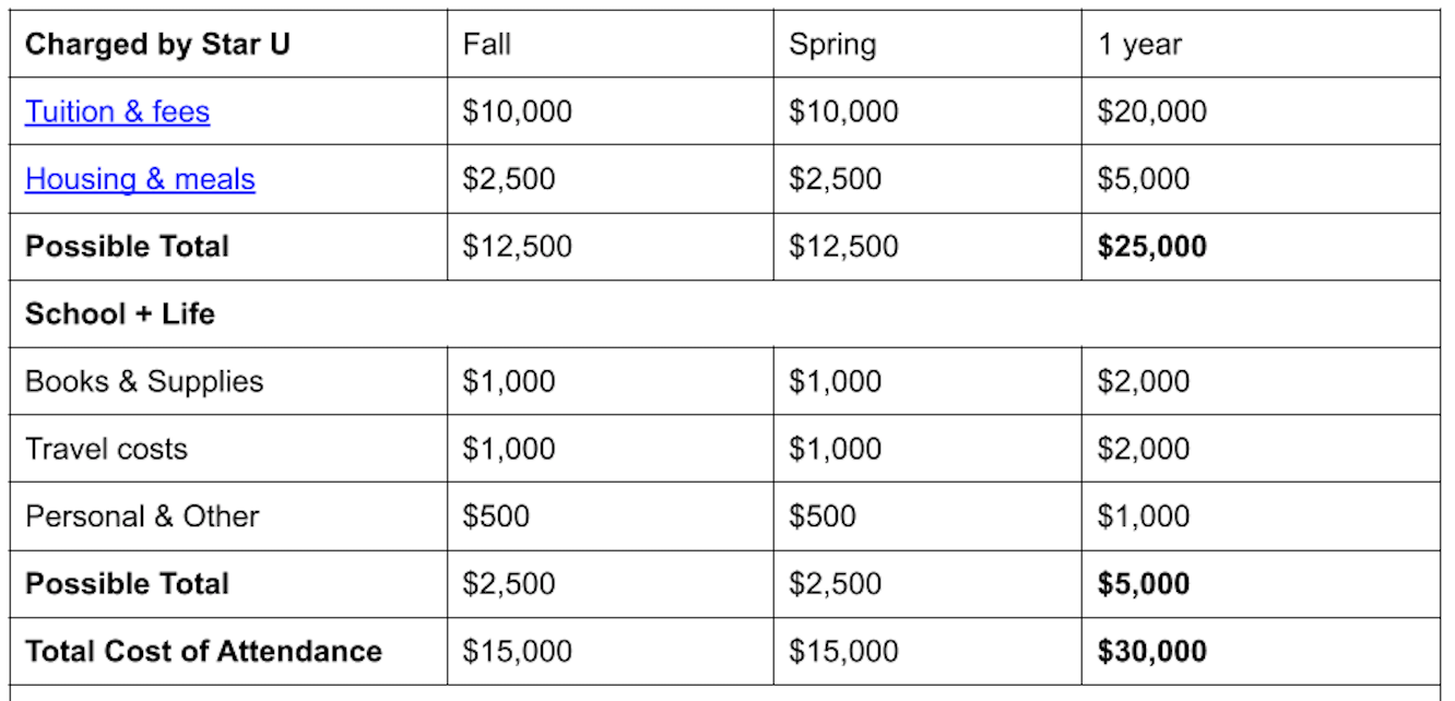
c. How much Federal Work-Study they are eligible to receive - Understand the full cost of attendance, including:
a. Direct costs such as tuition and fees
b. Indirect estimated expenses such as off-campus living and books and supplies - Understand the concept of “net price” or the cost after grants and scholarships are taken into account, and successfully apply loans to the remainder
- Understand the availability of other financial resources and alternative payment schedules (such as wages, savings, tuition payment plans, federal Parent PLUS loans) that they can use to pay remaining balances
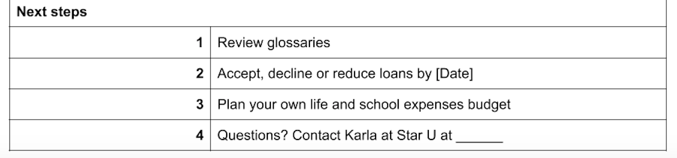
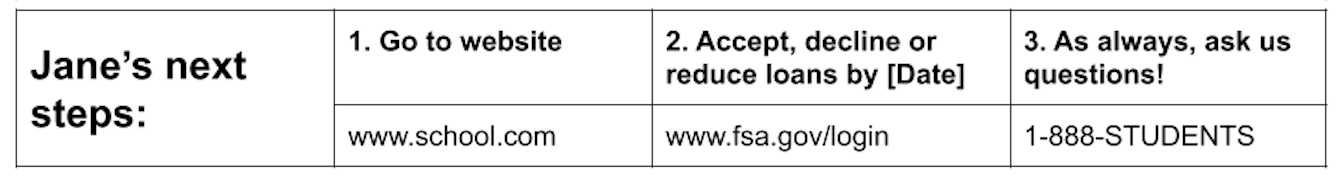
- Understand next steps for accepting, reducing, or declining any types of aid, and how to contact the school for more information or clarification
To compare the three prototypes, we hired an expert, Ann Duffet from FDR Research, to conduct interviews with students (both traditionally aged, and non-traditionally aged) and parents of traditionally aged students.
Duffet conducted one-hour interviews starting in November 2019, with two testing sessions conducted in Atlanta and Boston, comparing New America’s prototypes within the interviews. Thirteen people were interviewed: six parents, five traditionally aged students, and two non-traditionally aged students. (Please see methodology in Appendix A.)
Results of Phase One Interviews
First, the good news: most of the participants were able to make accurate calculations about price. They were able to identify and correctly sum scholarships and grants, how much they could borrow in federal student loans since they were already separated from grants and scholarships on our offers, and any work study money they were eligible to earn. They were able to, for the most part, distinguish the differences in these types of aid, although some still needed more prompts from the facilitator to arrive at the right answer, and it is important to recognize that many students and families have to navigate the financial aid offer process on their own with little to no outside help.
Participants valued cost information the most and wanted to see it first. Although they identified which costs were direct and indirect, based on the information given on the offers, they disagreed on what cost items should be included (especially for indirect costs). Many cared more about the direct costs and did not want to see indirect costs because, they argued, those are the costs that would occur anyway and are not as meaningful. One participant objected to Star University’s use of the phrase “possible total,” saying, “I would just say total…they can do an asterisk next to housing and meals, because these are choices people make. Possible sounds ridiculous.”
Although some participants did not think including indirect costs was necessary, they agreed that having the estimates on the offer was helpful. Some participants did not like the terms “direct” and “indirect” cost. One suggested calling it “mandatory” and “additional costs.” Some liked the way the Star University prototype, calling them “Charged by Star U” and “School + Life.”
None of the participants seemed to have any trouble with having two cost calculations: one that just applies grants, and another that applies both grants and loans.
Participants were able to tell which financing options were available to them. They seemed to understand what work study was, although it was unclear whether they knew it from their own experience or learned of it from the explanatory text provided.
Participants were also able to tell us what they needed to do next. One caveat is that participants who seemed experienced with the financial aid process tended to answer the next step question using their previous knowledge, not necessarily the information provided on the offer. When asked again to look at the next steps section, they agreed that the information was sufficient. Most preferred how Star and Sunshine presented next steps, both of which listed necessary actions that students and parents should take.
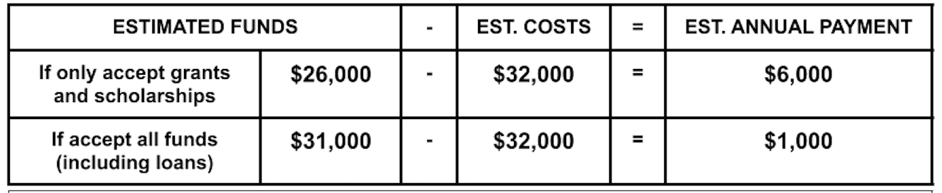
During the conversations, participants also told us the features they liked and did not like about each prototype that went beyond our success criteria. Although most were personal and different for each participant, one thing that most participants seemed to agree on was the order in which the different categories in the letter were listed. Our participants liked to see cost first, followed by grants and scholarships, and then student loans, alternative financing options, and finally next steps. Many liked having the net price calculation in a bold box like the Sunshine prototype, but a handful wanted to see an additional remaining cost calculation after grants/scholarships and loans were applied to the total cost of attendance.
After two testing sessions, most participants voted Sunshine as the financial aid offer that was easiest for them to navigate (6 votes), followed by Lightning (4 votes), and finally Star (3 votes). Most who voted for Sunshine highlighted the remaining cost calculation box and the layout of next steps at the bottom of the page as being particularly helpful. For those who voted for Lightning, they liked how the offer broke down cost and aid in detail, presenting them in a consistent format throughout the letter. For those who voted for Star, the reasons varied: most notably, one participant liked how it separated the total of direct and indirect costs.
Interestingly, at the interview sessions in Atlanta, Sunshine seemed to receive the most negative feedback. Participants did not like that Sunshine’s offer started with grants and scholarships, and that the different boxes on Sunshine did not align with each other, making it confusing to read. For that reason, we moved the cost section up and fixed the column misalignment after the Atlanta testing. As a result, Sunshine really stood out among participants in Boston. One participant remarked, “this one…by far, blows everything away.” Many participants especially liked the cost calculation box, which put two cost calculations in a bold box on the offer.1
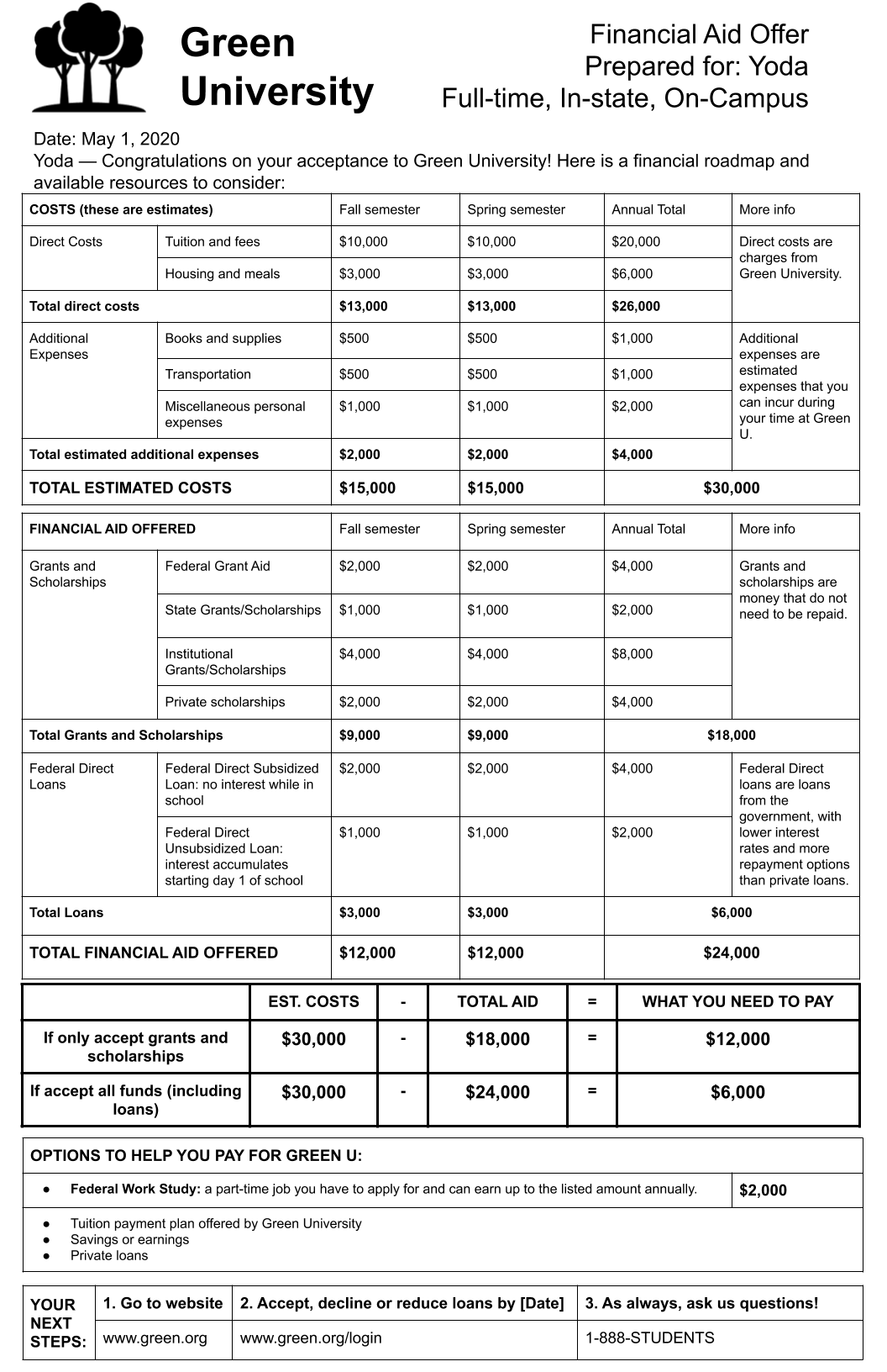
Based on feedback from our participants, we combined elements of participants’ favorite parts of Lightning and Sunshine. This prototype, which we named Green University, starts with cost information, followed by grants/scholarships, and then loans. This first section resembles the first half of Lightning. The next section—the remaining cost calculation, alternative options, and next steps—are taken from Sunshine.
Phase Two: Honing What Works
After completing our phase one research, we embarked on a second round of consumer testing to tease out what really worked well with our Green prototype, and what still fell flat. This time, we wanted to focus on “uninitiated” users, those who have likely never seen a financial aid offer before. In our phase one testing it was clear that some participants were relying on information and knowledge from their own memory. This time, we wanted to get feedback from high school sophomores and juniors, their parents, and non-traditionally aged students on the cusp of enrolling in college.
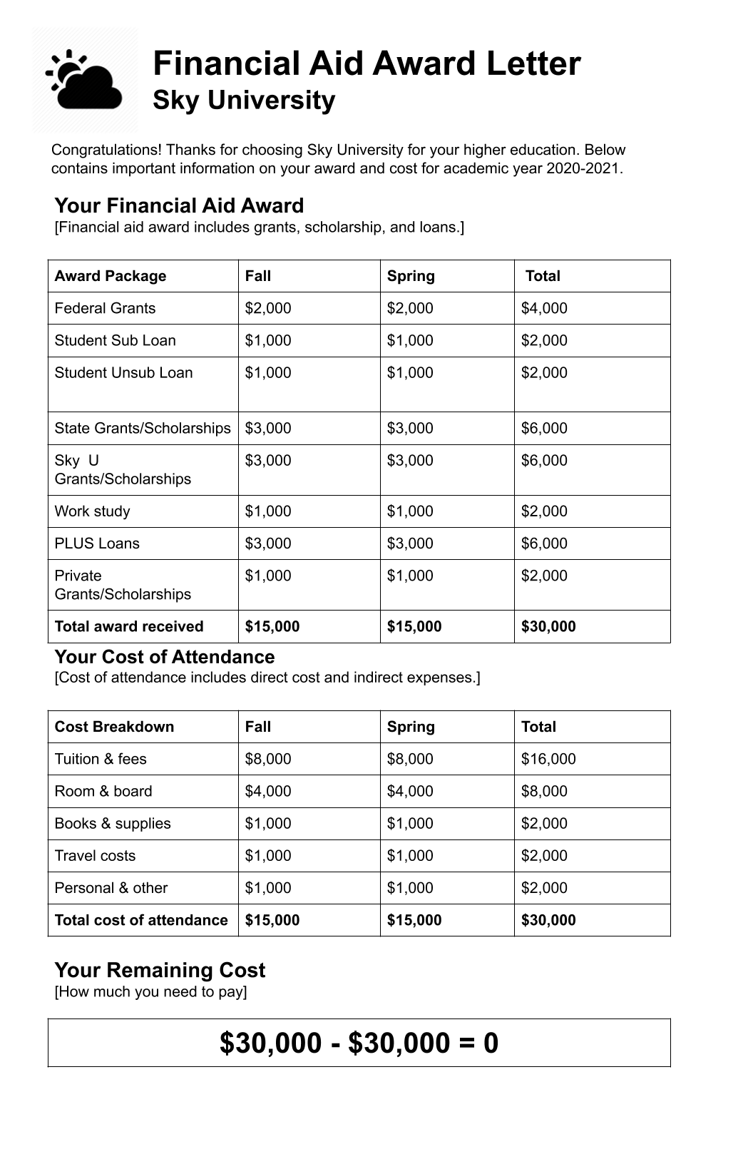
We also created a new prototype—Sky University—that combined many elements of a middling financial aid offer from our Decoding the Cost of College report. This was done in an effort to tease out what set our redesigned offer apart. Because all of the prototypes in our first phase met the success criteria, we wanted to understand how our redesign performed against an offer a student might receive currently.
Like everything about 2020, the second phase of our research was upended due to the COVID-19 pandemic. Initially, we had hoped to conduct in-person interviews over the summer. As it became clearer that the pandemic would make it unsafe to meet in person, we explored virtual options. Ultimately, we conducted 22 interviews via Zoom with our facilitator and New America representatives observing. (Please see Appendix B for methodology.)
We started by showing two prototypes in random succession: Sky (our middling offer) and Green (our “best practices” prototype). In effect, the comparison to Sky allowed participants to discuss the benefits of Green as they worked to answer our questions and do the math. Most participants struggled to navigate Sky, finding the offer disorganized and missing key information. In comparison, the details on Green resulted in everyone being able to meet the success criteria. “If you like things broken down, [Green] is a great document because it has got the direct costs, what additional expenses are,” one adult prospective student said. “This is very detailed.”
Notably, participants continued to struggle, as they did in phase one, with the concept of “additional expenses” or indirect costs. While participants understood that these costs were estimates from the institution, they were unclear how representative these estimates would be for their own personal situation. Some were not sure that including them was even necessary. One parent said, “I don’t even need money for these indirect expenses. I’m looking at it as $30,000, but there’s things on there that they always include that aren’t technically expenses; they are not fixed expenses, I should say.” This parent figured, “so it’s $30,000, but there’s $12,000 that could be adjusted like room and board if [my son] decides not to stay on campus.”
While participants understood the differences between loans and grants, some expressed appreciation for the explanatory text in the “More info” box. When it came to loans, participants struggled, especially with Sky University, to articulate the difference between subsidized and unsubsidized loans. For this reason, it will be important when designing a standardized letter to keep some sort of brief explanation, as seen with Green University.
With Sky University, Parent PLUS loans and work study were combined with grants and scholarships as part of the aid package. Once participants navigated both Sky and Green, they preferred Green’s presentation with work study and Parent PLUS loan being placed under “Options to help you pay for Green U” since they are not guaranteed aid. A parent has to apply and be approved for a PLUS loan and a student has to find a work study-eligible job and work a specified number of hours each week in order to receive the funding.
One of the biggest criticisms from participants about Sky came over how the offer “did the math” compared with Green. Sky’s offer lumped all aid together (including grants, student loans, work study, and PLUS loans) and subtracted the total from the cost of attendance, indicating that the student had $0 left to pay. Several participants said that this calculation made the offer misleading. “There probably is a subcategory of people who would more quickly gravitate toward Sky because [the $0] makes them feel confident in their ability to afford the school,” said one participant, “whereas Green is going to give them a more accurate presentation and is more ethically responsible than Sky.”
In the end, when it came to Sky University, the participants initially liked the simplicity but when they reflected on both offers side by side, believed that the extra information provided on Green gave it a sense of legitimacy and gravitas. “It looks more professional,” commented one high school student. Said another adult prospective student, “I can already tell Green is going to be more of a distinguished school by the layout of their document.”
At the halfway point (after the 11th interview) it became clear that while Green was the preferred version in terms of order and clarity of information, it was perceived as “cluttered,” “busy,” and “overwhelming.” Participants almost unanimously wanted more white space and a larger font. “I don’t like this setup because it is not straightforward to me,” said one parent participant, since “I want to glance at it and see what’s what.”
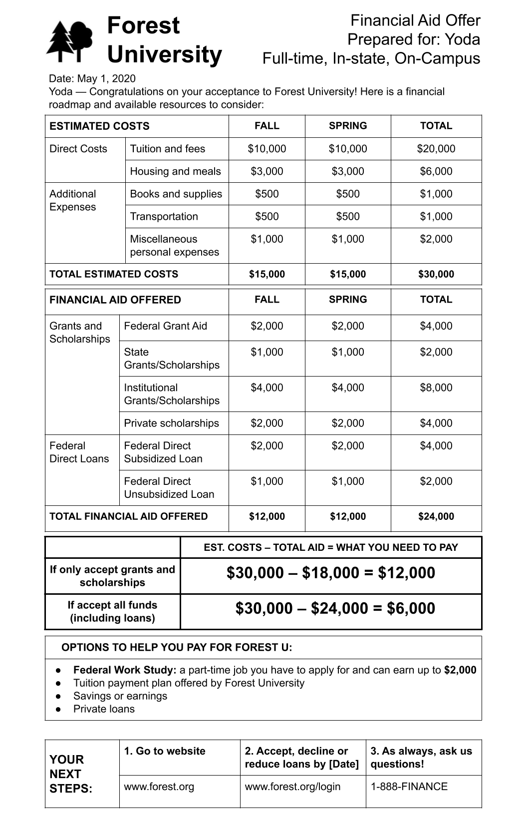
In response to these complaints, we created a third prototype, Forest University, which was a simpler version of Green. In 9 of the remaining 11 interviews, all three prototypes were shown. Green continued to be the preferred version, mainly because it was the only one that included the “More Info” column, explaining the various elements that make up the offer. It was evident that although many participants said they did not carefully read the explanations in the “More Info” section, they wanted to keep the explanations. Said one high school student, “I just liked how everything’s categorized [on Green]. And they had explanations on the side, which I noticed the other two don’t. So it’s a little bit more helpful, easier to navigate, not just for me, but for lots of people.”
Citations
- The evolution of the documents, including summary notes about how the offers changed throughout the user testing, is shown in Appendix C.