
The Financial Aid Offerpalooza
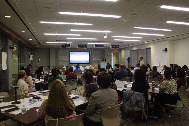
After publishing our report, we wanted to better understand just how terminology and formatting could be standardized and presented more clearly. We knew that a clear, accurate, and consumer-friendly offer cannot be accomplished if designers do not understand their users. For this reason, we invited the users (students and parents) and the designers (financial aid and enrollment officers at colleges and universities) to a daylong design workshop called Financial Aid Offerpalooza.1 Our goal was to facilitate conversations among the groups and have them work together to create a concrete financial aid offer prototype. The workshop also included other stakeholders, such as college access and guidance counselors, financial aid software developers, and policy experts. With diverse expertise and different levels of experience with financial aid offers, each participant brought to the discussion a distinct perspective on how a financial aid offer should look and what information it should include.
New America
In advance of our Financial Aid Offerpalooza, we convened three focus groups conducted by FDR Research Group: one of traditionally aged students, one of non-traditionally aged students, and one of parents of college students.2 Through the focus groups, we grew to understand which components of the offer are confusing to students and parents, how the technical terminology falls short, and what students and parents would like to see in the offer letters. The results of those focus groups were used to help frame and shape our Financial Aid Offerpalooza and were shared publicly and with the participants of the event.3
Under the facilitation of Stephanie Nguyen, a user-experience (UX) design expert, participants in the event learned about the challenges that students and families go through when it comes to navigating financial aid offers and the resources students and families rely on to overcome those difficulties. Colleges and organizations presented the changes they have made to their financial aid offers, and how these changes have worked for their students. The needs of both institutions and students that might have been overlooked came to the surface, driving thoughtful debate about how important information such as college prices and loans should be presented and how to simplify jargon and terminology and not mislead students and parents.
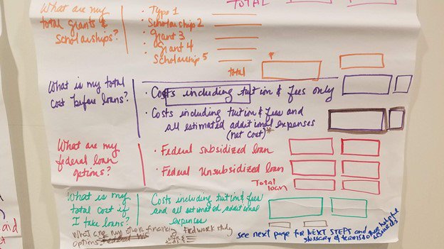
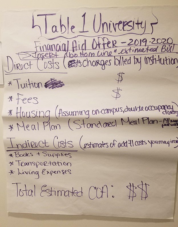
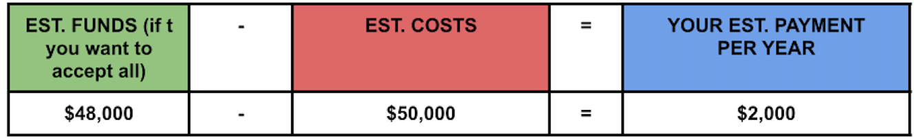
Following the discussion, participants were divided into teams to design financial aid offer prototypes. Nine prototypes were created, with many inventive features. Most prototypes followed the recommendations from our report, Decoding Cost of College, such as separating loans from grants, calculating remaining cost after financial aid, listing other financing options, and next steps. These prototypes creatively made the terminology more self-explanatory and accessible, either by using plain language instead of financial aid jargon, or by providing concise yet accurate definitions for terms students and families had struggled to understand. All prototypes placed cost information first, and then the other elements of the financial aid offers.
New America
New America
New America
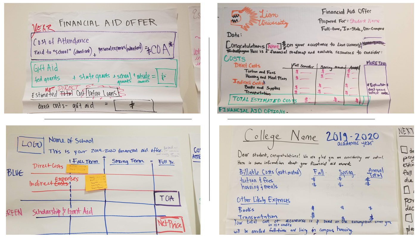
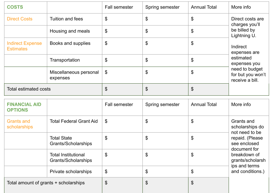
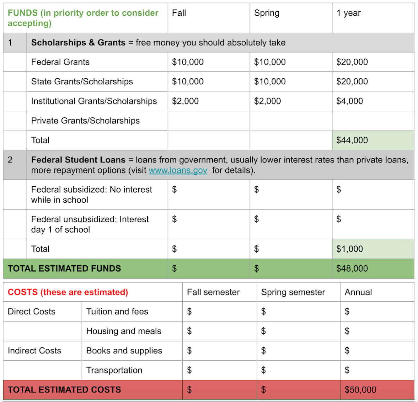
Guided by these ideas from the participants, Nguyen, our UX design expert, designed three prototypes for the made-up Star, Sunshine, and Lightning Universities. Each of the three prototypes had five components: college costs, financial aid (including grants and loans), net price (full cost of attendance subtracting grants and scholarships), remaining cost to the student after loans are included, alternative financing options, and the next steps a student must take to accept the award. Each prototype listed the student’s name and enrollment status, provided some definitions of the terminology used, and listed Parent PLUS loans and work study as alternative financing options, rather than misleadingly packaging them into the aid offer. However, each of the three prototypes also had some distinct features.
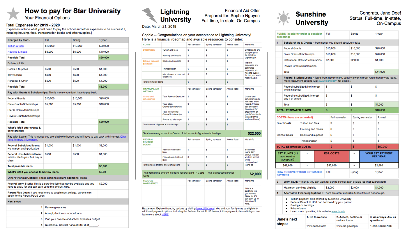
Star University used the most plain language to describe financial aid terms. For example, it titled the offer “How to Pay for Star University” instead of “Financial Aid Offer.” It used “charged by Star U” instead of “direct costs,” and “school + life” instead of “indirect expenses.” Star placed costs first, followed by grants and loans, and then calculated the net price right after presenting the grant information. It presented the estimated bill right after the loan information.
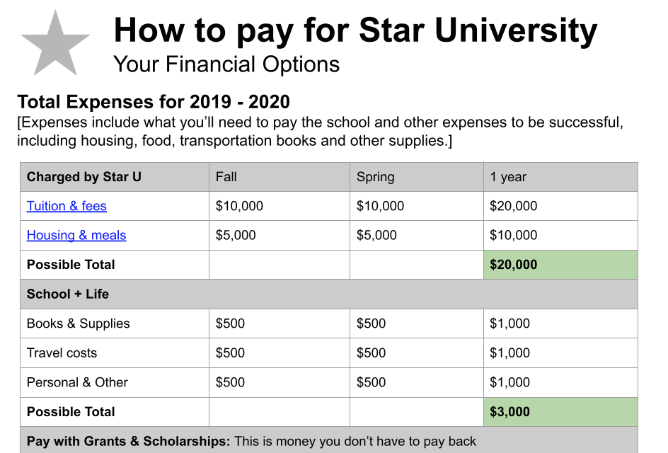
Lightning University took a similar approach in terms of the order in which it presented the information. However, Lightning kept most of the technical terms as used by colleges and universities. But it added an explanation column to provide definitions of the terms.
Sunshine University tried a different approach, displaying the grant and loan offers first, before breaking down the costs. Sunshine also featured a highlighted box which spells out the calculation of the remaining cost.
Once we had the three prototypes, we moved into usability testing. We conducted the user-research in order to understand the shortcomings of the prototypes and how to improve them so they could be used by all types of users, from high school students, to parents, to non-traditionally aged students.
Citations
- Rachel Fishman and Sophie Nguyen, “Financial Aid Offerpalooza,” EdCentral (blog), New America, August 5, 2019, source
- Fishman and Nguyen, “Financial Aid Offerpalooza.”
- Fishman and Nguyen, “Financial Aid Offerpalooza.”