
Section 4. FEAT Analysis and Interpretation
FEAT offers users two ways to access results: 1) a ZIP file for download, containing all the FEAT results and underlying data; and 2) a dashboard within the FEAT webpage, visualizing select insights from FEAT analysis. In this section, we provide more detail on the outputs from both of these.
Downloading FEAT Analysis in a ZIP File
The ZIP file will be named “feat_results_[date of run].” Below, we detail the analysis included in each folder contained in the ZIP file.
Full Datasets
In the full_datasets folder, there is a data_geocoded .csv, which contains the cleaned and standardized input data, along with the information required for geocoding for each type of housing loss in your input data. This geocoded data is still at the level of an individual eviction or foreclosure (i.e., not aggregated by census tract) and documents whether the census geocoder was able to match the data to an appropriate census tract, or GEOID. This data can be used to visualize where within a city or county housing loss is occuring (at the address level).
Data Summaries
In the data_summaries folder, there are four .csv files: acs_data_dictionary, housing_loss_summary, housing_loss_total, and address_errors.
Address Errors
The address_errors file contains the housing loss records that are excluded from all FEAT analysis and the reason why they are excluded. Below we list reasons why data may be dropped from FEAT analysis, as well as the error message that would be generated in this file:
- NA: The street_address_1 variable was blank or recorded as ‘n/a’ for this record.
- Duplicate: If the data in the required fields matches exactly for more than one record, FEAT will include one record in the data for analysis and drop any other duplicates.
- Error Parsing Address: The address was unable to be standardized. This occurs for example with PO Boxes, mobile home parks, addresses that specify a floor or entrance, and addresses that contain multiple street words (e.g., Drive and Boulevard).
- Unable to Find a Match in the Census Geocoder: The address appears to be valid, however the census geocoder could not find a match in their database. According to the census geocoder FAQs here, the possible reasons an address could not match are:
- Address is non-residential or commercial;
- Housing unit may have been recently constructed and is not in our database yet;
- Local Addressing Authority changed the address, and changes are not yet reflected in our database;
- Address may be in a location where we are missing address range information; or
- Housing unit may have been destroyed/demolished.
The Housing Loss Summary File
The housing_loss_summary file aggregates each type of housing loss data at the census tract level and calculates eviction or foreclosure totals, rates, and indices. These calculations are produced for individual years of data, as well as across all the years in the input data. Note that if there’s only one year of data, the total and yearly housing loss rates and indices will be the same.
Housing loss rates and indices are calculated using the following ACS variables: total renter occupied households and total owner occupied households with a mortgage.
Note: FEAT does not require a full year of data to produce analysis. Even a single record with a date in a given year will produce calculations. As such, users should exercise caution when interpreting the housing loss analysis and particular attention should be paid to the date range of the input data.
Housing Loss Rates
The methodology used to calculate eviction or foreclosure rates at the census tract level is as follows:
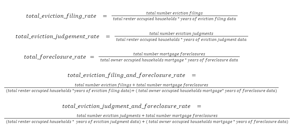
Housing Loss Rate Interpretation: The number of housing loss incidences per 100 households in an area (e.g., a 6 percent eviction filing rate means that 6 evictions were filed for every 100 renter households in a geographic region).
Housing Loss Indices
FEAT also produces housing loss indices, which is the ratio of the given census tract’s overall housing loss rate to the rate of the geographic scope of the input data, whether it’s at the county, city, or state level. For example, if the input data covers a county, housing loss indices would be calculated as follows:
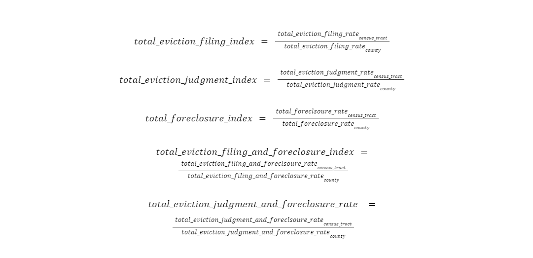
Housing Loss Index Interpretation: A housing loss index assesses which census tracts have the most severe housing loss relative to other tracts within that geographic scope. A housing loss index value of “1” denotes an average value (i.e., the housing loss rate of that census tract is exactly in line with that of the geography as a whole). Values less than 1 indicate lower than average housing loss, and values over 1 indicate higher than average housing loss relative to the rest of the geography. These values can be expressed in terms of their relation to the average: A value of “2” means that housing loss in the tract occurs twice as often as the rest of the county, a value of “3” means that it occurs three times as often, and so on.
Housing Loss Totals
FEAT produces a spreadsheet that aggregates data and includes housing loss totals and rates across all census tracts in the input data.
ACS Data Dictionary
FEAT sources over 70 variables from the U.S. Census Bureau’s American Community Survey. For a full list of ACS variables that FEAT appends, see our data dictionary here.
Analysis Plots
The analysis_plots folder contains analysis of the total housing loss over time, as well as correlation analysis between the ACS variables and each type of housing loss (as well as the combined housing loss) in the input data.
Time Series
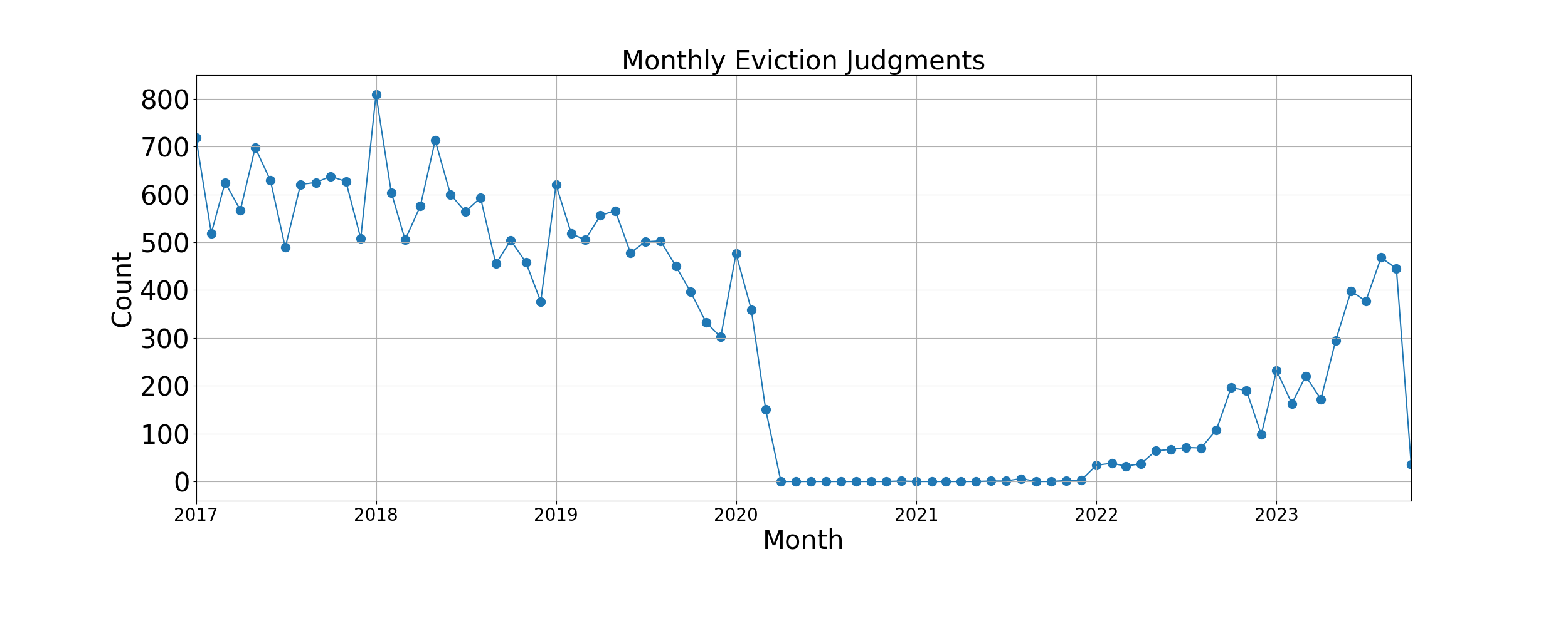
FEAT produces a .csv file that aggregates housing loss data by month and year for each type of housing loss in the input data.
In addition, FEAT produces a time series chart by housing loss type that visualizes the total housing loss counts by month.
Correlation Analysis Bar Charts and Scatter Plots
The correlation analysis is intended to demonstrate the strength of the relationship between each kind of housing loss and over 70 ACS socioeconomic, demographic, and housing variables, to assess the characteristics of the neighborhoods most at risk of housing loss. There is a correlation analysis folder for each kind of housing loss data, containing a bar chart of significant correlation results, a .csv that includes the correlation coefficients and results of statistical testing, and a series of scatter plots visualizing the relationships.
The Pearson correlation coefficient, or r value, ranges from -1 to 1 and indicates the strength of the linear relationship between the ACS variable and the housing loss variable. Generally, Pearson correlation coefficients above 0.7 or below -0.7 are described as “strong” associations, values between 0.4 and 0.6 or -0.4 and -0.6 are described as “moderate” associations, and values between -0.3 and 0.3 are described as “weak” associations.1
It is important to note that these relationships should not be interpreted as casual. That is, if race is found to be strongly and statistically significantly correlated with housing loss, we cannot conclude that worse housing loss is due to the racial composition of a neighborhood or that neighborhoods with a higher proportion of a certain race face higher rates of housing loss. We can only conclude that neighborhoods with higher racial composition are likely to experience higher rates of eviction in the jurisdiction being analyzed.
It should also be noted that correlation calculations on datasets with fewer than 30 observations should not be considered reliable, as the sample size is too small.
FEAT outputs a .csv, titled total_[type]_rate_all_correlation_results, within an analysis plots folder that includes all of the correlation results. For each ACS variable and housing loss type, the .csv details the Pearson correlation coefficient, the strength of association, the direction of association, the p value, and whether the correlation is statistically significant (p value is less than or equal to 0.05).
Variables that cannot be included in a correlation calculation, such as those that have no variation, are recorded as -666 in this file.
FEAT also produces a bar chart that shows the ACS variables. The bar chart shows the correlation coefficients of statistically significant ACS variables that are either moderately or strongly associated with housing loss, organized by strength of association (highest to lowest).
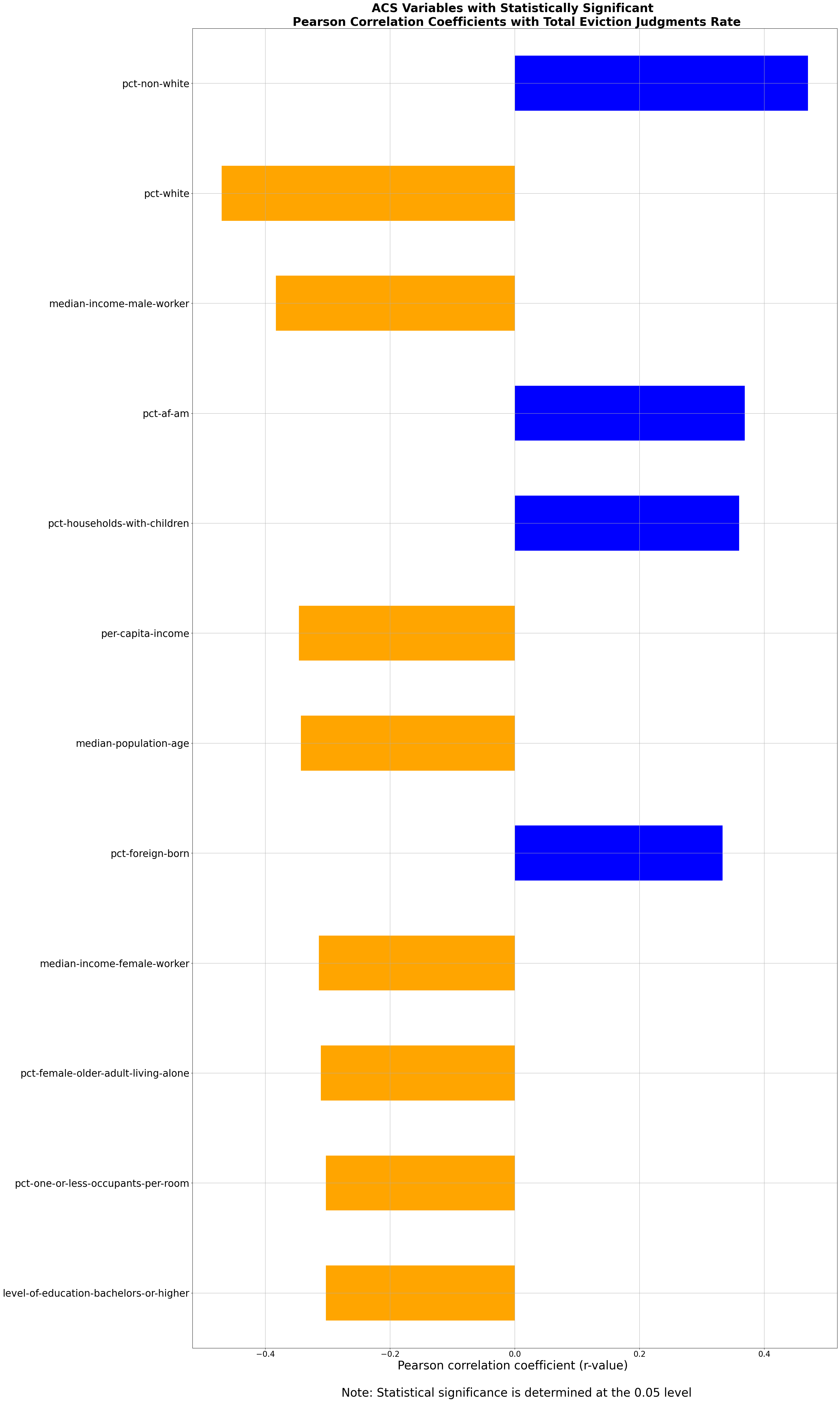
In the chart above, using the statistically significant, positive, and relatively strong correlation coefficient for percent of non-white households and eviction filings, the relationship can be interpreted as follows: Census tracts with a higher percentage of non-white households are likely to experience higher rates of eviction filings than census tracts with fewer non-white residents. In other words, census tracts with more non-white households tend to face higher risk of eviction than census tracts with fewer non-white households.
FEAT also outputs scatter plots for each ACS variable that meets the same criteria.
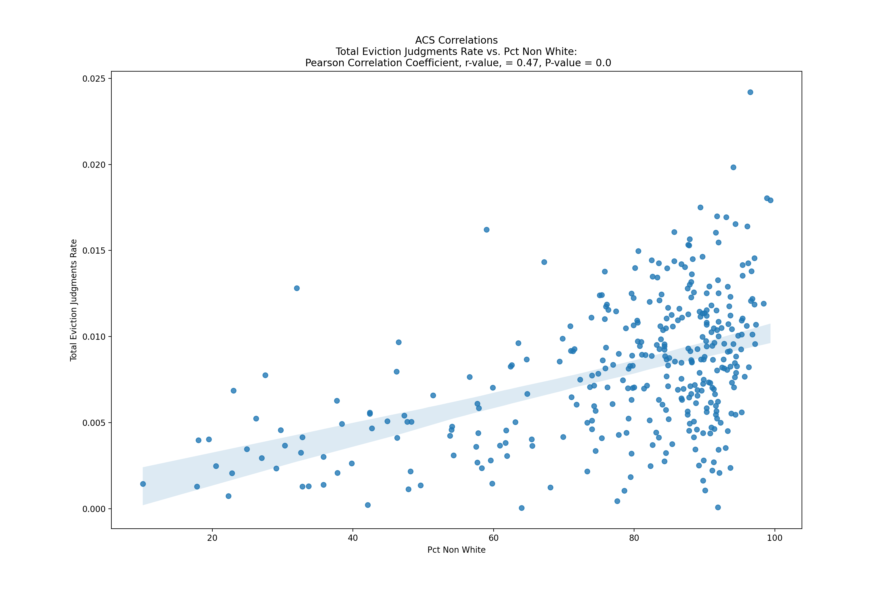
Finally, the scatter plot above represents an ACS variable (percent of non-white households) against eviction filing rates across census tracts. The scatter plot shows a moderately positive association between census tracts with a higher percentage of non-white households and the rate of eviction filings.
Note: These correlation results should not be interpreted as causal. That is, if race is found to be strongly correlated with housing loss, we cannot conclude that worse housing loss is due to the racial composition of a neighborhood or that neighborhoods with a higher proportion of a certain race face higher rates of housing loss. Rather, the full suite of correlation results provides an understanding of the social, economic, and housing characteristics of a neighborhood that is more at risk for housing loss.
Mapping Data
The mapping data folder has one file with geographical boundaries for the given county’s census tracts (.geojson) and a Geopackage file (.gpkg) to use in creating maps of housing loss data within a specific geography, including overlays of ACS variables, in GIS.
The geocoded data files stored in the other folders can be used with programs like Datawrapper and Excel to conduct additional analyses and visualizations, but these mapping-specific files are intended to be ready for use in an open source GIS software such as QGIS or in ArcGIS.
Visual Dashboard of FEAT Results
Below is a brief description of the select visualizations available in FEAT (all based on FEAT analysis of 2020–2023 eviction filing data in Albuquerque, New Mexico, from Eviction Lab’s ETS).
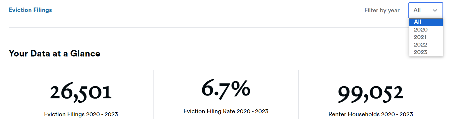
The ‘Your Data at a Glance’ section gives a snapshot of the number of eviction filings over a time period in your data, the average eviction filing rate, and the number of renter households in Albuquerque. Users can select whether to view results for all years or by an individual year.
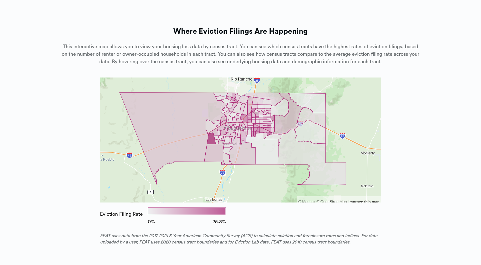
The ‘Where Eviction Filings are Happening’ visualization presents a census tract level heat map based on eviction filing rates. Hovering over each census tract offers additional information on housing loss and demographics.
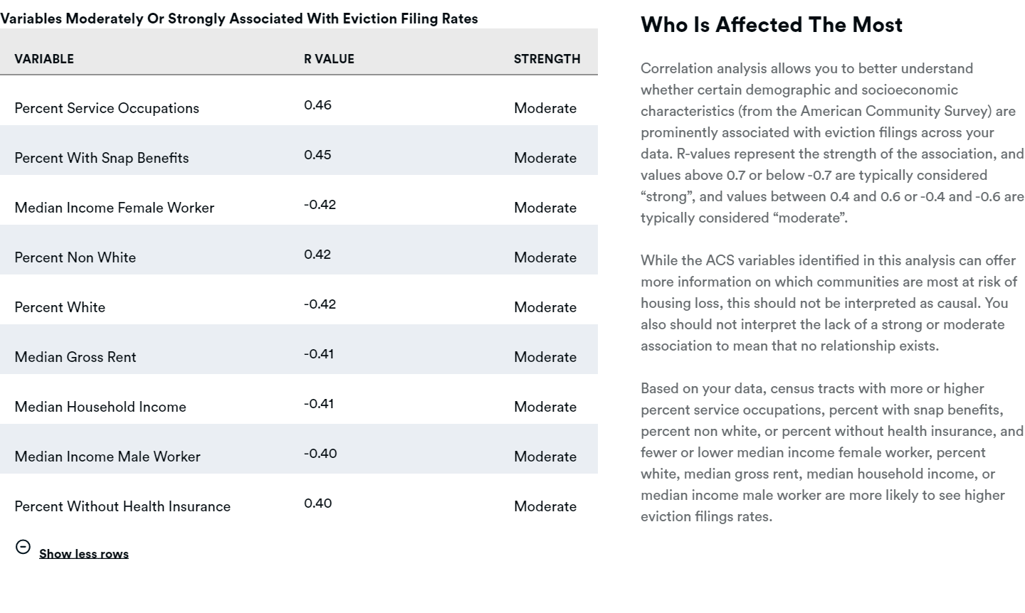
The ‘Who is Most Affected’ visualization shows select results for the correlation analysis run between ACS variables and housing loss rates. Specifically, the dashboard displays variables that are moderately or strongly associated with eviction filing rates and are statistically significant. Full correlation analysis results are in the ‘analysis_plots’ folder in the ZIP file.
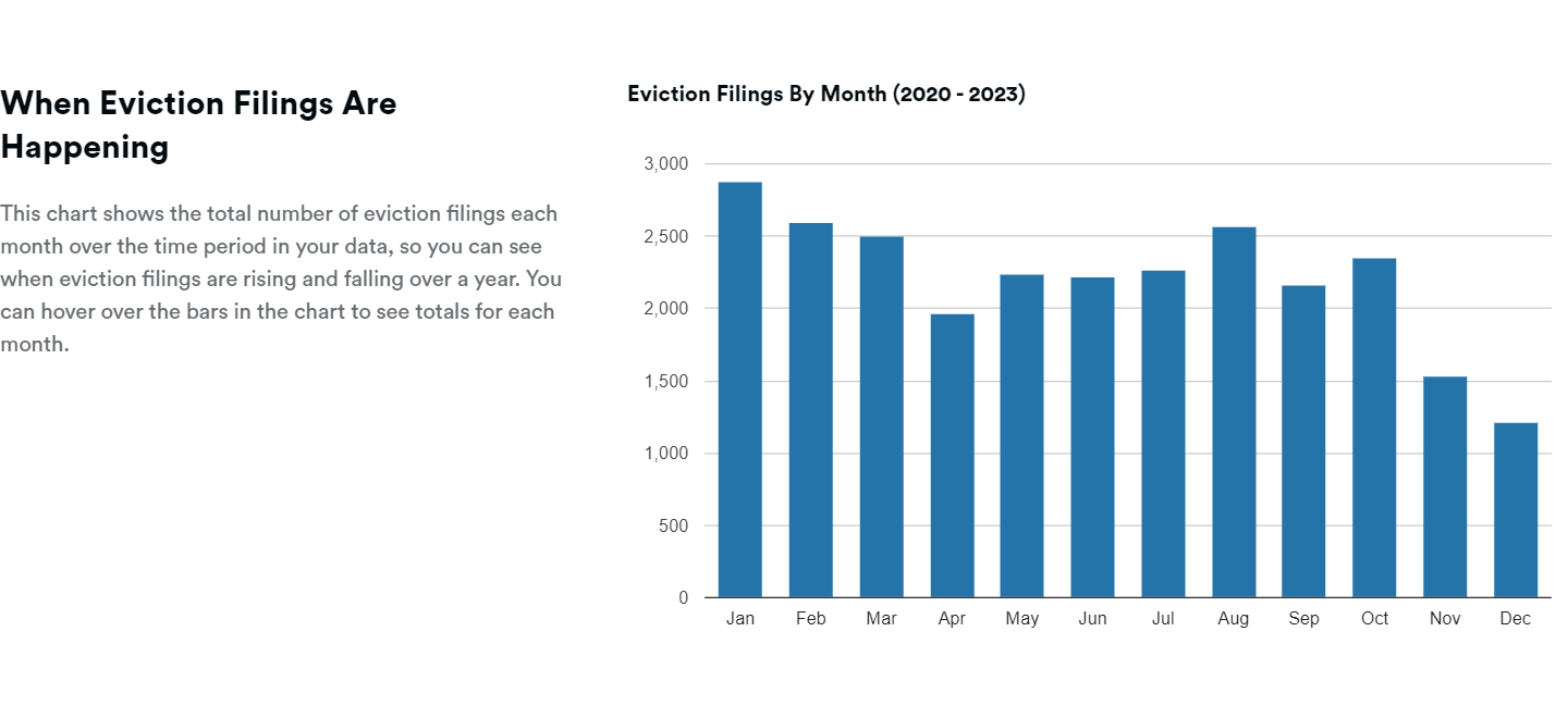
The ‘When Are Eviction Filings Happening’ visualization is a chart of eviction filings over the course of a calendar year (January to December). Hovering over each bar shows the total number of filings for that month.
Citations
- Christine P. Dancey and John Reidy, Statistics Without Maths for Psychology (London: Pearson, 2007).