Table of Contents
- Executive Summary
- I. Introduction
- II. The Past, Present, and Future of School System Redistricting
- III. Overview of Data and Methods
- IV. Gains from Three Approaches to School System Redistricting
- V. Achieving District Boundary Change: Lessons from a School System Leader
- VI. State Spotlights
- VII. A Time for Better Borders
- VIII. Interactive Map and Data Explorer
IV. Gains from Three Approaches to School System Redistricting
Model 1: Blank-Slate Redistricting
This model disregards existing school district boundaries in an effort to draw the optimal school district map for each state—a set of entirely new school districts that have much more equal property tax capacity per pupil and less segregation between school districts.
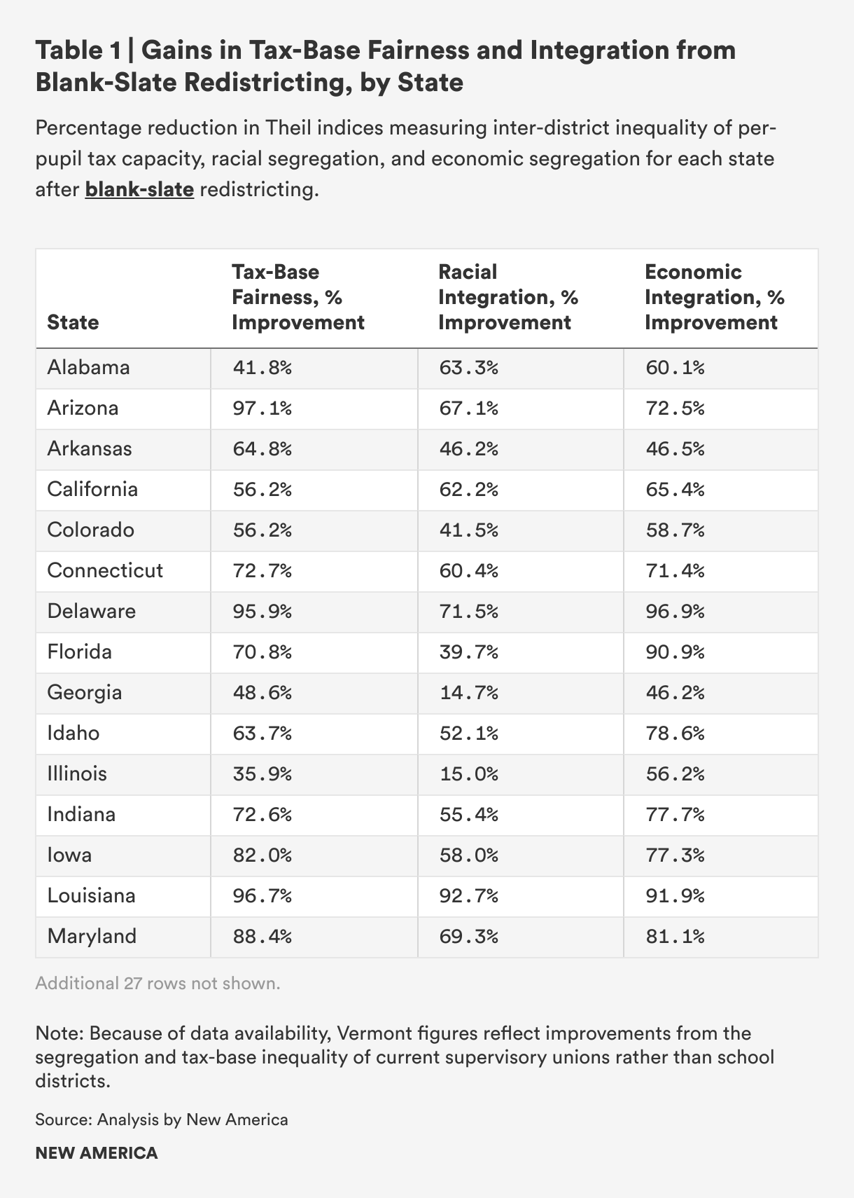
Our analysis revealed widespread gains from drawing new school district borders with funding equity and district diversity in mind. We measured improvements in our three outcomes of interest: equality across districts of per-pupil property valuation, district representativeness of the state’s racial composition, and similarity of district poverty rates to the statewide child poverty rate. These results are summarized in Table 1 and discussed in more detail below. To see each state’s proposed blank-slate redistricting map, see the interactive tool that accompanies this report.
Impact on Per-Pupil Property Tax Capacity
All 42 states analyzed saw reduced inequality of per-pupil tax capacity across districts after this simulated redistricting. In the average state, this inequality was reduced by 66.6 percent. Arizona saw the most significant gains, cutting inequality of property tax capacity by 97.1 percent. This was achieved by redrawing boundaries to encompass properties whose collective valuation per pupil is much closer to the statewide per-pupil valuation, making sure students across each state have fair access to local revenue and no district is at either extreme when it comes to property wealth.
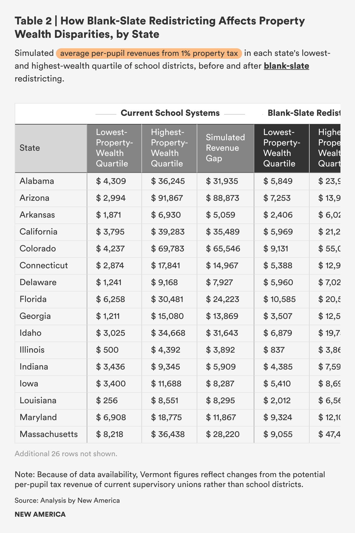
Currently, if every school district collected a 1 percent property tax and school districts in every state were divided into quartiles by property wealth per pupil, districts in the highest-wealth quartiles would raise $28,900 per student per year, on average. Districts in the lowest-wealth quartile would raise about $3,300 per student. The worst of these divides is in Oregon, where a district in the property-richest quartile would collect an astounding $119,000 more per pupil than a district in the property-poorest quartile. After blank-slate redistricting, districts in the highest-wealth quartile in the average state would still raise more from that 1 percent tax: about $16,100 per student per year, compared with $5,600 per student on average in the lowest-wealth quartile of districts. But that disparity would be less than half as large as it is today. In fact, the tax-capacity gap between property-wealthy and property-poor districts would narrow in 40 of 42 states. It would shrink considerably, by an average of 49 percent (and by 90 percent in Oregon).
Table 2 shows the average amount that would be raised per pupil by a 1 percent property tax in the lowest- and highest-wealth quartile of districts as they currently exist in each state, and the parallel amounts if our proposed new districts replaced existing districts.
Impact on Racial Segregation
The new proposed school district boundaries would reduce inter-district racial segregation in all 42 states. The average state would see district racial demographics become 47.6 percent more aligned with statewide racial proportions for the school-aged population, across five racial groups (Asian, Black, Latino, Native, and White students). The state that would see the greatest such gains would be Louisiana, which would cut inter-district segregation by 92.7 percent if the proposed boundaries were enacted.
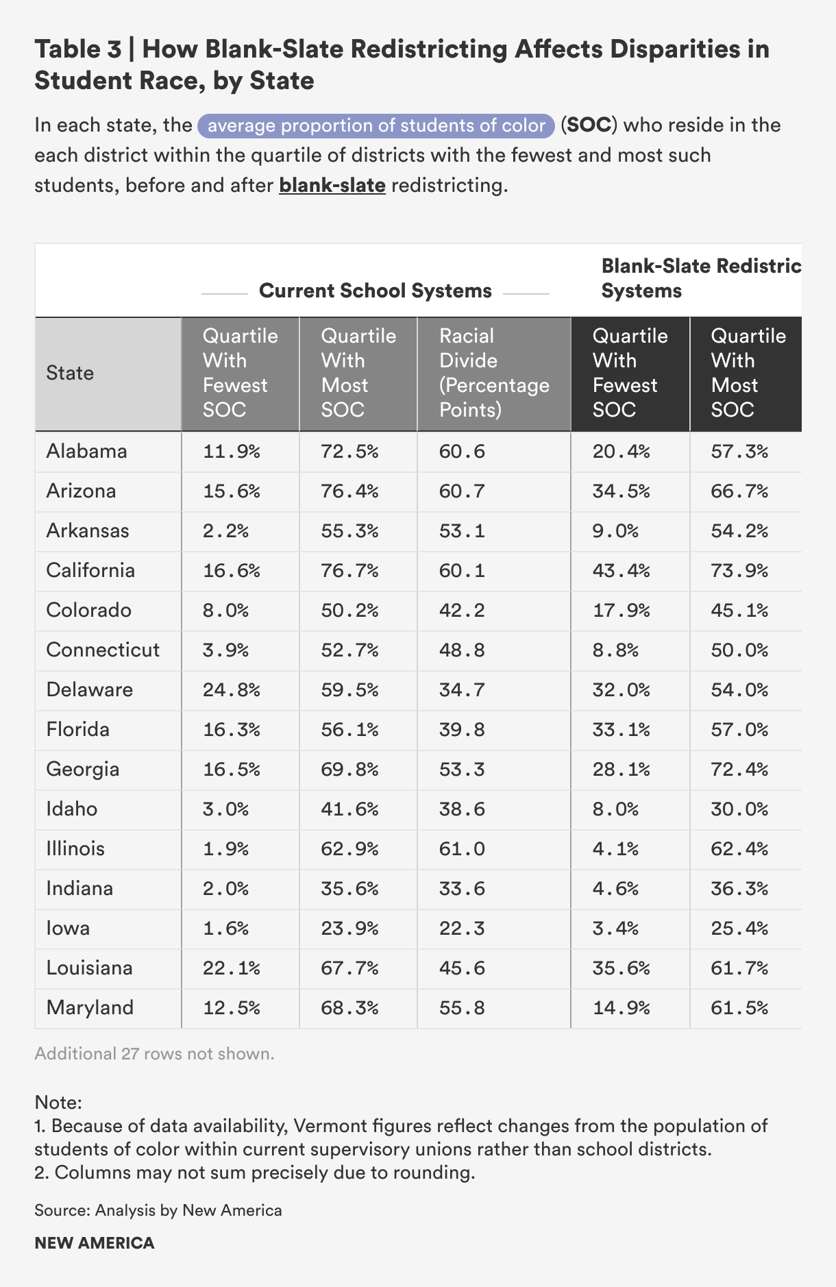
When districts in each state are divided into quartiles based on the percentage of students of color they include, we can see how the racial gap changes between the quartiles of districts with the most and fewest students of color. This comparison is a cruder measure of segregation than the overall improvement percentages reported above, primarily because that measure considers how well each district’s student population represents the statewide percentages of five specific races, while the quartile analysis only reflects differences in the percentage of students of color as a single group. Nevertheless, it can be helpful to see these quartile averages to get a more concrete sense of how White students and students of color are currently assigned to districts, and how they would be spread across districts after redistricting.
Currently, the average state’s bottom-quartile district has 7.5 percent students of color, while its top-quartile district has a population that is half students of color (49.3 percent), a racial gap of 41.8 percentage points. After blank-slate redistricting, the racial gap between the average state’s top- and bottom-quartile districts narrowed to 33.3 percentage points. This was the result of a shrinking divide in 35 of 42 states examined, and a modestly widening divide in seven states. However, when all five racial groups were accounted for separately, districts became more representative of statewide racial demographics in all 42 states.
Table 3 shows each state’s average percentage of students of color in the quartiles of districts, including the fewest and most such students, before and after blank-slate redistricting.
Impact on Economic Segregation
All 42 states in our analysis saw less economic segregation between districts under the proposed new district map. The average state saw district poverty rates become 65.0 percent more reflective of the statewide school-aged poverty rate after blank-slate redistricting.
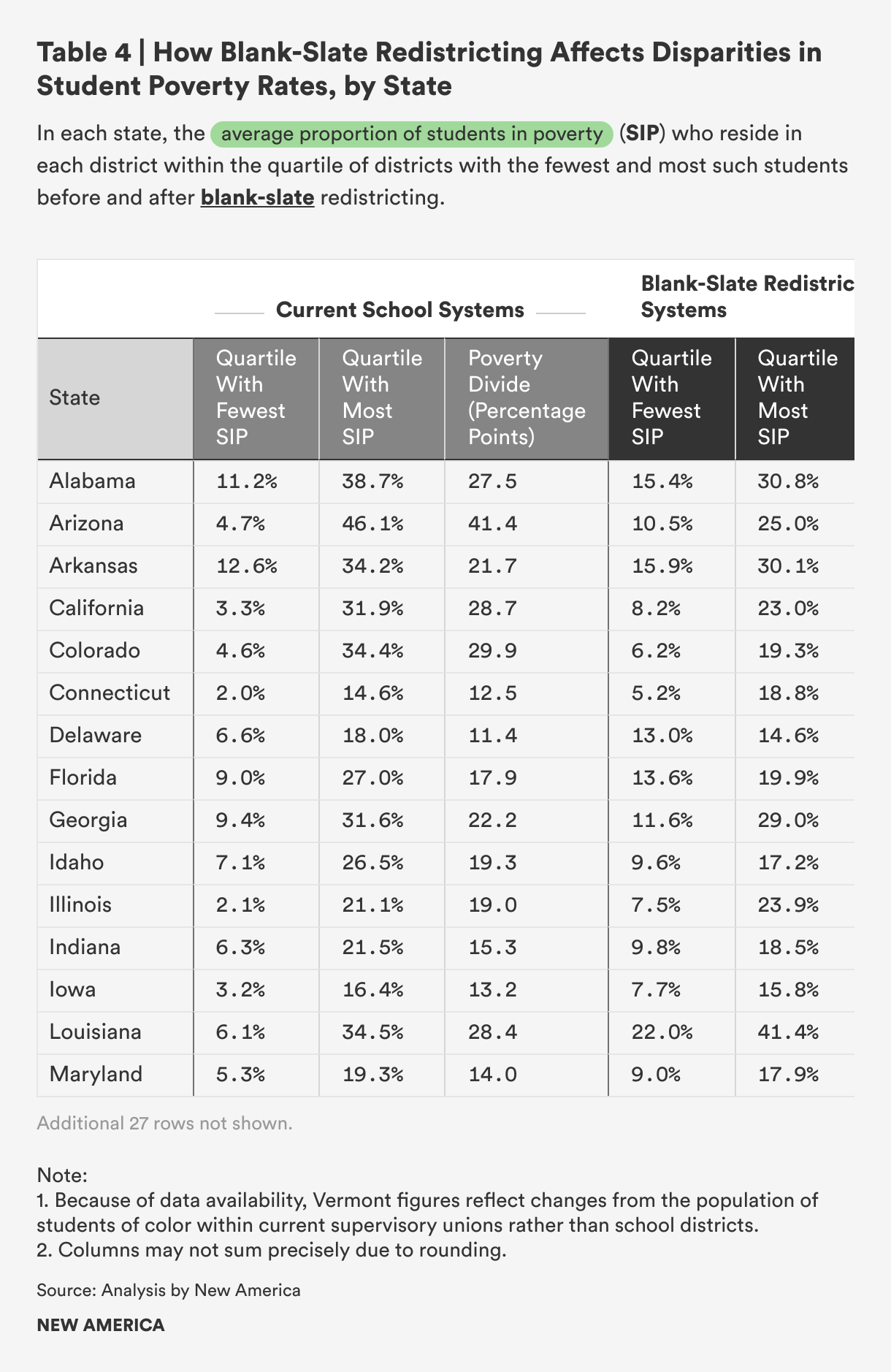
When districts in each state are divided into quartiles by student poverty rate, before redistricting, the average state’s poorest districts have a mean poverty rate of 26.2 percent, while its least-poor districts have a mean rate of 5.7 percent children in poverty, a gap of 20.5 percentage points. If school system borders were made fairer through blank-slate redistricting, that gap would narrow to 12.2 points, with highest-poverty districts averaging a child poverty rate of 22.0 percent, compared with 9.8 percent in the least-poor districts. Comparing these numbers for every state, 41 out of the 42 states analyzed would see their range of poverty rates narrow, reducing economic segregation. The sole exception, Connecticut, saw its poverty gap worsen by just 1.2 percentage points.
Table 4 shows the average district poverty rate in the lowest- and highest-poverty quartiles of districts based on current school system borders, and the parallel figures for districts after blank-slate redistricting.
Model 2: County-Based Redistricting
Rather than using an algorithmic method to redraw school districts, this model makes use of existing jurisdictional boundaries that are generally larger than current school districts: county lines. While there are states that use counties as the basis for some school district boundaries, few have exclusively county-level school districts.
In Florida and West Virginia, all school districts align with counties without exception.1 In Maryland, Nevada, and Virginia, there are only county-level school districts, with the sole exception of city-level school districts for cities that are not legally part of a county.2 These are the five states we consider to already have fully county-based school district maps.
Alabama, Georgia, Indiana, Kentucky, Louisiana, Mississippi, North Carolina, South Carolina, Tennessee, and Utah currently each have a substantial number of county-level districts alongside some other, non-county districts.3 Additionally, many of the counties with “county” school districts in these states actually contain both a county district and a separate city district, so the county district does not truly encompass the entire county. Montana has county-level high school districts.4 In other states, school systems either do not align with county boundaries or do so only occasionally, in individual cases.
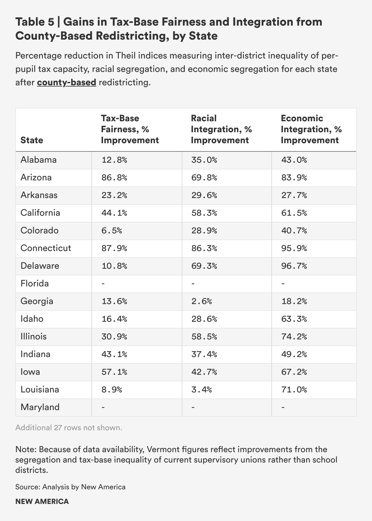
Because there is ample precedent for county-level school districts but states with exclusively county-level school district boundaries are rare, it is instructive to see how this familiar model, universally applied, could transform the equity of state school district maps. For this simulation, we analyzed the effects of replacing current school district lines with county borders in all states.5 We measured improvements in the same three priority outcomes as in Model 1: equality across districts of property valuation per pupil, district mirroring of statewide racial demographics, and district mirroring of statewide child poverty percentages. These results are summarized in Table 5 and discussed in more detail below. To see each state’s county-based school district map, see the interactive tool that accompanies this report.
Impact on Per-Pupil Property Tax Capacity
Out of the 42 states analyzed, 37 do not already have exclusively county-based school systems. All of these saw improvements in equality of access to per-pupil property wealth, though they were not as large as in Model 1.
Across the 37 states analyzed whose borders would change under a county-based redistricting model, the average state saw a 39.0 percent improvement in equality of access to per-pupil property wealth. Generally, school districts in Northeastern states (where existing districts are usually drawn at the town or city level) would see some of the greatest tax fairness gains from a switch to county-based school systems. Connecticut, for instance, would see a gain of 87.9 percent in equality of per-pupil tax capacity between districts. Rhode Island would improve by 81.2 percent on this measure, and New Hampshire by 66.4 percent. These gains underscore how a systematic move to wider, more inclusive borders can do much to level the property-tax playing field for school districts.
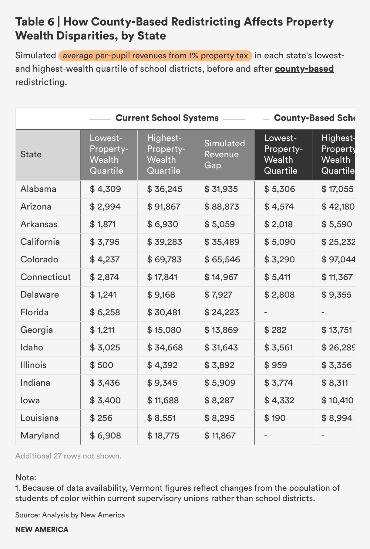
If every existing school district in these 37 states were collecting a 1 percent property tax, and if school districts in every state were divided into quartiles by property wealth per pupil, districts in the highest-wealth quartiles would raise about $26,700 more per student per year, on average, than districts in the lowest-wealth quartiles. County-based redistricting would reduce this tax-capacity gap between the highest- and lowest-wealth districts in only 26 of the 37 states. This indicates that the county-based model—which yields generally larger school districts, but not through any optimized process—may improve tax-base fairness across the whole group of districts in all states, but it does not reliably break the monopoly of the wealthiest districts on their states’ highest-value properties.
On average, county districts in their states’ highest-wealth quartiles would collect about $22,800 per student per year, while those in the lowest-wealth quartiles would raise almost $4,300. While this tax capacity gap would still be substantial and larger than the one that would result from blank-slate redistricting, it would reduce by more than a quarter the disparity that exists in states today, increasing fairness in students’ access to local school revenue.
Table 6 shows the average amount that would be raised per pupil with a 1 percent property tax in the lowest- and highest-wealth quartile of districts as they currently exist in each state, and the parallel amounts if the state had a universal, county-based school district map.
Impact on Racial Segregation
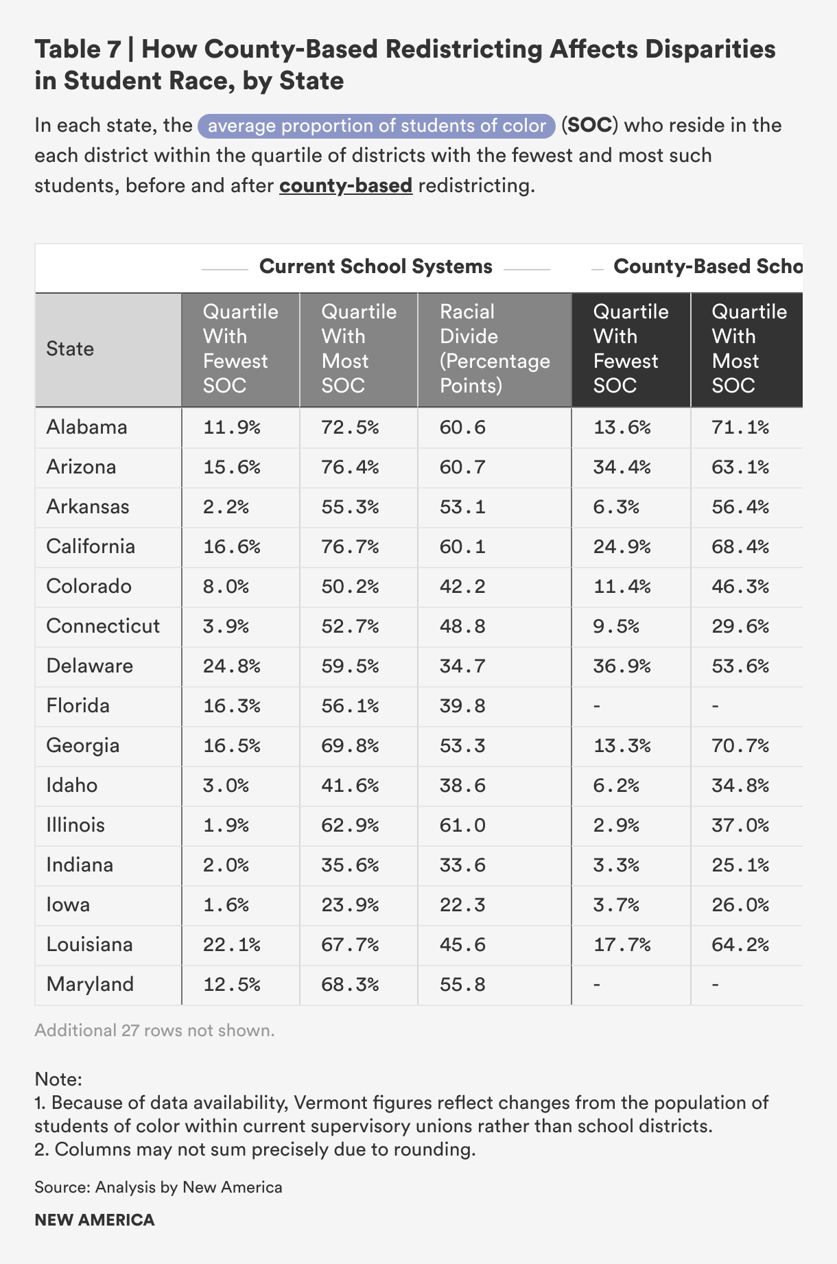
All 37 states saw a reduction in inter-district racial segregation in this model. That is, after the simulated county-based redistricting, the racial makeup of school districts in all these states more closely matched the proportions of five racial groups of school-aged children statewide (Asian, Black, Latino, Native, and White students). Racial segregation decreased by 40.7 percent on average.
When the districts of each of these states are divided into quartiles based on the percentage of students of color they include, the racial gap between the average state’s bottom-quartile and top-quartile district is 42.6 percentage points. Once states were redistricted along county lines, that gap shrank to 33.4 percentage points, an improvement almost identical to that in blank-slate redistricting. With county-based redistricting, this racial gap narrowed in 33 of 37 states analyzed.
This quartile comparison is less nuanced than the overall percentage improvement figure reported first in this section, since that measure considers the representativeness of districts’ populations across five different races while the quartile comparison places all students of color together in one category. When all five racial groups were accounted for separately, county-based redistricting made districts more representative of statewide racial demographics in all 37 states. Still, the quartile averages are helpful for understanding the degree to which White students and students of color would live and learn in the same districts.
Table 7 shows each state’s average percentage of students of color in the quartiles of districts including the fewest and most such students, before and after county-based redistricting.
Impact on Economic Segregation
All of the 37 states saw a decrease in inter-district economic segregation, meaning that after the simulated replacement of current school district boundaries with county lines, school districts in all these states saw their poverty rates become more similar to the statewide poverty rate among school-aged children. On this measure, the average state improved by 57.2 percent.
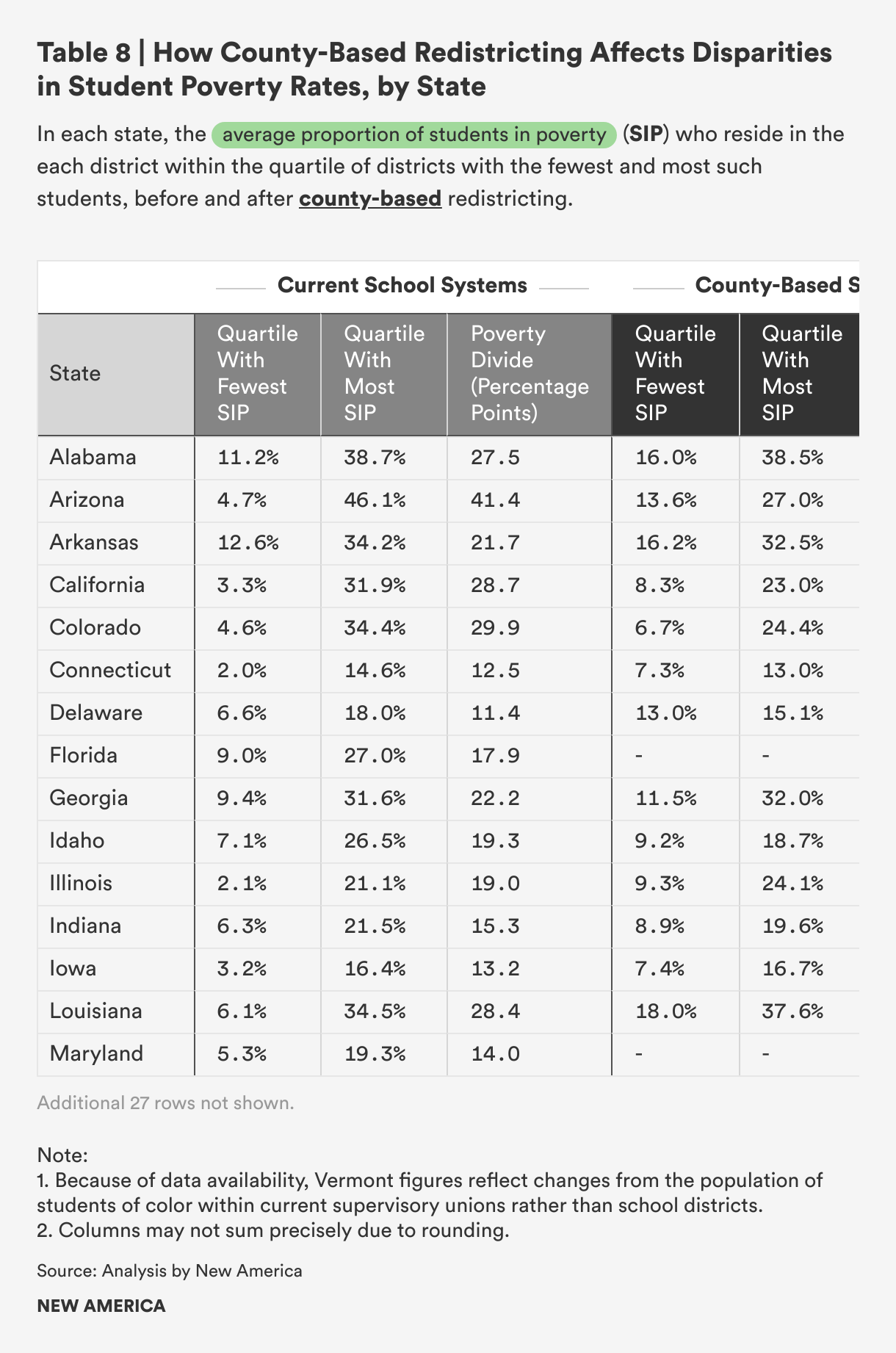
When each of these districts is assigned to quartiles by poverty rate, the average state’s highest-poverty districts currently have a mean proportion of 26.6 percent children in poverty, while its lowest-poverty districts have a mean poverty rate of 5.3 percent—a 21.3-point gap. After school districts were redrawn along county lines, that gap narrowed by over a third, with average poverty rates of 10.1 percent in the lowest-poverty districts and 23.2 percent in the highest-poverty districts. All 37 states saw this poverty gap shrink. The most impressive improvement was in Montana, where the poverty-rate gap was reduced from 47.9 points to just 13.1 points through county-based redistricting.
Table 8 shows the average district poverty rate in the lowest- and highest-poverty quartiles of districts based on current school system borders, and the comparison figures for districts after county-based redistricting.
Model 3: Redistricting by Merger
For this simulation, we measured the effects of strategically merging existing school districts to create larger districts that offer fairer access to property wealth and increase integration. School district consolidation is the most common form of district boundary change. This approach makes use of that familiar mechanism, but where most merger efforts occur at the local level, this model proposes optimal statewide merger plans. As before, we measured improvements in three areas: equality across districts of assessed property valuation per pupil, similarity of district racial demographics to statewide racial demographics, and similarity of district poverty rates to statewide child poverty rates.
Though the gains we measure from the merger model were not quite as great as those from the blank-slate model, redistricting via consolidation offers some practical benefits. The primary advantage of merger-based redistricting is that each school’s entire attendance zone (the geographic area from which the school draws its students) will be included in the new district. This is not guaranteed with the other two models, whose proposed boundaries may cut across existing districts. As a result, there is no automatic need to change school attendance zones when districts merge, reducing the potential growing pains for students and families when joining a new district. Additionally, while the blank-slate and county-based redistricting options can only be pursued wholesale, by states redrawing their entire school district maps, consolidations can happen individually, on local initiative. Our methods optimize for statewide improvement, seeking to simulate the merged-district map that would produce the most equal assessed property valuation per pupil across the state’s school systems while reducing racial and economic segregation between those school systems. This is ideally meant to provide guidance for whole-state school system redistricting. But statewide improvements are composed of district-by-district gains. So, in states that do not take up wholesale redrawing of school district boundaries, communities can still refer to this analysis to see the local mergers that would be most beneficial.
State results are summarized in Table 9 and discussed in more detail below. For maps showing the specific consolidated districts in each state’s merger model, see the interactive mapping tool that accompanies this report.
Impact on Per-Pupil Property Tax Capacity
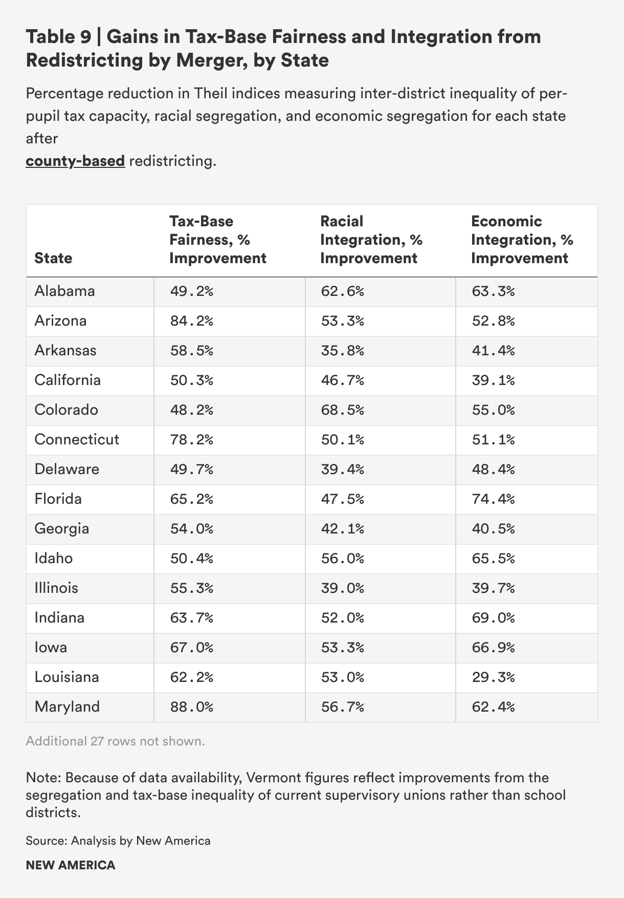
All of the 42 states in our analysis saw improvement in equality of per-pupil property tax capacity after simulated redistricting via strategic merger. The average state saw a 63.0 percent gain on this measure, as the per-pupil value of districts’ tax bases became much more similar to the per-student share of the state’s overall tax capacity.
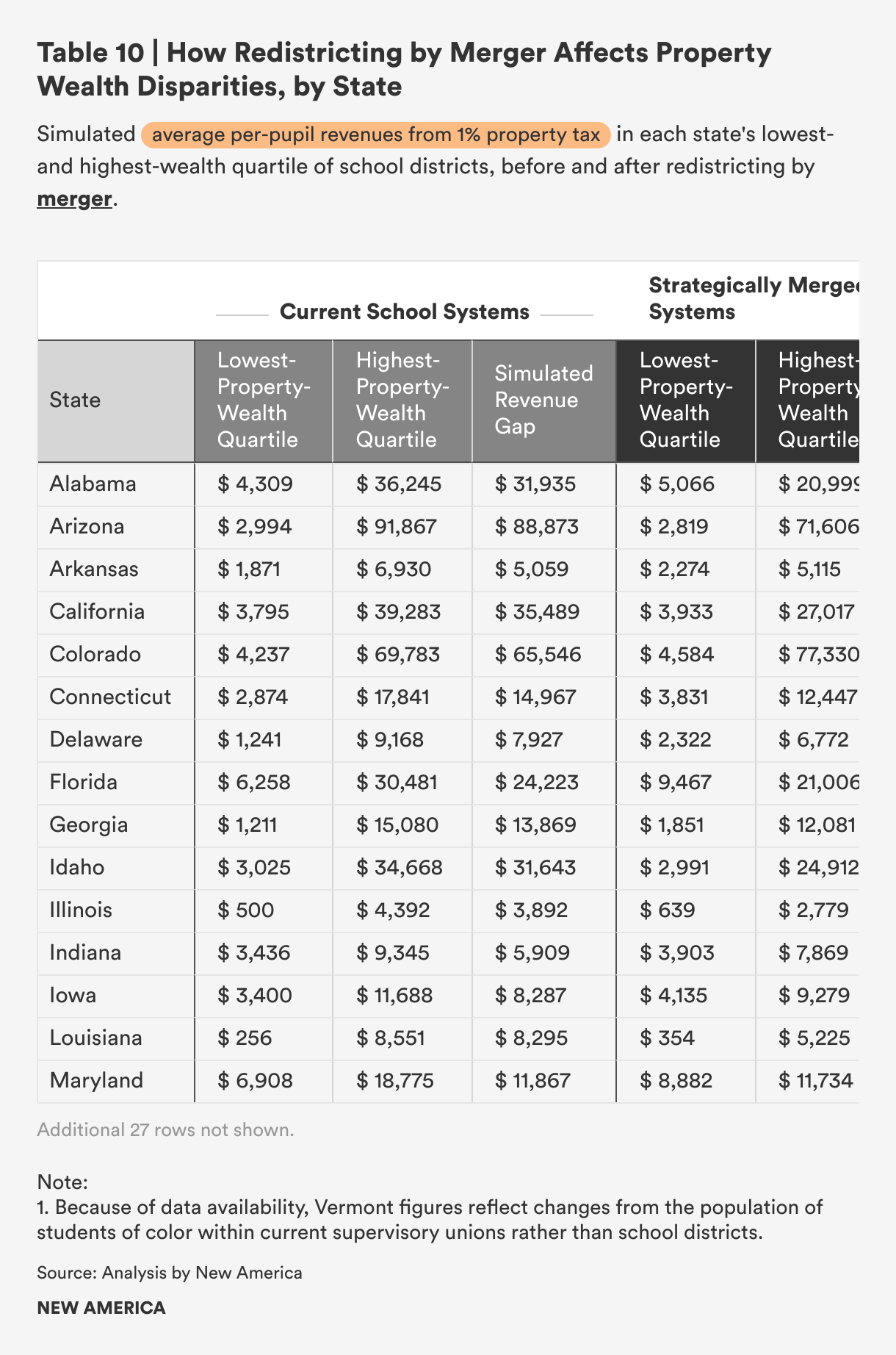
We have already determined that if every existing school district were to collect a 1 percent property tax, districts in the highest-wealth quartile of school districts for their state would raise about $28,900 per student per year, on average. Meanwhile, districts in the least property-wealthy quartile of school systems would raise just over $3,300 per student per year. After redistricting by strategic merger, that disparity would narrow in all 42 states analyzed. While the tax-capacity gap would shrink in more states after redistricting by merger than after blank-slate redistricting, the gains are not as great. On average across all states analyzed, top-wealth-quartile districts would raise about $20,000 per pupil from a 1 percent property tax after strategic mergers, while districts in the bottom wealth quartiles would raise $4,050, leaving a divide of more than $15,900 per student per year. This is about 40 percent smaller than the tax capacity gap under current school district boundaries, but that impressive gain still falls short of the blank-slate model.
Table 10 shows the amount that would be raised per pupil by a 1 percent property tax in the lowest- and highest-wealth quartile of districts as they currently exist in each state, and the parallel amounts if the districts were merged, as in our proposed model.
Impact on Racial Segregation
All of the 42 states saw inter-district racial segregation decrease after redistricting through optimal mergers. In the average state, districts’ racial demographics, defined as proportions of the school-aged population falling into five racial categories (Asian, Black, Latino, Native, and White), became 48.2 percent more reflective of the statewide school-aged population.
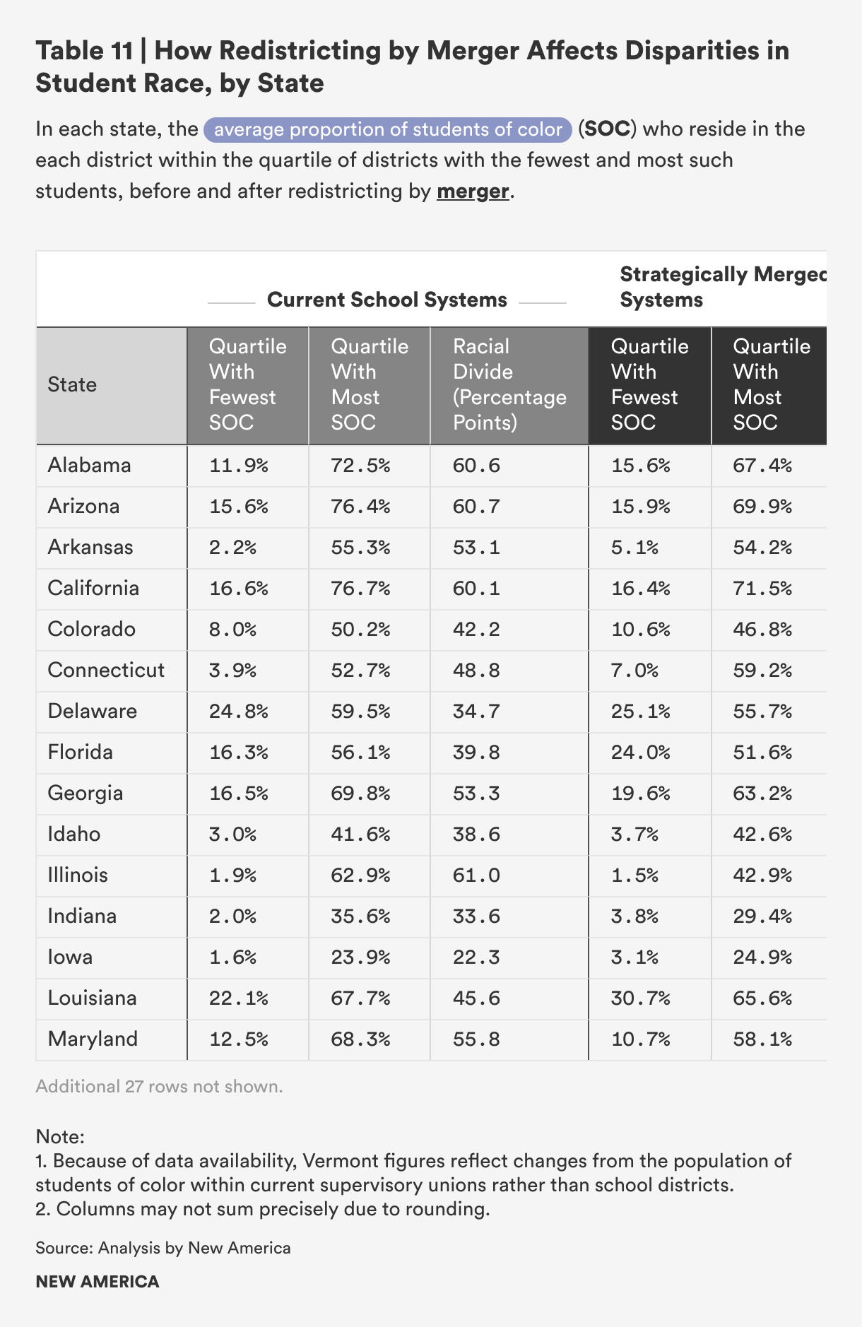
When each state’s districts are assigned to quartiles based on their percentage of students of color, the racial gap between the average state’s bottom-quartile and top-quartile district is 41.8 percentage points, between 7.5 percent students of color and 49.3 percent. After redistricting by merger, this difference would shrink to 35.4 percentage points, a slightly smaller improvement than with either blank-slate or county-based redistricting. This racial gap would narrow in 37 of 42 states analyzed.
As noted in the discussions of the other models, this comparison is somewhat simplistic relative to the overall improvement percentage above, which accounts separately for students in five different racial groups and shows gains for all 42 states. The quartile comparison has only a single category for students of color. Still, it is useful for showing concretely how White students and students of color are distributed across districts before and after redistricting by merger.
Table 11 shows each state’s average percentage of students of color in the quartiles of districts, including the fewest and most such students, before and after redistricting by merger.
Impact on Economic Segregation
All 42 states analyzed saw a decrease in economic segregation between school districts after merger-based redistricting. The average state saw its districts’ poverty rates become 54.6 percent more similar to the statewide school-aged poverty rate.
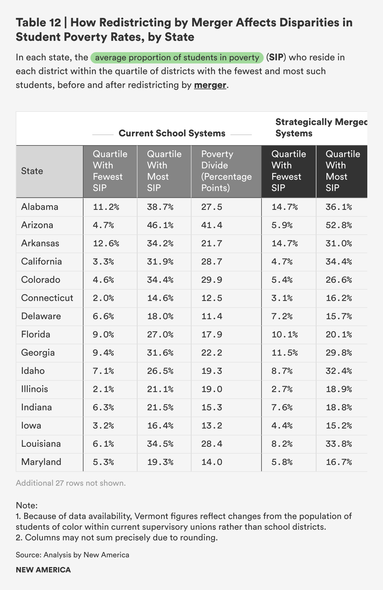
As noted above, when the school districts in each state are divided into quartiles based on their poverty rates, the average district in its state’s highest-poverty quartile has a poverty rate of 26.3 percent, while the average district in the lowest-poverty quartile has a poverty rate of 5.7 percent. If district borders were optimally merged, that 20.5-point poverty-rate gap would narrow modestly to 16.4 points, with the school-aged population in highest-poverty districts having a rate of 23.6 percent, compared with 7.2 percent in lowest-poverty districts. This average would result from a smaller poverty gap in 38 out of 42 states.
Table 12 shows the average district poverty rate in the lowest- and highest-poverty quartiles of districts based on current school system borders, and the parallel number for districts after redistricting by merger.
Discussion
Across all redistricting models, every state analyzed would see improvement on every one of our three priority measures. Over and over, we see that purposeful, whole-state redistricting can produce more diverse school districts with fairer access to local revenue.
Unsurprisingly, the blank-slate model, which is guided only by community-level property valuations and by where students live, would produce the largest gains for per-pupil tax-base equality and reduced inter-district segregation. But merger-based redistricting, for which there is more precedent nationally and which reduces the practical challenges associated with having to assign some students to new schools, would yield average improvements that are nearly as large. Even county-based redistricting, which uses only existing jurisdictional boundaries and is not algorithmically driven to address any of our priority areas, would still result in significantly more tax-base fairness and less inter-district segregation. For states willing to take up this issue, huge progress can be made. And all this is possible without changing anything about underlying student residential patterns or property values—just by redrawing the invisible lines that divide states and students into today’s unequal school systems.
This does not mean, however, that redistricting is a simple process for school officials and communities to navigate. The following section, authored by a school district superintendent who was directly involved in two school system consolidation efforts, discusses the practical and political challenges associated with effecting district boundary change and the policies that can help smooth the way.
Citations
- Economic Statistical Methods Division, Individual State Descriptions: 2022 (U.S. Census Bureau, April 2024), source.
- Baltimore, Maryland; Carson City, Nevada; and 38 cities in the state of Virginia.
- Economic Statistical Methods Division, Individual State Descriptions: 2022, source. Note that in Louisiana, these geographic entities are called parishes but are equivalent to counties.
- Economic Statistical Methods Division, Individual State Descriptions: 2022, source.
- Municipalities that are not legally part of counties are kept as separate school districts in this model, including Baltimore, Maryland; Carson City, Nevada; St. Louis, Missouri; and 38 cities in the state of Virginia.